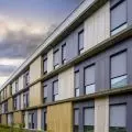
In Ilawa, on Lake Jeziorak, there is a complex of buildings with its own marina. It is in this picturesque place that the architect {tag:pracownie} designed two apartments for short-term rental. The interiors, maintained in a similar modern style, differ in color scheme. Accents of green and pink rule in the first, while navy blue and brick reds rule in the second.
The apartments were designed for guests who, in addition to active recreation at the lake, appreciate spending time in a nice, designer environment.
The light flowing into the interiors flows unhindered into the subsequent rooms
Photo: Beata Sikora © Ula Schönhofer
In the designer's words:
Designing two apartments with a small area ofthirty-three square meters and the same functional layout, so that each has its own character, turned out to be great fun. At the very beginning of our cooperation we decided not to refer to the nautical style in the interiors, we put abstract accents. To differentiate the apartments, we decided on large patches of color. In the first interior, accents of green and rose rule, in the second - navy blues and brick reds.
The vertical direction in the first apartment is emphasized by green rollers in the built-ins
Photo: Beata Sikora © Ula Schönhofer
In one apartment, the vertical direction is emphasized by rollers, grooves on the green built-ins and a pattern of pink tiles, while in the second the diagonal direction is emphasized by the lamp over the table, herringbone in the bathroom, and the pattern of the industrial wall separating the bedroom.
The lounge area, with a large double window that is a direct exit to the terrace, was designed so that the light coming in can flow unhindered into the next rooms. The separation of bedrooms in the apartments is conventional and created so as not to restrict natural light. In the first apartment, it is an industrial wall with a geometric pattern, in the second - green rollers.
American walnut kitchen cabinets and table
Photo: Beata Sikora © Ula Schönhofer
On the floor, the architect used bleached oak planks, juxtaposed with stoneware tiles in the kitchen, hallway and bathroom. The white of the floor creates a contrast with the American walnut of the kitchen cabinets and custom-made built-ins. Some of the kitchen equipment was moved into a high built-in that separates the kitchen from the living area. The built -ins also house the washing machine and utility area, while a closet is located on the bedroom side. The tables in both apartments were designed by an architect and finished with the same veneer as the kitchen cabinets, making the interior cohesive.
Pink tiles in the bathroom and designer accessories
Photo: Beata Sikora © Ula Schönhofer
Dobrawa Bies: What were the assumptions and design inspirations? Did you manage to achieve all of them?
Ula Schönhofer: The apartments are on a lake, and since the owner has two other apartments for rent by the Polish sea, we did not want to introduce a similar nautical atmosphere here. The starting point was to distinguish between two premises with the same functional layout. I looked for abstract spatial forms that would distinguish them from each other, such as colors, geometric figures. As a result, the apartments being in the same style, they differ in accents.
The diagonal direction in the second apartment is emphasized by a partition wall
Photo: Beata Sikora © Ula Schönhofer
Dobrawa: What did the investor expect? Did she give you a free hand?
Ula Schönhofer: The investor expected a functional space, equipped to a high standard. The design work went very nicely, I was able to go wild with solutions that are more impressive (the offer of apartments was to stand out) with the budget that most investors are able to allocate for their own apartment.
In the bathrooms, the architect used intense colors
Photo: Beata Sikora © Ula Schönhofer
Dobrawa: The interiors are dominated by bright colors. Stronger accents appear mainly in the bathrooms, why such a decision?
Ula Schönhofer: The apartments are small and have windows on only one wall. I thought it was important to illuminate this incoming light from one side as effectively as possible throughout the space. Hence the bright colors, but I think there are also strong accents in this open space, one apartment has blue built-ins and the other has green, both have colorful bed upholstery. Bathrooms are rooms where we spend less time than in other spaces of the apartment, so I think that the intense colors used here will not get tiresome so quickly:)


