Toy stores are often enjoyed not only by the youngest. Designing toys, but also interiors for children is often a huge challenge. Architects from mode:lina studio created a fabulous and safe space of an unusual toy store in Wroclaw.
unhindered
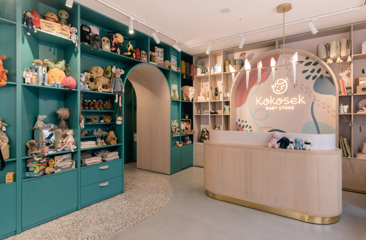
In magical Wroclaw, in the very center of the city, at Dyrekcyjna 3 Street, there was an awkward, irregularly shaped space, which by the end of 2020 was just about to transform into a toy store. Three massive pillars in the middle of the premises, initially did not make the architects' task easy. Eventually, the mode:lina studio team designed a wall that connected the pillars. With this new vertical surface, the store gained additional shelf space for displaying toys. The shelves were filled with teddy bears, cars, blocks, but also items that would interest parents more than children, such as natural cosmetics, strollers and furniture. And in arranging the interior, the designers also thought about the aesthetics of adults.
photo by Patryk Lewinski | mode:lina
not only for children
How to adjust the space for two age groups? Designer furniture, which certainly not one parent would like to have at home, has rounded edges, making it safe for children. Architects responding to the needs of the store, and struggling with the out-of-shape premises, designed an arcade maze. The path allows to test baby strollers, but also arouses the interest of the little ones. Who doesn't love mysterious, narrow passageways and mazes? The strollers have found space in the back of the premises, where they form the background of the store, visible from the outside, from the street. The attention is particularly drawn to the rounded island, which serves as a cash register, among other things. The island was covered with a concrete surface of marble grit, or fashionable terrazzo.
fig. mode:lina
pastel
Toy stores often overwhelm us with the number of colors and textures. How to keep the interior in child-friendly colors, and at the same time not to overdo it and allow the older ones to spend a longer and pleasant time in the room? This time the answer is pastel shades. They make the interior seem bright and light. The authors of the store's visual identity are the duo Lange&Lange. The muted, warm colors of the interior harmonize with their idea. The architects focused on functionality when designing the floor. The indestructible concrete floor complements the colorful interior. The extras? When the store is filled with hundreds of beautiful toys, it's not worth distracting from them. The copper finishes of the furniture will probably only be noticed by a watchful parental eye. Unusual cloud-shaped panels hang from the ceiling.
photo by Patryk Lewinski | mode:rope
shop windows
Designing storefronts is a completely different tale. Here the architects were helped by the Dodoplan design group, which made additional decorations. The spacious storefronts featured intriguing shapes that match the decor and will change with the seasons. The Mode:lina design team created special platforms for the decorations and store display, which form, matching the store's windows, a stage.
photo by Patryk Lewinski | mode:lina
like in a fairy tale
The investors and owners of the store dreamed of the absolute best store for the youngest in Poland. Its equipment consists of unique, often handmade toys, carefully designed with great attention to the needs of modern children. The interior of such a store had to not only match the standard of the display, but additionally attract the right customers. In the end, it must be said that it not only attracts, both children and adults, but also in its interior you can feel like in a fairy tale. It would be a dream come true not only for children to smuggle elements of this design into the interiors of nurseries, kindergartens and schools.


