Alicja Kaczykowska of {tag:pracownie} and Agnieszka Gibowicz of Interior Idea faced an interesting challenge, the clients asked the architects to remodel a house from the 1980s. Before moving back into the building, located in Gdansk, the owners decided to do a major renovation. They wanted interiors in an eclectic style with loft and classical elements. We invite you to come inside!
The terraced house from the 1980s is located in Gdansk on Mickiewicza Hill. The total usable area of the building is 169 square meters. Alicja Kaczykowska and Agnieszka Gibowicz carried out a major renovation and metamorphosis in it. The first floor, first floor and attic were rebuilt, along with the replacement of all electrical and sanitary installations. The building was additionally equipped with underfloor heating systems, an anti-burglary system, water treatment stations and several smart home functions. Some of the original elements were preserved and renovated, such as the wooden staircase, for which the architect designed lighting, a steel handrail and a glass balustrade. The wooden floor on the first floor and cast-iron radiators also got a second life.
The clients wanted a multifunctional living space
photo: XO photo © bene studio, Interior Idea
Dobrawa Bies: What did the investors expect? How did the cooperation go?
Alicja Kaczykowska: Cooperation with the owners was exceptional - they showed great awareness and aesthetic sensitivity. The style in which the new arrangement was to be carried out was defined as eclectic with loft and classical elements. They placed great importance on comfort and practicality, and their love of good design did not for a moment overshadow their thoughts of creating a homely, warm atmosphere.
The house required considerable design changes
© bene studio, Interior Idea
Dobrawa: What were the assumptions and design inspirations? How did the work progress?
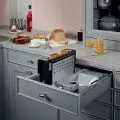
Alicja Kaczykowska: Among the main assumptions was to create an open space and thus a multifunctional living area. Originally, the first floor of the house was divided by walls separating rooms with specific functions. After a structural expert opinion, it turned out that the house has many limitations and demolition of all interior walls is unrealistic. An obstacle? Yes, but only an apparent one. The remaining vertical structural partitions determined an unusual kitchen layout with a large peninsula, which was also on the list of spatial and functional expectations. The result was an open kitchen area, bounded on the dining room side by a peninsula with a gas hob and a spacious worktop. Above it is a built-in hood with space for books and herbs. The kitchen is separated from the communication by a structural wall covered with decorative concrete and a steel ladder.
The kitchen is kept in dark colors, and the attention is drawn to the steel ladder
Photo: XO photo © bene studio, Interior Idea
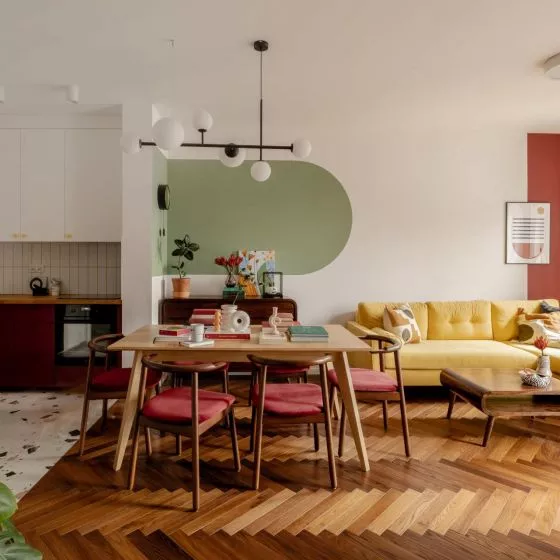
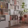
Thanks to the changes made, it was possible to create a spacious, well-lit living area, which consists of a living room, dining room, kitchen and communication. In the new space there was a place for the original communist commodes that have "lived" here forever, and a modular bookcase in the dining room - which was also the owners' wish. A very important issue, was the presence of the owner's cat, it is for this member of the family in the new development of the stairs to the attic, a space for a litter box was separated, which allows to easily maintain cleanliness, order, and the pet has its own intimate place.
Under the stairs there was a bookcase and a place for the cat
Photo: XO photo © bene studio, Interior Idea
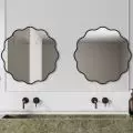
In the large bathroom on the first floor we met a surprise, well, a large part of the space was occupied by "stairs" - an element resulting from the spatial layout of the actual staircase. To take advantage of this space, a furniture enclosure was designed that hides a lot of storage space. The bathroom itself has the feel of a bath room, mainly due to a spacious seat by the window with shutters and wallpaper in the shower. A long cabinet with two sinks allows two people to comfortably use the bathroom at the same time.
The furniture cabinet in the bathroom conceals plenty of storage space
Photo: XO photo © bene studio, Interior Idea
Dobrawa: The apartment is dominated by natural, light colors and wood, dark kitchen furniture became the accent. Where did this design decision come from?
Alicja Kaczykowska: Natural, bright colors optically enlarge the interior and harmonize with daylight, while wooden elements are a reliable way to warm up the space. In the arrangement of the house there is no shortage of contrasts in classic colors. From the beginning, the owners showed a penchant for monochromatic accents, i.e. black-and-white graphics and posters, black metalwork elements, such as the loft door to the vestibule. The floor in the vestibule and small bathroom is a beautiful black-and-white mosaic. The small bathroom was based on the principles of contrast: large white tiles and a black wall. The graphite-white kitchen with wooden elements is elegant, timeless and works well with the rest of the open living space.
Bright colors optically enlarge the interior and harmonize with daylight, while wood adds warmth
Photo: XO photo © bene studio, Interior Idea
Dobrawa: How do you arrange the space wisely to maintain visual consistency?
Alicja Kaczykowska: The current trends of mixing styles require a lot of design sense and intuition from the designer. A healthy moderation is necessary to maintain consistency. Besides, a well-arranged space is always the result of cooperation with the client, translating his energy, expectations, interests, way of life into reality. By doing so, the space becomes individual, timeless and consistent with living matter.
Dobrawa: Thank you for the interview.
interviewed: Dobrawa Bies


