In the pandemic period, remote work has become one of the defining elements of daily life. How to adequately define the balance between professional activities, home responsibilities and rest? In the latest realization by Barbara Godawska of iHome Studio interior design studio, the most important thing was to determine the corresponding finding of life balance.
The space between the kitchen and the office is separated by a small island
photo by Tymoteusz Malinowski © iHome Studio
rearranging the rooms
The apartment is located in a modernist house in Warsaw's Ochota district. The fifty-eight-square-meter space underwent a full remodel. The existing walls were demolished except for the one that serves as a load-bearing wall. In their place, a new layout was created.
The location of key rooms was changed. Kitchens located in the location of the bathroom, in turn, the bathroom and dressing room took the place of the former kitchen with pantry. The changes to the apartment required many technical changes, including the relocation of the entire sewer riser. Ventilation and air conditioning systems were created from scratch.
A unique solution is the introduction of a pull-out music console in the kitchen island
photo by Tymoteusz Malinowski © iHome Studio
The key challenge I faced was to create from scratch a functional layout that responded to the client's very specific needs. The goal was to clearly distinguish two parts here, an office for his company and an occasional apartment," says Barbara Godawska, foundation designer from iHome Studio.
locating the office space
The key to creating the entire project was the proper distribution of work and leisure spaces. From the beginning, the investor clearly emphasized the need to differentiate these spaces in terms of color. The office, extending behind the front door, was to be bright, light and spacious as much as the space allowed.
The kitchen was finished in black colors, broken up by wood
photo by Tymoteusz Malinowski © iHome Studio
The office space is prepared for four people and consists of a huge white table. Right next to it is a toilet and a small kitchen along with an island, which has been lit up with numerous LED lights. The kitchen was kept in a gray and graphite color scheme. Opposite the kitchen wall was a monitor screen against a backdrop of upholstered panels and fluted tiles to correlate with the other side of the room. On the ground, a carpet was used to mimic the pattern of marble on a black and gray background, which is arranged in a checkerboard pattern.
rest area
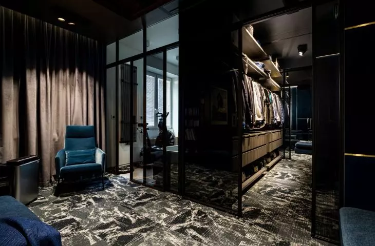
Separately, an area was separated for entertainment and relaxation. The main piece of furniture in the room - a large modular sofa - was designed by Barbara Godawska together with the investor. It can also serve as a place to sleep. Opposite it, a light wall of steel half-piles and glass was located, separating the bathroom and dressing room. In front of this partition, a large-format projection screen is lowered, replacing the TV set. The recreation room is connected with the office space only by a similar carpet pattern. The dominant color is navy blue - in which the walls and furniture were finished.
The main dominant feature of the living room is a sofa designed by the interior designer
Photo: Tymoteusz Malinowski © iHome Studio
During the work on the project and its implementation, the investor paid great attention to the smallest details. He wanted the solutions used in the arrangement to be original, unconventional. This is particularly evident in the private part," emphasizes architect Barbara Godawska.
Separating the space
The most important goal of the new arrangement was to distribute space according to function - to push back the situation in which we are forced to divide the space of rest with work and vice versa. To create interiors that clearly indicate the distribution of function space.
Garnet is the dominant color in the living room
photo by Tymoteusz Malinowski © iHome Studio
