Work submitted to the Halina Skibniewskaya student competition - HEALTHY HOUSE
To quote Frank Lloyd Wright: "What is most needed in architecture today is what is most needed in life - integrity. As with the human being, integrity is the most deeply embedded quality of a building." This thesis was particularly close to my heart when creating a space for a resident with special requirements, who, in order to move freely in it, needs to tame it first.
studio
© Agnieszka Niczyporuk
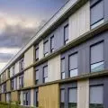
The presented project was created with two users in mind, one of whom is visually impaired. Great emphasis was placed on tactile and auditory (echolocation) sensations, which help the visually impaired person discern the topography of the apartment. The characteristic element that determined the appearance of the interior architecture was the edge, the rhythm created in a particular layout, which is recorded in the memory of the visually impaired viewer, becoming a kind of map for him. The two-story penthouse is located on the fourth floor of the building. In addition to its residential function, the space has a separate working area, i.e. a painting studio.
path of movement on both floors
© Agnieszka Niczyporuk
The design phase was preceded by a detailed analysis of the movement patterns in the building, taking into account all the necessary functions that the addressees need in the safe and comfortable use of the apartment. Its result was a series of abstract collages, then transferred to a specific space, constituting a kind of scenario, which in subsequent stages of the work was made real. Light, both sunlight and artificial light, played a significant role in the design of the space, with the task of navigating users through the facility, accentuating individual zones, but also creating a mood. The materials used were chosen not by accident.
living room on the first floor
© Agnieszka Niczyporuk
The varied texture is intended to make it easier to find landmarks in the space, so porous elements are used interchangeably with smooth ones. In turn, architectural concrete on the floor, quartz sinter cladding on the walls, increase the acoustics of individual zones, while lacquered MDF and stainless steel used in the buildings, treated interchangeably, differentiate the space tactilely. By juxtaposing white with black on individual vertical and horizontal surfaces, broken by the dominant red, which is both a warning signal (the user is approaching a potentially dangerous element - vertical communication) and an aesthetic differentiator in the apartment, a kind of mosaic was created. Individual zones are slipped out, not closed (the use of doors was kept to a minimum, thresholds were abandoned) to facilitate movement through the space. Such a procedure also allowed the free flow of air and ventilation of individual rooms. All kinds of buildings have been integrated into the existing architecture, so as to create a monolith and prevent people from tripping over individual elements.
bedroom and staircase
© Agnieszka Niczyporuk
The proposed concept in its formal and color austerity is intended to be a counterbalance to the stereotypical thinking of an interior for a visually impaired person as a space straight out of a hospital room, which is supposed to contribute to bridging the differences between people with different psychophysical abilities.
Agnieszka Niczyporuk
Illustrations: © Author


