{tag:studenci}, a student of the Faculty of Interior Design, Design and Scenography at the Eugeniusz Geppert Academy of Fine Arts in Wroclaw, designed the interior of a tea room inspired by Japanese culture - the ceremony of brewing and drinking tea. The style of the entire establishment is taken from the wabi-sabi philosophy and encourages visitors to focus on the moment in progress. Artistic ceramics are also on display in the interior, which is kept in natural colors and materials.
Natalia Machoń's Tea & Ceramics project is a semester-long assignment completed for classes in the Interior Design Studio, taught by Katarzyna Anna Jagiełło, PhD, Aleksandra Przybyła and Tomasz Taciak.
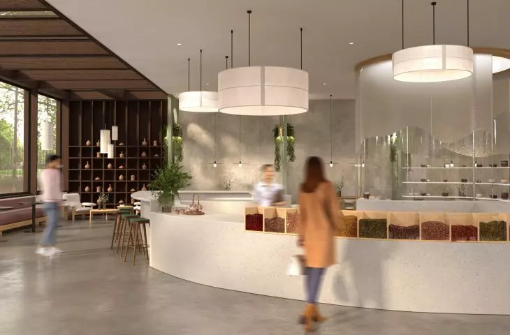
customer service zone
© Natalia Machoń
The style of the premises is taken directly from the wabi-sabi philosophy, which talks about the simplicity of living in harmony with nature. The unusual tea ceremony (in line with wabi-sabi) requires not only peace and time, but also the ability to be "here and now." It's not about just drinking the prepared beverage, but arranging the whole process, focusing on the process of tea consumption itself and experiencing it with more senses," explains the author.
The interiors of the tea house are inspired by the wabi-sabi philosophy
© Natalia Machoń
wabi-sabi in the interior
In order not to disturb the tea ceremony that guests can indulge in, the student designed the interiors of the establishment with harmony and respect for Japanese culture. The teahouse makes it possible to calm down, relieve stress and relax from an excess of stimuli. In the design, the author used natural and raw materials, showing the process of noble aging, such as wood and stone - thus referring to the wabi-sabi philosophy.
spaces allow for tranquility
© Natalia Machoń
The color scheme and combination of materials is based on a neutral color palette. There are shades of gray, beige and green broken by dark, massive structures created from wood. The interior, filled with light and air, freely penetrates to the outside through numerous glazings.
bright ceramics display area
© Natalia Machoń
a place with artistic ceramics
In contrast, the neutral customer service area was broken by the pure, cold white used in the ceramics display space. The white highlights the natural beauty of the unique ceramics which, apart from the tea, is the most important element of the project. The ceramics exhibition is the heart of the premises. It was created in the form of a cylinder surrounded by glass with entrances on both sides of the premises. It serves both a utilitarian and purely aesthetic function.
The premises are intended to become a place full of tranquility, while providing the highest quality of taste experience, but also a place for the promotion and sale of artistic ceramics, the author adds.
The space of the teahouse has been divided into zones
© Natalia Machoń
bar, lounge area and lodges
At the very center of the teahouse is the bar - visible from almost every corner of the premises. In addition to its standard function, it is a kind of small show, where guests waiting for tea can admire the way it is prepared. The designed space has been divided into several usable zones to meet the different requirements of customers.
rest area of the tea house
© Natalia Machoń
The premises include a rest zone - providing privacy and quietly enjoying tea or focusing on work. In addition, one of the lounge areas is separated from the rest of the room by a gentle elevation and latticed screens, referring to traditional Japanese shōji.
The walls between the lodges are filled with vegetation
© Natalia Machoń
For larger groups wishing to spend time together, the architect proposed lodges that were separated from each other by green walls filled with vegetation. On the other hand, the open area with tables is addressed to those who simply want to spend time in the tea room, whether with a group of friends or in solitude.
See also the design of MO.i development and service space for women by Natalia Kedzierska, which was also created during classes at the Interior Design Studio.


