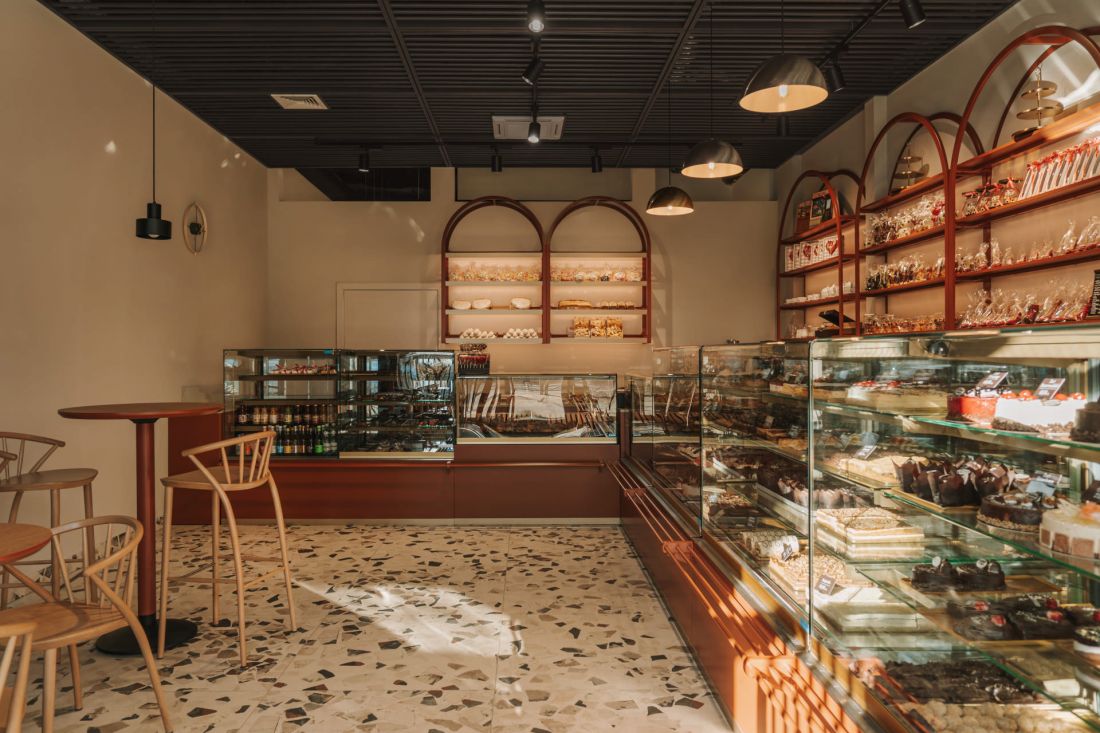
We bring you a bit of sweetness today! We'll take a look together into the kingdom of traditional cakes, decorative cakes and aromatic yeast cakes - the new premises of S.R. Jaworscy Confectionery in Wroclaw, operating since 1989, whose equally tasty interior was designed by Klaudia Utracik-Paduszyńska and Paulina Sobczyk of the Klu Studio studio.
The designers focused on what is most important in a confectionery shop - an impressive display of the baked goods available on the premises
photo: Migdał studio
On the first floor of the Centreville apartment building designed by Maćków Pracownia Projektowa on Drobnera Street in Wrocław's Nadodrze district, the sixth confectionery shop under the name of Stanisława and Ryszard Jaworski has opened. Although the family business, which has been operating for more than thirty years, is famous in the city for its traditional recipes, it entrusted the interior design project to a duo of young architects known for their bold projects, including the Dragon Box restaurant interior filled with intense colors.
The new premises of S.R. Jaworscy Confectionery in Wroclaw
photo: Migdał studio
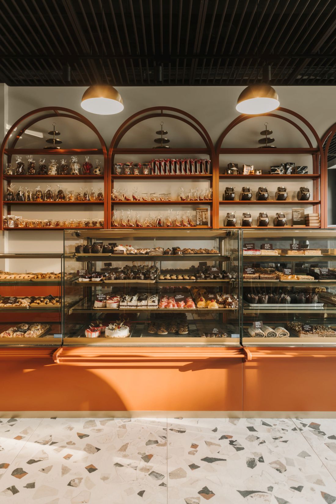
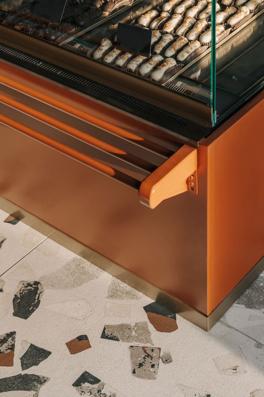
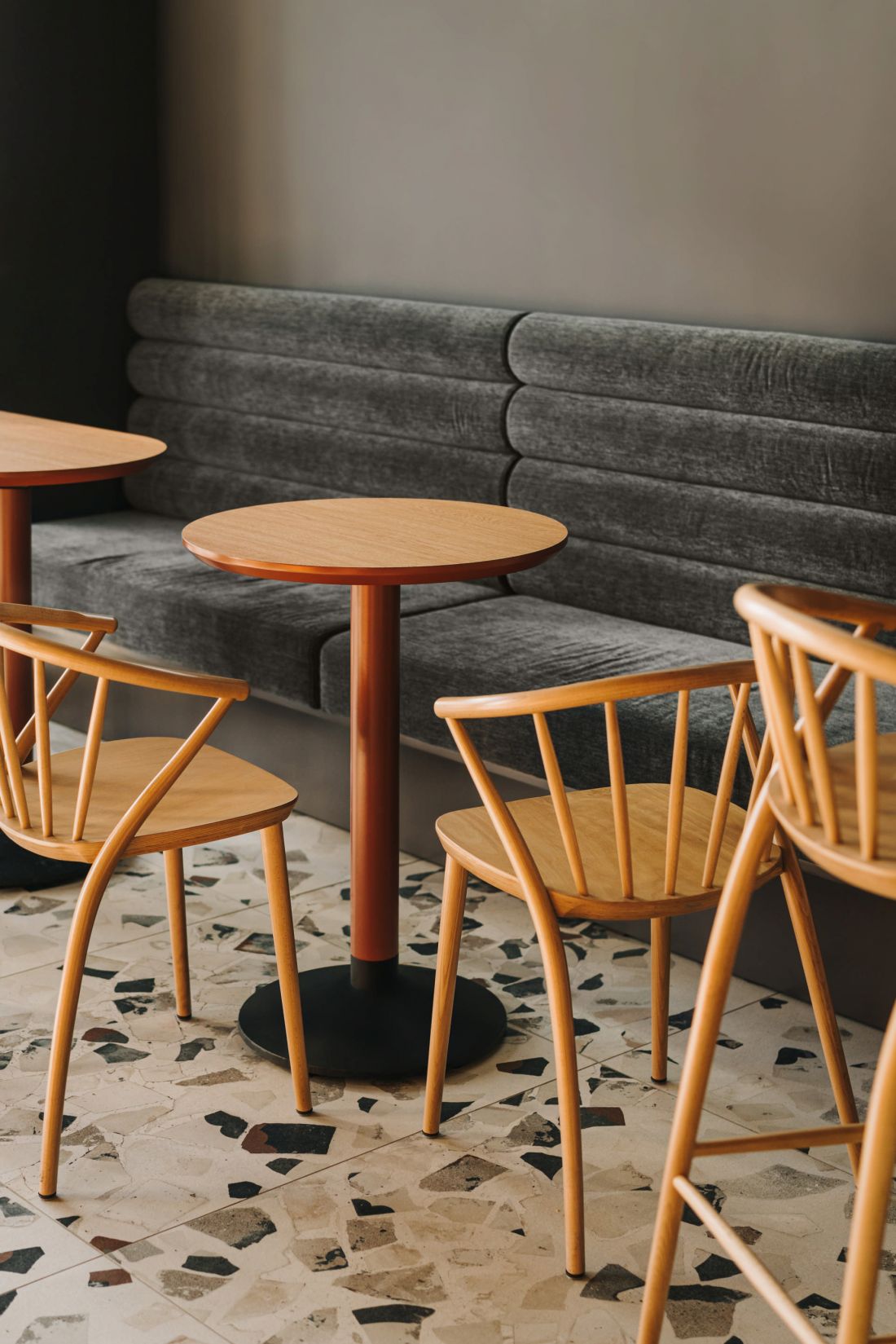
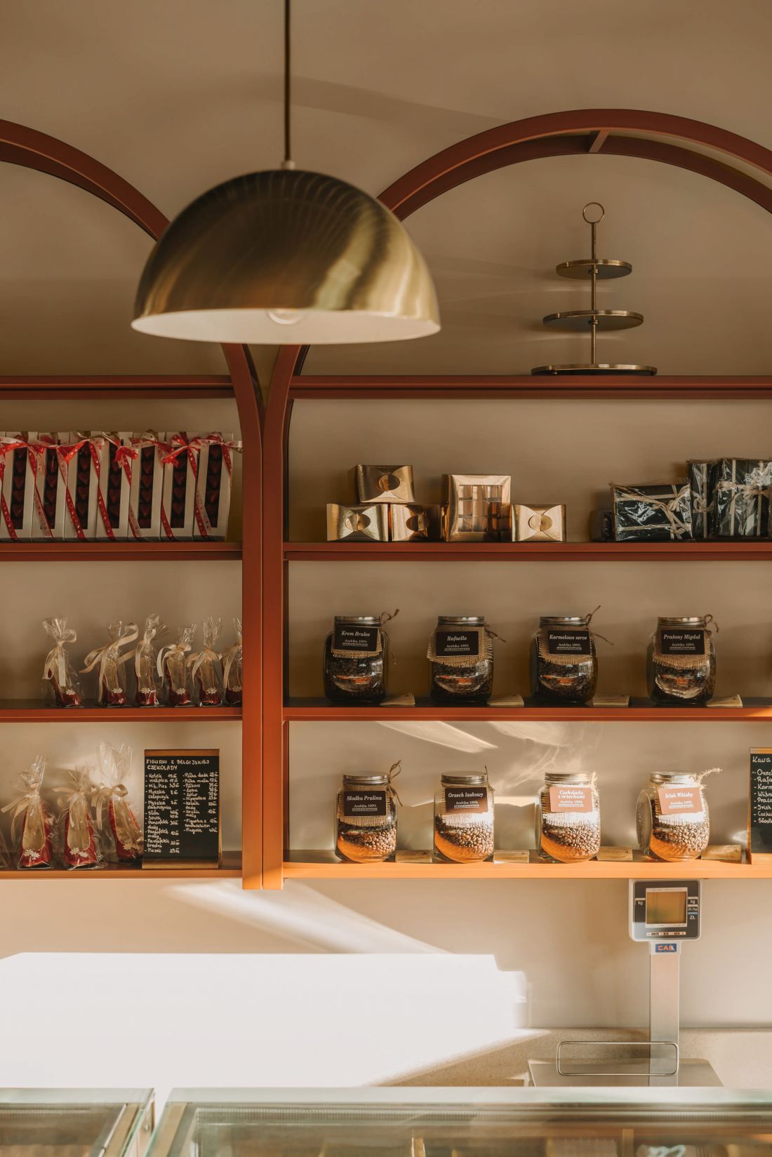
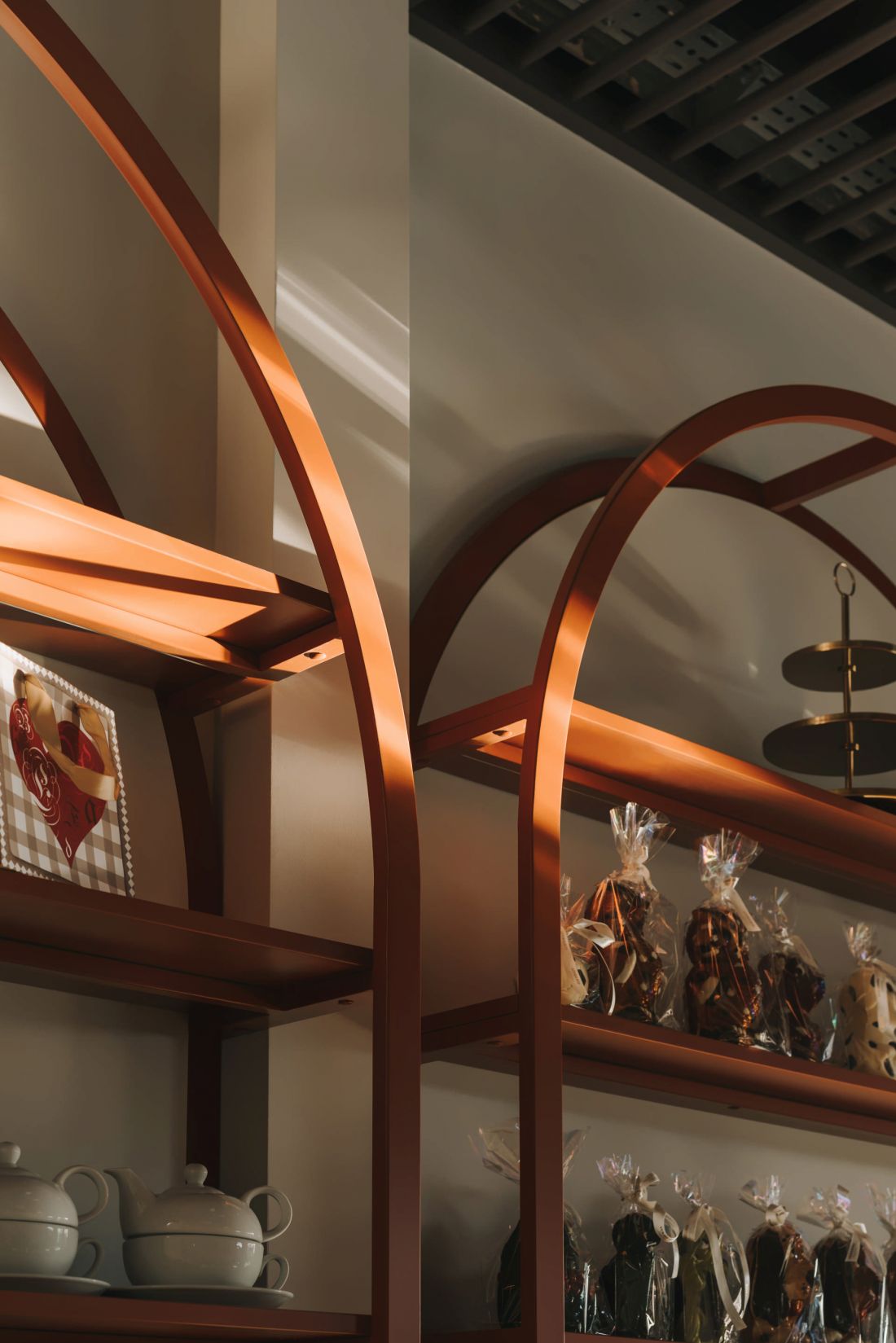
In this case, the designers focused on what is most important in a confectionery shop - an impressive display of the baked goods available in the establishment. Behind the glazed counters, whose lower fronts are emphasized by the red shade of the finish, the architects placed openwork shelves (also in a warm brick color) topped with arches. The shade contrasts with the light color of the walls, the multicolored floor with a fashionable terrazzo pattern and the dark, openwork ceiling.
Behind the glass counters, the architects placed openwork bookcases topped with arches
photo: Migdał studio
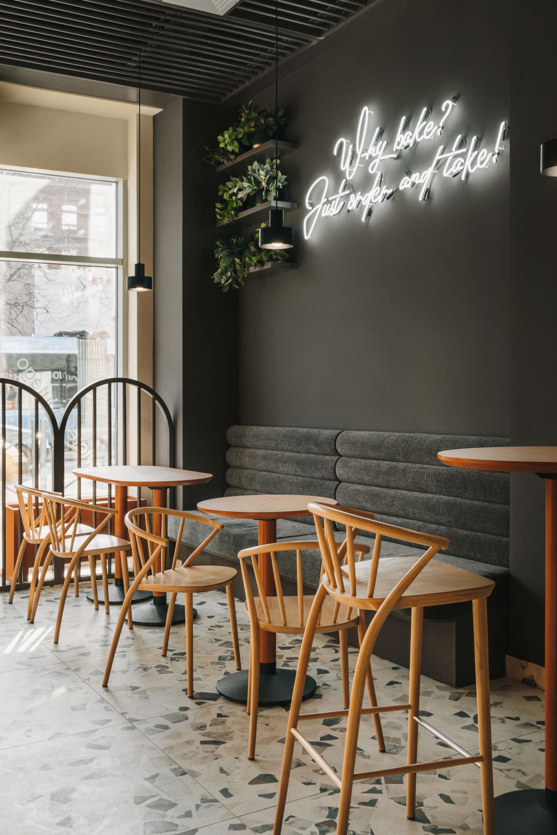
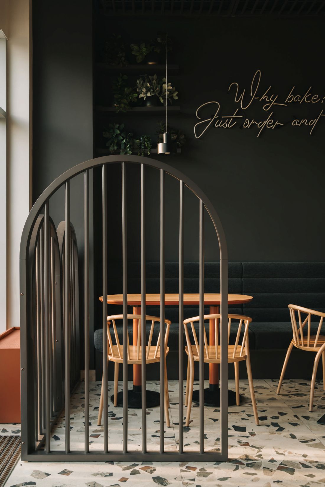
A café corner, separated by an openwork screen and highlighted by a black wall decorated with neon, awaits customers who decide to enjoy sweet treats in the premises.
The café area is highlighted by a black wall with a neon sign
photo: Migdał studio
Klaudia Utracik-Paduszyńska talks about the interior design of a confectionery shop in Wrocław's Nadodrze district.
Ola Kloc: Wroclaw's Drobnera Street runs along the Oder River, adjacent to the Bielarska, Słodowa and Młyńska Islands, a short walk is enough to reach Ostrów Tumski or the Market Square. How did this environment influence your project?
Klaudia Utracik-Paduszyńska: We wanted very much for someone casually passing by the premises to be interested in what was going on inside. When creating this interior, we had in the back of our minds that we needed to reach a very wide range of customers.
interior details
photo: Migdał studio
Ola: As you mentioned, designing the interior of the confectionery meant trying to meet the expectations of many customers. You haveto your credit both interior designs for apartments and commercial premises. What other challenges do you face in each of these types of spaces?
Klaudia: These are completely two different tales. First of all, because when we design an apartment, we only respond to the needs of the residents, while in the case of a restaurant or café, we have a whole cross-section of people. We are very fond of the premises' themes, investors are usually more open to crazy ideas. The interior often has to be, above all, original, memorable. We usually spend no more than an hour in it, so we can bet on strong colors, contrasts and a multitude of structures. In the case of an apartment, this could prove too tiring. Apartments are also a lot of fun for us, provided the developer is brave and open-minded :)
Ola: Coming back to the pastry shop on Drobnera Street - the eyeis drawn to the rows of arches, the patterned floor and the counter in a warm shade. What influenced such a choice of colors, materials, textures and shapes?
Klaudia: We had several concepts, but this one appealed most to the investors. Jaworscy Confectionery offers a very classic assortment, with form and color we wanted to add some freshness.
black accents in the interior
photo: Migdał studio
Ola: What are you most pleased with in this project?
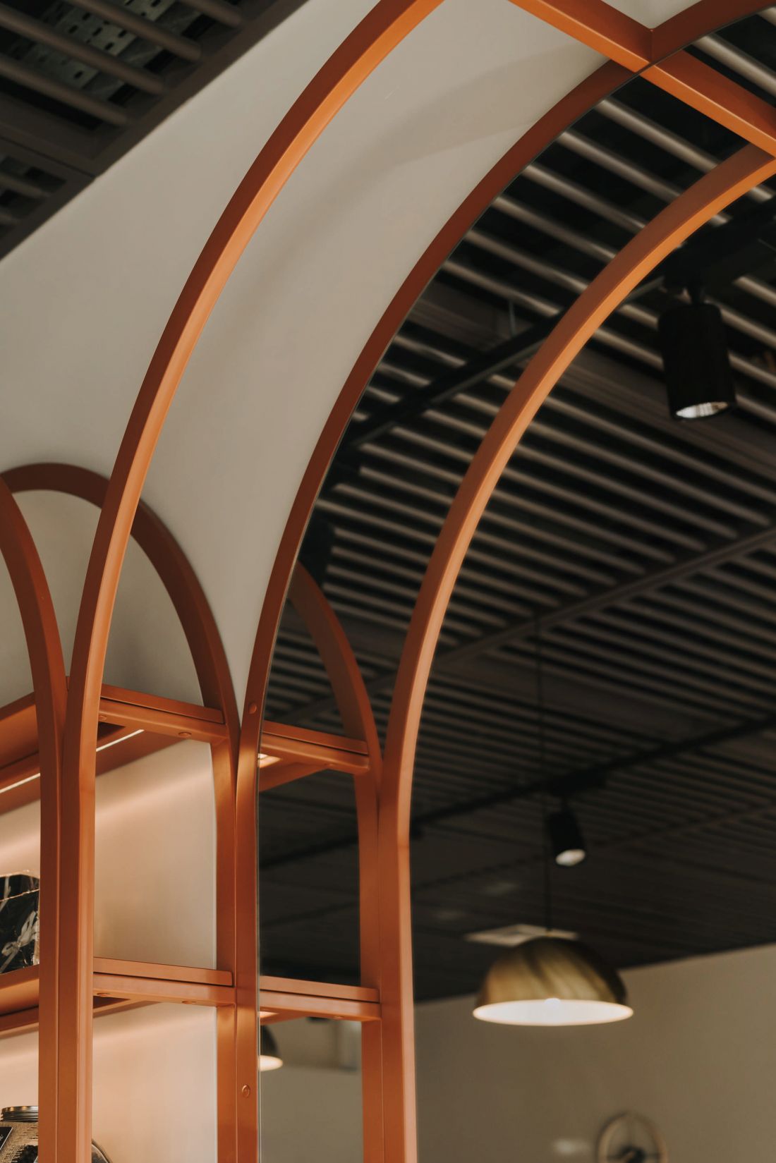
Klaudia: From the fact that the investors realized it entirely according to our assumptions. I think it's worth noting the openwork ceiling, it was made of round wooden profiles and performs its masking function perfectly. The clients had concerns that it would be too dark, but in the end they are glad that we convinced them. We like the row of arched shelves, a mirror filling two modules is cool.
Ola: Thank you for the interview.


