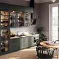
The intense color of cornflowers brings to mind summer in the Polish countryside. The unusual shade of flowers attracts the eye, standing out among the golden fields of grain or multicolored meadows. How to use this color in an interior? See how Diana Żurek and Bartosz Girek of Furora Studio did it in the "Cornflowers" project.
cornflower-colored kitchen
Photo: ONI Studio
Arranging a cornflower-colored interior in Olkusz was an experiment for the design duo, a field to try out non-standard solutions, but also.... an opportunity to make dreams come true - because this interior is a private apartment of the architects, in which they also set aside space for an additional studio and, as they emphasize, a kind of showroom for clients - the latter, seeing how the designers live, have the opportunity to experience the interiors created by them and try out the proposed solutions.
studio details
photo: ONI Studio
The original layout of the 70-square-meter apartment required reconstruction - the kitchen and bathroom were enlarged at the expense of the corridor. The resulting reduced entrance and communication zone was painted entirely white by the architects, optically enlarged with a high mirror and supplemented with the author's dresser also in white.
So where do we find the title cornflowers? The distinctive color reigns in the living area of the apartment - the built-ins in the kitchen are distinguished by a Kleinian navy blue, blended into a slightly more subdued background built up by the rest of the furnishings.
The living room with kitchenette is full of simple, overlapping solids
Photo: ONI Studio
In the living room with a kitchenette you will find simple, overlapping solids. Circles, squares, half-circles, triangles - arranged in a bright composition filled with a strong shade of ultramarine, which was covered with kitchen buildings, creating a monolithic puzzle , explain the architects of the studioFurora.
In the living room with the kitchen, the various inspirations of the project creators meet - modernist orderliness and postmodern play with shapes, Japanese culture and design drawn from Denmark and the Bauhaus school in Dessau, all laced with contemporary touches.
Wassily armchairs designed by Marcel Breuer and Japanese inspirations
photo: ONI Studio
Each piece of furniture placed in this space deserves attention - the centerpiece of the living room is a low table with a bottle glass top supported onmassive stone legs, right next to it stand a slightly extravagant Mono sofa by Polish brand Comforty, whose armrests feature a decoration in the form of metal cylinders, and two designer metal Wassily armchairs designed by Marcel Breuer. "The icing on the cake" of the living area are the painting behind the sofa and the carpet on the floor, which, thanks to their contrasting colors (black and white) and geometric forms, perfectly complement this diverse space.
The "icing on the cake" of the living area are the black and white painting behind the sofa and the rug on the floor
photo: ONI Studio
In the kitchen area, once we manage to tear our eyes away from the colorful furnishings, we notice a sizable wooden table surrounded by stylish SAGE chairs by Polish brand The Good Living. Attention is also drawn to the less distinctive but thoughtful elements, such as the walnut-toned wainscoting, the fabric-textured dresser, the metal cabinets, the light-softening bright blinds and the black minimalist lamps.
A sizable wooden kitchen table surrounded by stylish SAGE chairs by Polish brand The Good Living
photo: ONI Studio
The bedroom is kept in subdued colors, although it does not lack strong color accents. The closet is separated from the bedroom by a fabric door alluding to Japanese shōji screens, while a warm shade of the walls and a low wooden openwork bookcase add to the coziness of the interior.
bedroom
Photo: ONI Studio
Beiges and browns are broken by stone mirages behind the bed, with intense character, and mint-blue shades of the headboard. Red also appears, drawing an abstract pattern on the wall , the architects add.
Colorful accents in the bedroom include stone mirages behind the bed, a blue headrest and red in the painting
Photo: ONI Studio
A similar treatment of juxtaposing subdued, natural elements with original solutions was used by the designers in the bathroom, which is filled with a contemporary interpretation of w ainscoting in the form of light blue panels with embossed round shapes. Cream-colored tiles with a stone-like pattern, a modern sink and a wall clad in veneer contrast with a red wall lamp housing.
A bathroom decorated with a contemporary interpretation of wainscoting
photo: ONI Studio
The last room is occupied by the studio, which can be entered both directly from the apartment and from outside, which certainly allows the homeowners to maintain privacy when they need it. The central office area is occupied by a large table with a glass top with rounded corners resting on light wooden legs. Above it hang three lantern-like silk lampshades of lamps by Danish brand Oisoioi. The whole is complemented by communist-era furniture and a brushed steel cabinet.
The central office area is occupied by a large table with a glass top with rounded corners
photo: ONI Studio
The whole apartment is actually minimalist eclecticism, combining classic styles that intertwine with modern design. Japan, plastic, metal, geometry and a pinch of (post) modernism, the architects conclude.


