A bright, two-level apartment with colorful accents is located in Gdynia's Sopot Gate development. Architects from P2 Pikiel & Piltz studio are responsible for the interior design for travel and literature lovers (especially fantasy and Si-Fi). We talk with Zuzanna Pikiel about openness to patterns and colors, design work and the challenges involved.
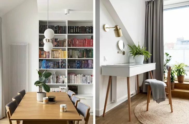
The center of the living room is a sizable bookcase
© P2 Pikiel & Piltz
Dobrawa Bies: The apartment is a combination of strong colors. The attention is drawn to the intensely green kitchen. Was it easy to convince investors to make such bold decisions?
Zuzanna Pikiel: The use of colors was one of the first issues the clients raised with us. This was our next cooperation, so the trust built up beforehand definitely worked in favor of further proposals on our part. And the greenery? It naturally complemented our colorful living room space, adding freshness to the interior.
First floor plan of an apartment in Gdynia
© P2 Pikiel & Piltz
Dobrawa: What were the assumptions and design inspirations?
Zuzanna Pikiel: We tried to create a bright, energetic interior, where you could recharge your batteries after a day at work. At the same time, our clients wanted a place for their interests - reading books, planning their next trips. I think this openness to color and patterns is the result of these two passions!
Graphic wallpaper ties the two levels of the apartment together
© P2 Pikiel & Piltz
Dobrawa: Please tell us about the materials and solutions used.
Zuzanna Pikiel: The main interior element that connects the two floors of this apartment is the graphic wallpaper on the staircase wall. Exotic flowers, greenery, roses - on both levels they bring an amazing energy. And it was a hit! In the kitchen there was a practical bar cabinet, in the living room the first fiddle is played by a huge bookcase - and it still couldn't hold all the clients' books! An important element on the first floor is a glass wall, but about it in a moment....
The mezzanine was one space from which several smaller ones had to be separated
© P2 Pikiel & Piltz
Dobrawa: What caused you the greatest design difficulty, and what are you proud of?
Zuzanna Pikiel: Usually, what fills us with pride the most is the solved issues that were not among the easiest at first. In this case, it was the mezzanine - the attic, which was one big area, with large bevels and several slope windows. From the beginning, it was to house the clients' private bathroom, a dressing room, space for a large bed and a dressing table.
A glazed bathroom on the mezzanine
© P2 Pikiel & Piltz
We managed to combine the functions in such a way as to open up the space as much as possible and let in a lot of light - hence the idea for the glass bathroom. Any fixed wall in this space would have only made this bright bedroom a cramped carriage house. We managed to avoid that! And on top of that you can take a bath under the stars:)


