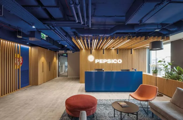
How to furnish a corporate office in a way that does not trump kitsch and at the same time is functional? The architects of the Colliers Define platform tried to face this topic. They arranged colorful, spacious and bright office interiors for more than 700 employees of PepsiCo on an area of 5,000 sqm in the Brain Park office building in Cracow, built by Echo Investment.
Colliers Define designers responsible for the interior design and design concept for PepsiCo's offices tied together the color, open space and multiple functions that the various interiors will perform with greenery, colorful graphics and glazing. It can be seen that they tried to reflect the values and lifestyles offered to consumers of the products, offered by PepsiCo. The designers of the space planned as a workplace for those employed by the giant chose not to reveal the values it promotes. The effect of their actions turned out to be satisfactory, a friendly and comfortable work environment was created, fostering creativity.
PepsiCo office in Kraków's Brain Park office building
© CreoConcept
Kandinsky, a painter, printmaker and art theorist, among others, wrote about the importance of colors in human life. Kandinsky was the author of a color theory that was fundamental to 20th century painting. He considered important not only the optical properties of individual colors, but also their effect on the psyche of the viewer. In the work entitled "On Spirituality in Art. "On Spirituality in Art" he hinted, among other things, that the color blue has, in his opinion, the ability to sink. In the deep tones of this color, the sensation of sinking becomes more intense, awakens in a person a longing for purity and transcendence. The color blue soothes, cools, calms: it is, after all, the color of the sky. It is unclear to what extent the interior designers of PepsiCo's office were aware of Kandinsky's color theory, and to what extent the shape of their vision was imposed by the branding of the respective brands. The fact is that they decided to use deep tones of blue - falling into navy blue - as the dominant color in the rooms, intended for conferences and meetings. They opted for a shade of yellow in the dining areas and in the broader spaces intended for everyday living. Kandinsky characterized it as the warmest and brightest color - energetic and at the same time, capable of acting as an irritant. Red was also featured on posters and some wallpapers, as a counterbalance to navy blue. Russian painters equated beauty and red.
PepsiCo's office in the Brain Park office building in Krakow.
© CreoConcept
Interestingly, the designers boldly operated with the luscious color, but chose not to introduce the green color artificially, on the walls or in the upholstery colors. In PepsiCo's offices, it appears only on live plants. The aforementioned luscious colors do not tire thanks to the natural materials providing a background for them, so the interiors are not pretentious. The designers responsible for the design concept from Colliers Design included greenery, relaxation zones and adequate lighting of the office, including natural sunlight. Thanks to these design measures, the office interior proposed to the employees of the global food giant is friendly and comfortable, conducive to creative work and the expression of individuality at the same time.
Natural materials, a distinctive visual identity, based on strong, clean color and simple shapes, familiar in every corner of the globe: one can consider these determinants as an opportunity, but also a challenge.
Scientific research and pandemic experience have shown that humans are herd creatures and need direct contact with colleagues: in the case of the BrainPark building, such an effect was easily achieved: the building is a new development and does not require adaptation, only an interesting arrangement. As a result, the investor and designers were able to design the interiors to match their vision from start to finish. The design office opted for glass systems, supplied by CreoConcept.
PepsiCo office in the Brain Park office building in Cracow.
© CreoConcept
Glass walls are a solution that quiets the interiors, while at the same time allowing for the creation of spaces where intellectual work requiring concentration can be performed, without taking away the ability to see each other, and most importantly - without reducing sunlight. Glass walls allow you to freely form and adapt the office space to the needs of employees and adapt it acoustically. Due to the features outlined above, this is a solution that will become a leading trend in office interior design in the coming years. Therefore, in the offer of CreoConcept company providing solutions for the project, you can find both single-glazed and double-glazed systems, which have obtained the necessary certificates from the Building Research Institute.
The realization in PepsiCo's Krakow office shows how well bringing people closer to nature works in buildings conceived as workplaces for more people. CreoConcept is happy to provide solutions for projects where wood, stone and lush vegetation appear. Glass walls in relation with these materials - especially wood - look friendlier, bringing a pleasant atmosphere to the interiors. It is also not without significance that wood, like PET panels or plants, has a role in the acoustics of a room, quieting it. CreoConcept likes to provide solutions for projects, bringing superadded value to the lives of its users while providing high aesthetic value to the solutions used.
In the implementation in the BrainPark building, for which CreoConcept provided the walls, one can see comfortable armchairs, bold prints and graphics corresponding to the brands offered by the food giant - the interiors evoke involuntary associations with pop art. The poster-like form of the decorations placed on the walls and the vivid colors carry good energy, vitality and attract, allowing you to forget that you are in an office.
THINK CREO!
For more information, visit the company's CreoConcept page on the A&B portal.


