Marta Winkler, a graduate of Opole University of Technology, created the design of a multi-family building in Opole. The building was created in the idea of co-living (co-housing). This idea, which has been gaining popularity in recent years, involves supplementing residential development with shared spaces that enable the creation and strengthening of neighborhood ties.
co-living in Opole
The project by a graduate of the Faculty of Construction and Architecture at Opole University of Technology is an engineering thesis created under the direction of Dr. Eng. arch. Anna Szczegielniak.
The author designed the estate according to the idea of co-living
© Marta Winkler
In recent years there has been a noticeable increase in the number of apartments being built in Opole. The proposals of developers are usually limited to the apartments themselves, without taking into account the common parts for residents. This makes it difficult to establish neighborly relations. An attempt to solve this issue is the creation of multi-family residential development in the idea of co-living. Usually this type of development consists of a small private space and shared spaces, which raise the standard of the apartments while keeping their relatively low rental price, the author explains.
The development was located in the Gosławice district of Opole
© Marta Winkler
The proposed development was located near the Malinka estate, in the Goslawice district. It is a quiet neighborhood, well connected to the rest of Opole and attracts many new residents. The author noted that in the planned location the main buyers of the apartments will be young families with children and the elderly.
The building has the form of a cuboid with an atrium
© Marta Winkler
minimalist block with cutouts
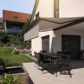
The young architect decided to design the building in the form of a cuboid with an atrium. Different-sized cutouts perforate the solid, and in them the author placed gardens and terraces. Thanks to the cutouts, more sunlight reaches the inner courtyard. The building consists of a service area located on the first floor and three residential floors. Underground parking is available to residents and service owners. The open space around the building performs recreational functions and complements the service area. The building's surroundings were designed by Marta Winkler in contrast to the entire block. By using circular forms of greenery and a playground, the space became more plastic and user-friendly.
The building consists of a service area located on the first floor and three residential floors
© Marta Winkler
comfortable apartments
The building includes four types of apartments and numerous common spaces. The layout of the building has been adjusted to the sides of the world, so that the apartments have adequate light. The eastern and western wings provided the opportunity to create a corridor layout with small apartments ventilated on one side, while the northern and southern wings used a gallery layout. The gallery layout additionally fits in with the concept of co-living, where the gallery provides a place to establish neighborhood relations. The building's vertical communication consists of four communication risers consisting of a staircase and an elevator, located in the inner corners of the building, which are the least lighted and therefore the least favorable for housing.
the layout of the building has been adjusted to the sides of the world
© Marta Winkler
Floors one through three are occupied by co-living space. On each of these floors the author has placed apartments ranging from one-room to four-room, all with a loggia or balcony. The apartments in the designed building are laid out and zoned for living and sleeping areas. The living areas of the apartments, which include a kitchen, dining room and living room, have been designed in an open-plan layout. Each apartment is adapted for people with mobility limitations.
The apartments are laid out and zoned for day and night parts
© Marta Winkler
diverse common spaces
On each of the residential floors, the author designed common spaces. On the first level, on the west side, there is a seniors' club and a room for technical classes. Meanwhile, on the east side of the building is a coworking space. Level two is equipped with a cafeteria with the possibility of opening to the garden area and a screening room. On level three, residents will find a gym and fitness room, as well as a game room with technical facilities and an additional projection room. There are also storage rooms for bicycles and strollers on each floor. The common spaces have been arranged according to the sides of the world, giving each of them adequate light.
Wooden cladding visually warms the interior of the atrium
© Marta Winkler
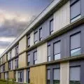
white facades complemented with wood
When selecting the facade materials, the student was guided by the appearance of the surrounding buildings. The exterior elevations were covered with white plaster. In order to emphasize the cutouts in the body of the building, as well as the loggias and outdoor communication spaces, the author used wood cladding contrasting with the rest of the facade. Loggias and cutouts in the building are often used as spaces for residents to relax and meet. The use of wood in these areas visually warms the space, making it more comfortable.


