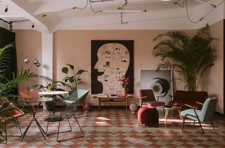
Clay.Warsaw houses the headquarters of three companies, a photography studio, a meeting place and an art gallery. The space itself is extremely inspiring - not only because of the building's preserved original architectural elements like the iron pillars and red-and-white checkerboard floor, but also the Polish art and design that fills it.
Inside the former military warehouse building,architect Mateusz Baumiller, who runs the Baumiller Studio, created a cozy interior full of Polish design and art. Exterior wiring, glazing in black thin frames, high ceiling and structural columns perfectly harmonize with the warm colors on the walls and individual design elements. From the threshold, Clay.Warsaw inspires creativity!
Basia Hyjek: What was the main inspiration for the project?
Mateusz Baumiller: The inspiration, of course, came from loft rooms with large glazing in steel frames, bringing out the tectonics of the building, i.e. massive columns, beams and stringers, which had previously been buried in dozens of small rooms through numerous arrangements, but also from pre-war residential interiors. Hence, it is in Clay's space that rounded walls, painted trim and colors appear. All this to break the warehouse-like space with strictly domestic solutions - such an action on the contrary.
The colors and materials featured in Clay are rather typical for residential interior design - warm pinks, turquoise, a large wall area lined with oak veneer or velour curtains
photo: PION Studio
Basia: Where did you get the idea for such a selection of colors and materials?
Matthew: The colors and materials that appeared in Clay are rather typical for residential interior design - warm pinks, turquoise, a large area of walls lined with oak veneer or velour curtains. All this is rarely seen in office spaces and even more rarely in office-warehouse spaces. This effect of breaking convention was what it was all about. At the same time it was important to create a place where working artists would feel comfortable, where it would be possible to have a nice conversation and relax, sitting on a comfortable couch with a coffee in hand, surrounded by excellent paintings, looking through the glass door at the work of a pre-war elevator crane.
In Clay, I was given a 500-square-meter warehouse with a grid of columns and the need to create office space, a studio, storage rooms, conference rooms, three kitchens and a social room
photo by Ernest Wińczyk
Basia: Where did the idea for the division of space come from?
Matthew: The division of space is always derived from the possibility of adapting the place to the needs of the investor. At Clay, I was given a 500-square-meter warehouse with a grid of columns and the need to create office space, a studio, storage rooms, conference rooms, three kitchens and a social room.
The solution, which turned out to work perfectly, is to divide it into three tracts: the middle tract is two kitchens, warehouses, a social room, and conference rooms. The side tracts are a studio and an office, which can be connected to each other, via conference rooms that open to two sides, and a kitchen. This plan made the entire space "mobile" with the possibility of any arrangement.
The challenge in this case was not to spoil the space, which was cool from the start
Photo: left: PION Studio, right: Ernest Wińczyk
Basia: What was the biggest challenge in creating this space, and what gave you the most satisfaction?
Matthew: The challenge in this case was not to spoil the space, which was cool from the start. The floor plan of the apartment is a slightly broken rectangle with numerous windows, so the plan was not to enclose, not to create cloisters, but to create the rooms so that you could feel the scale of the volume, and light could move freely. And this was achieved, a plan was created with a clearly separated space for all residents, where everyone has his own corner, and thanks to the glazing and curtains, he decides whether to add his "piece" to the common area.


