Work submitted for the competition
"Best Interior Diploma 2021/2023".
The subject of the study is a ceramics studio in Warsaw's Wola district. The project is to take into account the needs of employees and participants of ceramic workshops. It is a first floor premises with an area of 139 square meters. It has been divided into zones corresponding to the different phases of creating clay products, and the place can accommodate a maximum of twenty workshop participants.
The center of the studio is a table with potter's wheels, which has curves on the edges and graphic stains on the tabletop
© Cecilia Mosak
My pottery studio includes basic functions such as modeling clay, using tools, potter's wheel, decorating, glazing, firing and drying. In addition, the studio is equipped with a changing room where you can change into aprons. A café annex breaks up the typical function of the studio, creating a place to rest and relax surrounded by a space dedicated to small art.
SCLAY ceramics studio interior design, floor plan and features
© Cecylia Mosak
The design was inspired by organic forms reminiscent of rolled clay. As a result, the interior has many curves and rounded areas. The colors are based on pastels, harmonizing with the studio's „clay” logo. The goal was to create a space full of light and open to people, emanating warm colors and inviting creative play.
The design was inspired by organic forms resembling rolled clay
© Cecylia Mosak
Before the arrangement, the premises were divided into smaller rooms, which meant that access to daylight was limited. So the design focused on opening up the space and increasing the amount of light to make working with clay comfortable and enjoyable. An important element was to separate the ceramic kiln area from the rest of the interior, which provided space for a bathroom and a changing room.
The design thus focused on opening up the space and increasing the amount of light to make working with clay comfortable and enjoyable
© Cecilia Mosak
There are several dominant elements in the ceramics studio. The first is the large logo placed in front of the entrance, made of plexiglass attached to the wall. The second element is the reception desk, which also serves as a display for ceramics and artists' works. The reception counter has a rounded shape and a characteristic curving of the shelves that alludes to the arched lines of the logo.
higher glazing table
© Cecilia Mosak
The reception desk is made of laminated MDF and heat-bent plywood, and has no seating to keep the space open toward the activity room. The idea is that the instructor has access to the reception area, as the owner and teacher can serve guests at the counter, but primarily the clay classes are to be held here.
The center of the studio is the potter's wheel table, which has curves on the edges and graphic stains on the tabletop, color-coordinated with the interior. The table top is made of durable laminated board. The room also has a free-standing, easily accessible sink. Next to it is a cafe annex, the centerpiece of which is a coffee maker that provides a color contrast that harmonizes with the stains on the pottery table.
cafe annex
© Cecilia Mosak
The café annex includes a dishwasher, kettle and storage cabinets. Three tables with Poul Kjærholm-style chairs are placed in front of the work surface. The studio's lighting is consistent, with biomorphic forms hanging over the various areas of the room to coordinate with the lamps. In the corner of the room is a taller table for glazing ceramics, and on the wall is a graphic referring to the studio's logo.
checkroom
© Cecylia Mosak
Different heights of the tables form the zones of the room, depending on their function: the table with the potter's wheels is the lowest, the café tables are traditional in size, and the glazing table with hockers is the highest The checkroom, equipped with twenty lockers and an arched seat, is connected to the bathroom by a simple communication adapted to the needs of people with disabilities.
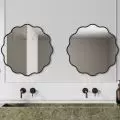
interior of the bathroom
© Cecilia Mosak
The bathroom has a mirror in a color frame referring to the studio's interior and two washbasins with a large bowl, typical of art studios and workshops.
SCLAY ceramics studio interior design, showcase
© Cecylia Mosak
The studio's facade is an important visual and marketing element. Its interesting shapes attract the attention of passersby and encourage people to stop in. The reception counter, located by the window, allows one to look at the ceramic works created in the studio. Through the window, you can also see the participants of the classes, their work, as well as guests relaxing over coffee.
Cecilia MOSAK
Illustrations: © Author


