In the Warsaw Brewery in Wola, which is being built according to a design by JEMS Architekci, on the premises of the former Haberbusch and Schiele brewing plant, Monika Ryszka of Studio Kontent and Kasia Kuźmińska of JEMS studio jointly designed the interiors of seven two-level apartments for rent. Kasia Kuźmińska talks about the inspiration, the difficulties associated with the design of the M2 apartment and the effects of their work.
The 


The living room is dominated by a strong orange color of the walls
photo: Max Zielinski
Ola Kloc: What was the priority for the investor?
Kasia Kuzminska: The investor was Resi4Rent, a company that deals extensively with apartment rentals. The presented interior is one of the seven two-level apartments we designed at Browary Warszawskie. The Investor wanted to create aesthetically diverse spaces, the common denominator of which was to create interiors in which the user would feel at home. Together with the Investor, we selected aesthetic directions that would fit into the context, as well as best suit the needs of the future resident.
Ola: The apartment is located in the Warsaw Breweries designed by JEMS Architekci, what was the influence of the architecture on the interior design and arrangement? Were functional changes to the space necessary?
Kasia: The building where the apartment is located is one of the strongest buildings of the Warsaw Breweries, it has an unambiguous and strong architecture, which, thanks to its repetitiveness, allows the activity of the residents to play first fiddle. It is they who, through window decoration, displaying plants or other elements on balconies, give the facade additional character. The views outside the window, the identity of the place and the character of the building mass had a direct impact on how we thought about the interiors. From our perspective, one should be closely related to the other in order to create a coherent, sincere and legible expression for their users.
Left: a small, bright kitchen; right: a high dining space and stairs leading to a mezzanine floor
photo: Max Zielinski
During the design process, we tried to refer to the local context, climate or history of the place. Some of the apartments in the interiors visually continue the post-industrial character of the district, while others are meant to create a kind of idyll that gives respite in the rush of everyday life. These interiors appeal to the feelings we experience when we are in nature. Calm, respite, tranquility, which are difficult to experience in an overstimulated and intense context.
The interior we designed is located on the top floor of the highest building of the Warsaw Breweries. We made several changes to the basic functional layout. Since we like in architecture the possibility of its adaptation to the user's needs, we decided to divide the space into several microinteriors. Depending on your mood or needs, you can integrate these half-spaces more or less between each other. This arrangement allows them to visually intermingle while maintaining their autonomy. We wanted the kitchen in this interior to be aesthetically and functionally related to the other parts of the apartment and to smooth the way of using them, while not being strictly separated from the living space. The dining room is located in the central, two-story space of the apartment and is meant to concentrate the future life of the household members of this interior. It also constitutes the most important place because of the way the functions are composed and arranged in the space. On the mezzanine is an open, bright bedroom with a library and suspended seating.
Left: view of the kitchen and dining room; right: mezzanine
photo: Max Zielinski
Ola: M2 is dominated by a strong orange color and natural accessories, what influenced such a choice of colors, materials and textures?
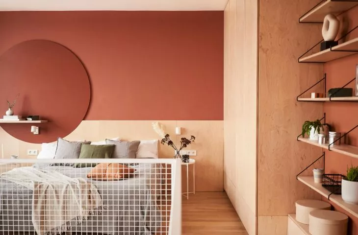
Kasia: As we mentioned at the first stage of design, together with the client, we tried to define several aesthetic directions. Some of them referred directly to the context, while in others the goal was to create a kind of micro-world to help break away from the rush of everyday life. Wola is the fastest growing district of Warsaw, full of life and constant change, so the character of the interiors is based on natural materials, textures and colors. It is intended to create a place where we will feel wrapped in warmth and coziness. It is an interior that is supposed to recharge our energy in the intensely rushing reality. We half-jokingly half-seriously laugh among ourselves that the circle on the headboard behind the bed symbolizes the sun, but this is exactly what this space was meant to be: sunny, friendly, relaxing and a little sentimental.
left: the bedroom is decorated with a circle on the headboard behind the bed; right: a fragment of the bedroom
Photo: Max Zielinski
Ola: What was the most difficult part of this project, and what are you most satisfied with?
Kasia: The biggest challenge was designing the space not for a specific resident. Usually we are dealing with the target users of a particular house, apartment or office, we can react to their suggestions, needs or ideas. Here the situation was completely different, as we made decisions based mainly on our intuition and discussions within the team. We imagined different options for using and functioning in the space and matched the visual expression to it. What pleases us most about this project is that thanks to the fact that the Investor gave us so much freedom in the design, we managed to realize a bold, coherent, clear and expressive space. A place that is contemporary, decisive, energetic, and that breaks the ascetic approach to colors.
Ola: Thank you for the interview!


