Ewa Stepnowska, a fashion designer who while still a student at the Warsaw Academy of Fine Arts interned with Marc Jacobs in New York, now runs a Polish brand creating women's swimwear - Bodymaps. The swimsuits, with their offbeat colors and details reminiscent of the 50s, 60s and 70s, were the main inspiration for the design of the brand's premises in a small boutique in a shopping center in Warsaw's Powiśle power station.
Temporary interior in the spirit of less waste
The PowiślePower Plant, recently rebuilt according to a design by APA Wojciechowski Architekci, was built in the early 20th century as one of the most modern power plants in Poland. After nearly a century of operation, the post-industrial buildings have been transformed into a fashionable shopping center.
In this industrial space, the Bodymaps brand decided to present its collection in a pop up store, a store occupied seasonally - after a certain period of time, the boutique will be dismantled. The temporary nature of the interior encouraged its authors - architects from the Mili Młodzi Ludzie studio - to create a design in the spirit of less waste and reducing the number of durable items that cannot be recycled.
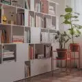
The swimsuits are presented on metal stand structures and simple white furniture
photo: ONI Studio
In the end, most of the elements used are designer-made original furniture and geometric mobile solids, which can be used in future locations and unveilings of the boutique.
strong colors in a small interior
When choosing materials, the architects were inspired by the raw, industrial surroundings of the former thermal power plant building. The walls were painted in two colors - a shade of broken orange in the upper part and white in the lower part.
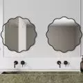
Left: a fragment of the boutique's display; right: the fitting room
photo: ONI Studio
The main part of the small boutique is a space displaying the brand's collection. The swimwear is presented on metal stand structures in a shade of warm pink and simple white furniture. In the depths of the store, an orange counter was designed with a mirrored accent on the front, which, according to the authors of the project, gives the furniture a light and vintage look, harmonizing with the character of the brand. The display space from the changing room area is separated by a purple wave-shaped screen.
The display space from the fitting room is separated by a purple screen
Photo: ONI Studio
Against this intense color background, the swimsuits look like part of the decoration - multicolored, vivid shades arranged from intense red through orange, beige and brown, to blue and finally black, bring to mind the colors of a warm sunset on a dream vacation.


