A duo of architects from the k3xmore studio, Kinga Kwaśny and Magda Orzeł-Rurańska, have arranged the interior of an apartment in the newly built Franciscan Estate in Katowice. The modern space, which consists of a living room with an open kitchen and three bedrooms, is dominated by herringbone laid wooden parquet, to which, as the designers explain, the rest of the interior has been subordinated, so to speak.
apartment plan and axonometry
© k3xmore
The timeless combination of black, white and wood has given this modern interior a certain classic twist. It manifests itself not only in the layout of the parquet floor, but also in the minimalist stuccowork on one of the living room walls, the textures of the marble or details such as the gold fixtures in the bathroom. Juxtaposed with designer lamps and simple dark furniture, they form a cohesive (though contrasting) whole.
Architects from the k3xmore studio talk about the heart of the apartment, the functional corner furniture and how the parquet floor ended up on the wall.
Ola Kloc: What was the priority for the investors?
Kinga Kwaśny, Magda Orzeł-Rurańska: The most important aspect for investors was to get an apartment space tailored to their needs, with a precisely defined budget. Investors attach great importance to the living space, where they love to spend time together with their household members, invite friends and relax. That's why we prioritized the living room with kitchenette - the heart of the apartment.
Ola: The apartment is dominated by black, white and wood. What influenced such a choice of colors, materials and textures?
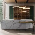
Kinga, Magda: The dream of the investors was to use natural wood in the form of parquet. Such parquet is very distinctive and dominant in the interior, so we decided to limit the amount of other materials. We used simple white on the walls and introduced black in the form of several textures - laminated furniture board and conglomerate forming countertops. The white of the walls is broken up by the texture of marble in some rooms. Furniture such as the dining table, sofa and consoles are also kept in dark tones.


minimalist stuccowork on the wall
Photo: Ania Grzelka
Ola: You have designed the "Corner" module, a multifunctional building integrating the kitchen, part of the hallway and the bedroom. Tell us, please, more about this project.
Kinga, Magda: The idea for "Corner" stems from the functional layout of the apartment, which we did not want to violate. The sleeping area with bedrooms is divided into two zones: the children's bedrooms are located in one part of the apartment separated by communication, while the master bedroom was located near the living room with the kitchen. The entrance to the bedroom was quite exposed, so we decided to conceal it - facing the door with a built-in piece of furniture that housed a bookcase. As the kitchen was right next door, we treated this space as a whole, a corner, or corner. The use of a single material emphasized the resulting solid.
The 


"Corner" module, which is a multifunctional development integrating the kitchen, part of the hallway and the bedroom
Photo: Ania Grzelka
Ola: In the hallway, you extended the herringbone parquet flooring on the floor to the height of the entire wall. Where did you get the idea for such a solution?
Kinga, Magda: It was a very simple procedure - there is an electric board in the hallway, the relocation of which would be quite problematic. This part of the corridor is located right at the entrance to the apartment and is the space where we planned to place a closet, a seat, a large mirror, a console - elements that constitute the equipment of a comfortable entrance area. Therefore, there was an idea that the dodge, which was created by masking the electrical board, should not be finished like a wall, but made into a "furniture". In order not to add more materials, we decided to "stretch" a piece of floor to the wall.


parquet on the wall in the hallway
photo: Ania Grzelka
Ola: What are you most pleased with in this project?
Kinga, Magda: We are most pleased with the fact that the investors feel comfortable in the space we designed.
Ola: Thank you for the interview.


