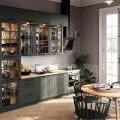
Architects from the Cracow studio projekt i... inspired by the Japanese design philosophy of wabi-sabi have created a monochromatic apartment. Natural noble materials reign here, wood of almost all kinds and accessories made by artists and craftsmen. Welcome to the interior, where details delight with their austerity, and everything is based on the division of dark vs. light.
kitchen kept in dark colors
© design and...
The 72-square-meter apartment consists of three rooms and a large corridor, which the architects from the studio projekt i... filled it with hardly visible, practical cabinets. The dark kitchen and living room is a space for relaxation, while the study, which is kept in black tones, is conducive to concentration and work at night. Quite a contrast is the bedroom and bathroom - bright rooms, full of white and light.
The apartment is dominated by natural materials
© design and.
The whole apartment is mostly filled with natural materials - wood varied by different cases, stone, brass, steel, linen. This apartment is peace and breath - that's what I thought about when designing it," says Sylwia Liana, chief designer of design i...
The dark vs. light division is a frequently used treatment by Sylwia Liana
© design and...
Dobrawa Bies: Wabi-sabi is, freely translated from Japanese, the appreciation of imperfection and transience. In my opinion, however, the apartment of your project is 72 sqm perfectly, although unusually (I'm talking about dark colors) designed. Please tell us about the ideas and the work itself.
Sylwia Liana: I am fascinated by brutal beauty. I am fascinated by the noble aging of natural materials and these are the ones I use in my designs. Clients know me, they know about my fascinations and partly share them. I am so lucky that investors very often give me a free hand. Why? You would have to ask them. Maybe they know that I don't plan to do them any aesthetic harm.
The apartment is characterized by different types of wood
© design and.
In this apartment, I knew I could afford to use different types of wood (this was not the first project done with these investors) and I took advantage of that. I think this is what became the canvas for the project. The dark pieces of wood burned for us by the Krakow artists were the beginning. They were joined by small gold-plated lamps made by a friendly ceramicist or a brass RTV cabinet made by my favorite carpenter. All these items should age with dignity, cover with patina, tarnish.
The interiors are built on the contrast of dark and light
© design and.
Dobrawa Bies: Who are the investors and what requirements did they set?
Sylwia Liana: They are very conscious people. They respect natural materials, they don't need to epitomize household appliances therefore, you won't find any design icons in this apartment . There's supposed to be plenty of storage space and it's supposed to be fairly practical. Take a look at the piece of steel flat bar attached to the wall above the bed. What is it for? And so that you can attach souvenir photos with magnets. The interior is mostly filled with simple, practical items, interspersed with items with soul made especially for us by artists or craftsmen. They are small things, but they add character.
swing in the living room
© design and.
Dobrawa Bies: The interior is an oasis of calm, lots of space, a combination of dark and light wood tones. What influenced such a design decision?
Sylwia Liana: This is an apartment for living, not for show or for investment - the apartment is for the client. Its owners are very balanced and calm. The dark-light division is a procedure I often use. The dark colors of the kitchen with the living room and the study are balanced by the light interiors of the bedroom and bathroom, where a person starts the day and needs to wake up.
bright bedroom and natural wood
© design and.
In the dark study you can calm down or study books, this is what the investor was doing, and as we know, these types of people work best at night, so color was not a big obstacle here. In the living room I could afford dark colors because there are two huge windows.
A dark study allows you to focus when working
© design and.
Dobrawa Bies: What was the most difficult part of this project, and what are you most satisfied with?
Sylwia Liana: The hardest part was deciding whether really such a dark monochrome in the kitchen with the living room would work.
As I mentioned earlier, my clients, especially returning clients, rarely limit me in design, so it is always my risk.
DobrawaBies: Thank you for the interview.
You can also read about the wabi-sabi style here, and if you're wondering about black accessories, check out our article on design tricks.


