It is with curiosity that we peep at photos of houses or interiors where architects live - the characteristic shape of Robert Konieczny 's Arka or the designer spaces of Przemo Lukasik 's Warsaw apartment catch the eye and allow us to get to know the style of a particular designer better. We won't know what the apartment of architect Arseniusz Romanowicz looked like in the Old Mokotow tenement, but fortunately the new owner made sure that certain elements of the original space were preserved. So let's take a look into its nooks and crannies!
apartment floor plan
© Grzegorz Layer
Romanowicz lived in the apartment in question from 1947 to 2008, during which time he completed numerous projects for train stations and railroad stations in the capital (in cooperation with Piotr Szymaniak), including the Central Station or the Warszawa Powiśle station, where today a popular club cafe operates in the pavilion of former ticket offices.
Today, the 60-square-meter apartment is home to theater director Ewelina Marciniak, author of, among other things, the adaptation of Szczepan Twardoch's novel "Morphine" for the stage of the Silesian Theater in Katowice. Entrusting the design of the interior of the Warsaw apartment to Silesian architect Grzegorz Layer, she stressed that it was important for her to preserve the original layout of the apartment and design elements, such as parquet floors, doors and antique furniture.
preserved closet in the bedroom
© Grzegorz Layer
The rectangular-plan apartment thus maintained the existing functional division with a separate kitchen with a small dining room, a living room open to the corridor, a bedroom and a small bathroom.
Thanks to its high height and sizable west-facing windows, the apartment has a spacious and bright character, explains {tag:pracownie}. - The dominant color in the interior is white, appearing on the walls and simple, geometric furniture, providing a neutral background for other expressive furniture and accessories, the designer adds.
The kitchen is also submerged in white
© Grzegorz Layer
The whole seems indeed to be sunk in white, occasionally broken with colorful accents in the form, for example, of a metal coat rack with multicolored balls in thehallway (the Hang it all project by Charles and Ray Eames), a sofa in an intense cornflower color or the wooden toy-like Shuffle modular table by Mia Hamborg adorning the living room. However, the first fiddle in this interior is undeniably played by plants, meticulously drawn even on the floor plan of the apartment, and books.
The hallway is decorated with a colorful Hang it all hanger designed by Charles and Ray Eames, and the living room with designer tables: Shuffle designed by Mia Hamborg and a mirrored coffee table by HAY
© Grzegorz Layer
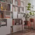
An important element in the design was to find space for plants and books, the architect emphasizes. - Flowers appear in all rooms, and in the living room they play a prominent role. Space for a rich book collection was created in the bedroom by building up the wall behind the bed with a system of shelves and cabinets, Layer adds.
Above the bed in the bedroom hangs a tube chandelier designed by Ms. Jurek
© Grzegorz Layer
The whole is complemented by designer accessories - a chandelier made of test tubes designed by Ms. J urek hanging over the bed in the bedroom, a striking mirrored coffee table by HAY, or mounted on the bathroom wall Pin Copper decorations designed by Oskar Zięta.
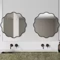
The kitchen and bathroom, on which the wall is mounted Pin Copper decorations designed by Oskar Zięta
© Grzegorz Layer
The interior, although bright, spacious and full of intriguing elements, leaves a certain unsatisfactory feeling and a huge curiosity about what it looked like in the days when it was inhabited by the "derailed" (as he said about himself) Warsaw architect.


