Located in a conservation building from the late 1940s and early 1950s, the Warsaw apartment in Old Bielany refers to mid-century and vintage style. The interior, full of color and space, is filled with books and original furniture by Rajmund Halas and from the kitchen one can admire sunrises. Dorota Kudła-Kubrakiewicz of Fantakrea studio is behind the project.
The Warsaw apartment is decorated in a vintage and mid-century style
Photo: Pion Level © Fantakrea
When looking for an apartment, the investors chose the Old Bielany neighborhood for its friendly atmosphere and proximity to the Bielany Forest. The stylistic assumption of the project was to refer to the mid-century style and use vintage furniture from that era. Some of the furniture, such as the dressers in the living room and the tables in the living room and kitchen, were designed by architect Dorota Kudła-Kubrakiewicz, referring to mid-century design.
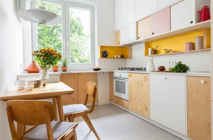
Theplan of the apartment remained original, but in the course of the project the investors together with the architect rejected a great many versions of the functional layout. They wanted space, a large kitchen, storage space and, most importantly, a place to work from home. The dominant interior colors are nautural oak wood and white walls. It is worth noting the birch plywood in the kitchen used for the built-in design, as well as tiles reminiscent of terrazzo tiles popular in the mid-20th century.
The apartment in Stare Bielany is 50 square meters in size
© Fantakrea
Dobrawa Bies: The apartment in Stare Bielany is located in a building from the late 1940s and early 1950s. Was it clear from the beginning that you would refer to the mid-century style?
Dorota Kudła: Yes, already at the stage of discussing design assumptions we made such a decision with the clients. It was also dictated by the desire to refer to the architecture of the building. The interior refers to it insofar as we decided on a vintage, mid-century style, but we were agreed that in the interiors we would keep the ceiling facets, the original radiators (except for the kitchen one). The windows were replaced, but with the same ones, only sealed. The same goes for the parquet floor, the one that was in the apartment could not be saved, but the classic oak stave, so popular in those days, was laid.
The interior refers to the architecture of the building
Photo: Vertical Level © Fantakrea
Dobrawa: What requirements did the investors set and what was their priority?
Dorota Kudła: The priority was definitely the division of space. The idea was that the apartment should have a large and comfortable kitchen, living room, bedroom, plenty of storage space, including for books, and, well, that it would be possible to work from home. Precisely because of the work space, we tested various layouts, but in the end the walls stayed in their places, although at the conceptual stage we went through several versions.
The colors complementing the white and natural wood are yellows, pinks and blues
Photo: Vertical Level © Fantakrea
Dobrawa: The interiors are an explosion of colors and classics of Polish design. What influenced such a design decision?
Dorota Kudła: The idea was not to create a furniture museum but a certain authenticity that also fits well with the owners' general philosophy of life. It's about the philosophy of less waste. If I can use something that is of good quality, comfortable and I like, even though it is not new, why not? The idea of giving things a new life, renewing, restoring also appeals to me personally.
As for the color scheme itself, the base is very simple - oak stave laid in a herringbone pattern and white walls. Complementary colors are yellows, pinks and blues in various shades. I came up with the idea of adding pinks and yellows to the base by analyzing the location of the apartment in relation to the world sides. The kitchen window faces east, and I thought for sure that one could watch the sunrise from it with very interesting colors. The blues came as a complement.
The architect used original chairs by Rajmund Halas, and managed to maintain stylistic consistency in all the interiors
Photo: Vertical Level © Fantakrea
Dobrawa: What was the most difficult part of this project, and what are you most satisfied with?
Dorota Kudła: I am satisfied with the stylistic and color consistency achieved. It was not easy because of the number of elements. However, in the end we achieved a balance. I'm also happy with the use of refurbished original furniture such as Rajmund Halas' Type 200-190 chairs, a design from the 1960s, and Boomerang chairs.
The most difficult part was the bathroom design. The bathroom is tiny and using four designs was a challenge. The color scheme - cool beige, blue, black, white and pale pink. The bathroom cabinets were made of birch plywood, inside the tall cabinet is placed a litter box for the cat. It was not easy to find a place for it.
Dobrawa: Thank you for the interview.


