Soothing space and colors and boho-style accessories. These were the requirements that the owners of a Warsaw apartment located in Mokotow approached Fantakrea studio with. Architect Dorota Kudła took up the challenge and created interiors full of light, natural materials and ethnic patterns.
open living area
Photo: Pion Level © Fantakrea
The investors wanted an interior with a balanced, even soothing composition. From the beginning, they stressed that the minimalism of the interior was to find expression both in the visual concept and in the functional and material solutions used. At the same time, the interiors were to be warm, hence the decision on boho-style accessories," says Dorota Kudła.
The challenge was to determine the functional plan in the area of the kitchen and living room
Photo: Pion Level © Fantakrea
The apartment located in the new Wiślany Mokotów project is one hundred square meters, but the architect was asked to design its more representative part - the living room and the investors' bedroom. The designer based the premise on using a consistent set of materials and functional solutions for all rooms. Hence the breaking of simple white surfaces of the furniture, with open oak shelves. This solution was used both in the kitchen and living room, as well as in the bedroom and both bathrooms.
Bright walls contrast with wooden accessories
Photo: Vertical Level © Fantakrea
around the table
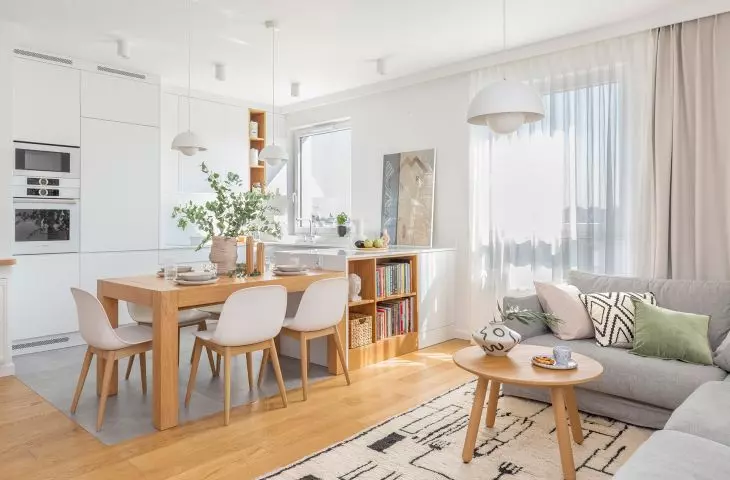
The biggest design challenge was to determine the functional layout in the kitchen and living room area - the clients had high expectations here. I prepared several versions of the functional layout, assuming partial or complete demolition of the wall between the kitchen and living room. The final solution with a wide kitchen countertop passing into an oak dining table was a certain compromise to the investors' program. However, I convinced them that it was optimal and that we simply couldn't fit more in this space if the assumed sense of spaciousness of the interior was to remain," explains the architect.
The living area is centered around a table
Photo: Vertical Level © Fantakrea
In order to get more space and more favorable lighting, the partition wall in the bedroom, as well as the wall between the kitchen and living room, was demolished. In place of the latter, the author proposed the aforementioned wide kitchen countertop with storage space, accessible from both the kitchen and living room sides. The countertop, which flows seamlessly into the table, is the center of the living area. The apartment's owners enjoy cooking and hosting guests.
All interiors are maintained in a consistent style
Photo: Vertical Level © Fantakrea
harmony in boho style
The tranquility and harmony of the designed elements of the apartment were enriched with boho-style accessories. Matte white, warm grays and the color of natural oak wood were juxtaposed with expressive weaves of linen, earth colors and complemented by ethnic accessories with strong linear patterns. Simple oak flooring and clean lines of minimalist furniture provide a backdrop for objects with organic shapes and clear textures.
The walls are decorated with graphics by Wojciech Tylbor-Kubrakiewicz
Photo: Pion Level © Fantakrea
In the bathroom located next to the bedroom, a large irregularly shaped mirror and asymmetrical fixtures of colorful lampshades provide an accent against the background of simple forms.
Calm colors and simple forms allow users to enjoy the simplicity and space with which to recuperate. The whole project is complemented by art - graphics by Wojciech Tylbor-Kubrakiewicz hung on the walls ," concludes Dorota Kudła.


