Thesmall square footage of a Poznan apartment became a design challenge for {tag:pracownie}. Thirty square meters, the architects planned in such a way as to maximize the use of space - they created a wooden cubicle hiding doors and closets, and designed sliding elements separating the living and sleeping areas.
The light and beige aesthetics were broken by the architects with black sliding elements, which are the most important detail of the apartment - enclosing the bedroom zone and not blocking the daylight. The oak corner of the living room and bedroom visually binds the whole, giving a minimalist character. A cubby hides the door and the capacious closets of the bedroom and bathroom. The accent is the strong red of the graphic entitled. "Lago di Garda" from Studio Worth and the green of the furniture details.
Sliding elements separate the bedroom from the living area
© Ktura Architekci
Dobrawa Bies: What was the main inspiration for this project?
Katarzyna Buczkowska-Grobecka: Every time we design individual architecture, the main inspirations for us are conversations, the first conversation with the investor and a site visit. Already then the idea for a given space is born, or at least its preliminary outline and concept.
Dobrawa Bies: How to make the best use of such a small space?
Katarzyna Buczkowska-Grobecka: Just the way we did it in "Wildecki 31" ;) To tell you the truth, there is no single key or rule for this. Each space needs to be approached individually and, first of all, at the very beginning you need to know precisely and define the expectations of investors. Small spaces are all the more difficult because you need to meet the functionality of an average two- or three-room apartment, where you have far fewer square meters at your disposal. There must be "everything" very well packed and comfortable. In our opinion, these spaces should be kept in a light calmed color scheme.
The project makes maximum use of the small space of the apartment
© Ktura Architects
Dobrawa Bies: What were the investor's expectations and needs?
Katarzyna Buczkowska-Grobecka: There were several, but the most memorable was the investors' great love for beiges and browns. We had a great desire for these tones and colors.
Dobrawa Bies: Where did the idea for such a combination of colors, patterns and materials come from?
Katarzyna Buczkowska-Grobecka: The colors were initiated by investors, and we took it very seriously ;) Each time we propose individual architecture, designed fully by us, but the role of the investor and discussions with him are extremely important.
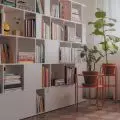
The interior is dominated by whites and beiges
© Ktura Architekci
Dobrawa Bies: What gave you the most satisfaction in creating this project, and what was the biggest challenge?
Katarzyna Buczkowska-Grobecka: Satisfaction - it is undoubtedly the wooden cubicle, which connects, calms, defines and "does" the whole space! It was the best design move we made in the whole apartment. The sliding elements dividing the living area from the bedroom area proved to be a challenge.


