A space adventure awaits at the Airspace inflatable amusement park in Gdynia! Astronauts (big and small) will jump into space, spend time in the space shuttle, get ready in the training capsule and go through the space jungle, and practice their dexterity in shooting down meteoroids from the spaceship, on a special shooting range!
Architects from Besign Studio have created a truly cosmic space for learning and fun! The design is reminiscent of the aesthetics of the 1980s - sharp, vivid colors known from computer games. Now interplanetary adventure is available at your fingertips!
Basia Hyjek: What was the main inspiration for this project?
Magdalena Wieczorek: Airspace is a 1500 m² inflatable amusement park located in Gdynia. Children spend time here playing and learning. The theme of the park is space travel and the world of games. So we were inspired by space travel, games from the 1980s, and various motifs that refer to the style of retrofuturism.
The investors wanted Airspace to be a place that inspires, encourages scouting and, above all, is safe. The idea was to combine science with sports and fun, and the investors wanted the interior design to reflect this
Photo by Malgorzata Szczurowska
Basia: What were the expectations and needs of the investors?
Magdalena: When we started working, we received a brief from the investors, on the basis of which we created the first concepts for the project. The investors wanted Airspace to be an inspiring place, encouraging scouting and, above all, safe. The idea was to combine learning with sports and fun, and the investors wanted the interior design to reflect this. As for the style, as a team we had great creative freedom and full support of the investors, of course, while strictly sticking to the agreed budget.
Basia: Where did you get the idea for such a combination of colors, patterns and materials?
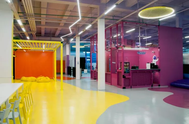
Magdalena: The color scheme was taken from the synthwave aesthetic, and refers to the 1980s. Colors such as magenta, yellow, purple and orange are not only intended to stimulate children to play, but also delineate the various zones in the facility. Zoning has been defined by patches of color spilling out of the interiors of the cubbies, and communication in the park is marked by lightning. A colorful stain on the floor leads from the ticket counters straight to the juicy orange interior of the changing rooms. The canopy of this area was made with fabric strips, decorated with lines of light.
zoning was defined by patches of color spilling out of the interior cubbies, and communication in the park is marked by a lightning bolt
photo by Malgorzata Szczurowska
The yellow zone is a space designed to familiarize you with the safety rules you need to follow when playing in Airspace. The yellow spot seamlessly transitions into a magenta-colored zone - common to the ticket offices and cafeteria. The sanitary facilities, like the rest of the interiors, are kept in the cosmic style of the park and adapted for both children and adults. The halo effect mirrors are reminiscent of a solar eclipse, while the colorful grout and ceilings allude to a retrofuturistic atmosphere. An interesting touch is the ceiling installations. Designed and custom-made gradient panels and glowing steel hoops add an original touch to the interior.
Ceiling installations are an interesting accent. Designed and custom-made panels with a gradient and glowing steel hoops, add an original character to the interior
Photo by Malgorzata Szczurowska
Basia: What gave you the most satisfaction in creating this project, and what was the biggest challenge?
Magdalena: The biggest challenge for us was the functional arrangement. The zone serving the park is a small part of its entire space, and we had to fit many functions into it. The design of the free-standing reception desk was also a challenge. The cubic form designed from steel and expanded metal bathed in neon pink had to accommodate the functions of ticket offices, a store with a display window, a social room and a small cafe on the other side. With such a number of functions, it was quite a challenge to ensure that the solid form did not lose its cubic features.
