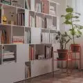
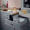
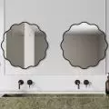
White, black and cobalt. These three colors dominate the Silesian Apartment - an interior in one of Katowice's blocks of apartments from the 1960s. Magda Bajor, an architect from Keokeo Studio, when designing this space, gave it a modern character through bold and uncompromising play with forms, textures and materials, creating a coherent, though contrasting interior.
contrasts in the kitchen and living room
Photo: Ewa Kania
Ola Kloc: What was the priority for investors?
Magda Bajor: Time. I had very little of it to complete the project. The premises were intended for short-term rentals. It was supposed to start serving such a function as soon as possible.
On the other hand, if we take into account the investor's guidelines, there were few. He suggested leaving the beech parquet in place.
Ola: Looking at the plan, there is a clear division of the interior into three rectangular parts - the entrance area and kitchen, the open living room with dining room and, in the depth of the apartment, the night area - a bedroom with a bathroom. What is the reason for such a division of space?
Magda: The division is the result of existing plumbing and load-bearing elements. The apartment is located in a block of flats from the 1960s, which posed certain limitations. A beam and load-bearing columns extend between the entrance-kitchen area and the living room. Meanwhile, in the bathroom, the gas and co installations became the sticking point.
I took advantage of what I found, opening up the cramped rooms and adding some new divisions so that the use of the space was comfortable and the space itself gained a modern character.
Ornamental glass walls separate the various parts of the apartment
Photo: Ewa Kania
Ola: The project is full of contrasts - with white walls are juxtaposed with black furniture and floors, with smooth surfaces - textures and patterns. What influenced such a bold choice of materials, colors and textures?
Magda: The interior was to have a unique character. I'll start with white. White in various textures is always a starting point for me. In this case, it is the background that connects the other elements. It connects them into a whole, but also allows each individual element to exist. Thanks to the white, the other intense colors affect the interior, but do not overwhelm it.
Outside the window, on a neighboring building, there is a huge sign in a color similar to cobalt. I decided to transfer this element to the interior of the apartment. In addition, the bedroom overlooks the balcony where the balustrades, similar in height to the headboard, are painted the same color. And so the headboard of the bed and the balcony balustrade, which are divided only by the balcony door, are united by color, which gives the impression of continuity, rhythm. The use of this color allowed me to achieve a sense of harmony between the newly designed and the found.
The 


rhythm of riffles on the glass clarified the pattern of upholstered trim
photo: Ewa Kania
I conditioned leaving the parquet floor to change its color. The black parquet goes nicely with the selected black and white tiles.
My favorite madness is the bathroom. One material, the form of the mirror and a touch of cobalt allowed to create an interior simple and very graphic. Maximum content.
Ola: The apartment is full of interesting and often surprising solutions like the ceiling-reaching elongated mirror in the bathroom, the soft lampery in a distinct color in the bedroom or the recently fashionable ornamental glass separating different parts of the apartment. What was your design process like in creating these solutions?
Magda: Normally, form followed function. Ornamental glass obscuring plants, whose leaves lean against its sheet - this was the image I had in my mind. I liked the impression made by such a juxtaposition, so, wanting to separate the entrance space from the relaxation area, I used it. I like cohesive interiors, where the elements surprise, but also combine into one inseparable whole. So I duplicated the ornamental glass, placing it between the bedroom and the dark bathroom, which I wanted to illuminate. The rhythm of the grooves on the glass clarified the pattern of the upholstered trim. The height of the headboard and the height of the bathroom tiles are the same. The rest is a play of creativity with intuition. I work with paper and a 3D model to get the space under control. I add elements, and when I have the feeling that it is just right, neither too much nor too little I consider the project finished.
Details in the bathroom and bedroom
Photo: Ewa Kania
Ola: What was the most difficult part of this project, and what are you most satisfied with?
Magda: There were no difficulties. The investor having full confidence always makes my work easier, and the final result fills me with satisfaction. If I had to give, for example, three things that make me most happy, I would choose these:
First, the realization. The realization corresponds one hundred percent to the project. It is the translation of an idea into matter. An idea unadulterated by the interference of compromises and omissions.
Secondly, the impression. A realized functional interior that looks nice in a photo is a success. On the other hand, the fact that its user feels good in it, that despite the contrasts used, the space allows one to relax and feel special is the pinnacle of success.
Third, the interior is unique. I wanted it to be like that and make it memorable. So that the viewer could not say that this space resembles something he has already seen, but that he should have the feeling that it is unique. This, in my opinion, has succeeded.
Ola: Thank you for the interview!


