Voting for the Audience Award in the 3rd edition of thecompetition for the Architectural Award of the Wielkopolska Region has ended.The game, which lasted from November 15, consisted of casting one vote for one's favorite in each of the six categories - Multifamily Residential Building, Public Building, House, Export Work, Common Space and Interior. So a total of six votes could be cast in the voting. The highest number of votes (275), the grand prize in the Public Building category, and thus the Grand Prix was awarded to Shoot house by P3 Pracownia Architekturyfrom you .
The purpose of the NAWW competition is to promote Greater Poland as a region that cares about the quality of the built environment, public space and architecture. Shaping aesthetic awareness in the creation of architecture, developing an understanding of the features of identity and sustainability of the built environment. In November this year, the official results of the 3rd edition of the competition organized by the SARP Poznań Branch and the Wielkopolska Regional Chamber of Architects of the Republic of Poland were announced.
In the same month, "Architektura & Biznes", which is a media patron of the competition, announced the public vote for the best architectural work of Wielkopolska. The vote could be cast in each of the six categories.
Grand Prix and award in the category of Public Building
Shoot house by P3 Pracowania Architektury, Sebastian Nowakowski, received 275 votes, thus winning in its category - Public Utility Building and receiving the Grand Prix of the entire competition for the Audience Award.
Shoot house, Vlasciejewki
Photo: Anna B. Gregorczyk © P3 Pracownia Architektury
[excerpt from author's description]
Shoothouse buildings are a type of special shooting ranges that simulate real-life crisis scenarios. [...] In the beginning there was a plot of land with a surprising terrain, existing training buildings and a designated place for a facility intended to be different from all the ones so far. The escarpment always attracts the designer's attention because of its great compositional possibilities. In this case, it was one of the functional guidelines (independent access to two floors) that ultimately decided to inscribe the building into the existing earth embankment. The designed building was to complement the investor's existing training center both spatially and functionally. [...] The architects decided to go a step further in inscribing themselves in the landscape context, and so not only cut the building into the embankment, but also move the floors in relation to each other, creating a sense of mass following the terrain, while creating terraces. As it turned out, attractive new spaces for training purposes. Completing the massing is a dominant built-in staircase that provides easy access to the building's roof. On its axis, the main entrance to the building was highlighted with an arcade.
Multi-family residential building
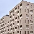
In this category, the highest number of votes (138) was received by Fama Jeżyce (stage I) in Poznań by HRA Architekci design.
[author's description]
Fama Jeżyce is one of the largest investments under construction in the heart of Jeżyce. On an almost 8-hectare site formerly occupied by Wiepofama stands a housing development that enriches the changes that have been taking place here for several years. In addition to residential buildings, the space will be filled with new roads, squares, an attractive square and a promenade with a place for rest and recreation. When preparing the concept of the Fama Jeżyce estate, we focused particular attention on maintaining consistency with the existing character of Jeżyce buildings. Individual stages will therefore have a quarter character. Each of them will be distinguished by individual elevation solutions. In the first stage it will be wood. In the contemporary architecture of the estate we also have a hidden history - the rounded corners of the buildings refer to the interwar period, and the concrete balconies give them a raw character.
Home
The most votes (37) in the House category went toHill Top House by the mode:lina project
Hill Top House
Photo: Patryk Lewinski © mode:lina
Export Work
The best Export Work in the public vote was Zakątek Malucha Nursery and Zakątek Przedszkolaka Nursery in Łochów by Decocafe Architektura Dobrochna Kniat, Krzysztof Kostrzyc, Małgorzata Czarniak, receiving 101 votes.
interior of the nursery school
photo: der blitz creative agency
© Decocafe Architektura Dobrochna Kniat, Krzysztof Kostrzyc, Malgorzata Czarniak
[excerpt from author's description]
In the nursery section, a reference to nature was proposed in the concept of the children's rooms and the lobby. [...] Through the use of geometric elements and monochromatic colors, references to nature are not literal. In addition to the dominant colors in the halls, as well as in the entire building, efforts were made to use natural materials and colors, oak veneer and white and black colors. [...] The design of the preschool part of the facility, in contrast to the nursery part, is inspired by the city. Cottage-shaped buildings appear in the halls, also varying in color. [...] The premise of the project was to introduce simple, minimalist solutions that will help shape children's sense of aesthetics from an early age.
Shared space
In the category of Common Space, the most votes (74) were cast for the redevelopment of the Lazarski Market Square in Poznań , designed by the Authors' Architectural Studio - Jacek Bułat.
Redevelopment of Łazarski Market Square in Poznań
Photo: Dawid Majewski © Autorska Pracownia Architektoniczna - Jacek Bułat
excerpt from author's description]
The main design goal was to create a space with high aesthetic qualities, as well as functional, pedestrian-friendly, which will activate the local community. The designed area was included in a residential zone, consisting of privileging pedestrian and bicycle traffic, increasing the level of safety. [...] Kazimierz Nowak Square, located in the western part of the Market Square, lies on a slope with a total difference in level of about 4 meters. Here, the square's slab was designed to be raised so as to create a separate space where the recreational function dominates. [...] The whole area is finished with an amphitheater staircase for meetings and street art shows. The northern frontage of the Square is a pedestrian promenade where food gardens can be staged. [...] An additional recreational zone for relaxation, with plenty of greenery and seating areas, is located in the northern part of the square. A naturally shaped slope of greenery separates the pedestrian zone from the street and parking spaces. [...] The modern retail space, organized on a circular plan, provides easy access from all sides. The transparent canopy above it, with a visually lightweight steel structure and the double-layer ETFE plastic pneumatic membrane used, provides shade and protects from rain and snow, without changing the color of the products on display. [...] During construction, a mock-up was created with varying degrees of printing, which presented different degrees of shading for the space under the canopy. In the end, the printing of the film to serve as sun protection was assigned for the bottom layer.
Interior
The winner of the interior category, is the CRAFTON Office of the mode:lina project, receiving 54 votes.
CRAFTON Office
Photo: Patryk Lewinski © mode:lina
[excerpt from author's description]
Software House Crafton, which operates rapidly with clients from all over the world, adapted a pre-war villa in the center of Poznań for a surprising new headquarters for its team. [...] The office consists of three floors, for which a common denominator was needed so that, despite the diverse geometry of the rooms, the entire space would be perceived as a coherent whole. Due to thehistorical nature of the building, the designers decided to leave the traditional elements of its interior: original woodwork, stucco, original wooden floors and stairs. The space was treated as a three-dimensional canvas for an abstract painting - the dominant white was dynamically and consistently broken with expressive colors associated with the Crafton brand.
You can see the full results of the vote for the People's Choice Award and all the projects competing in the competition here.


