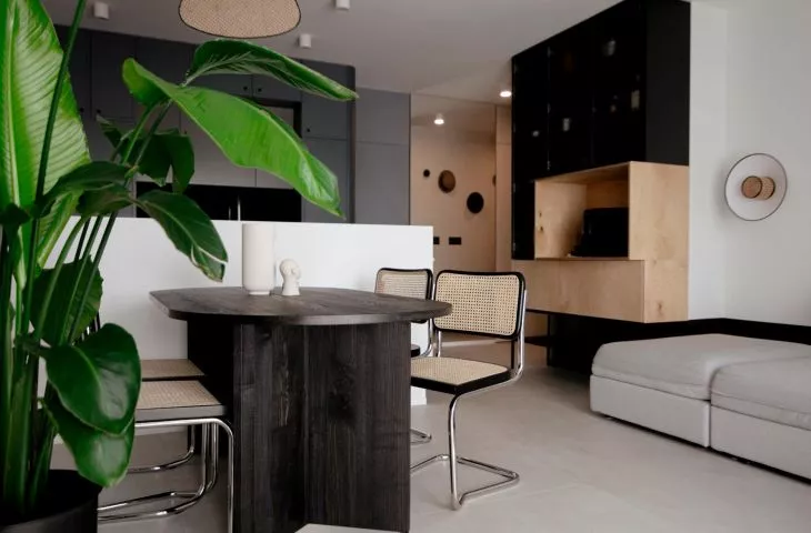
Natural colors and materials have been interior design must-haves for several years - wooden floors and furniture, linen curtains, hues drawn from the colors of the earth, ubiquitous greenery and the increasingly fashionable rattan braids, which can be used in many ways.
fashionable braids
Used in furniture and accessories, plaits gained popularity in the second half of the nineteenth century thanks to the design of the famous chair number 14 by Michael Thonet; later, in the 1920s, a similar motif was used in the design of the Cesca skid chair by Marcel Breuer, which went down in design history. Openwork braids in a natural beige hue also began to appear more and more often on lamps, furniture fronts and finer accessories, not only in exotic boho style interiors, but also in juxtaposition with minimalist spaces, such as in one of the projects of architects from the Wroclaw office Na Antresoli.
Rattan accessories in a minimalist interior
photo: Agata Piątkowska
interior full of contrasts
The interior is dominated by black and white - strong dark lines are drawn vertically and horizontally on the light walls of almost all the rooms, and darker furniture or parts of it are contrasted with the light floors. The perception of the space is softened by the curved shapes of the furnishings and natural-colored elements - wooden parts of the furniture, vertical laths on the walls in the kitchen and living room, a pistachio-green bookcase and thethe aforementioned rattan accessories - chairs on skids in the dining room, a decorative lamp over the table, as well as introduced here and there in smaller decorations, in picture frames or on fragments of furniture fronts.
left: view from the kitchen to the dining room; right: a fragment of the living room
Photo: Agata Piątkowska
For the investors, the most important thing was that their space was unique and the apartment had a unique style. They wanted it to evoke emotions regardless of whether they were positive or not, the designers write. - This project was a challenge for us from the beginning. Our main task was to adapt this space to the needs of the future homebuyers. The apartment originally had three rooms, an open living room with a kitchen and a small bathroom. We knew that our only solution to satisfy the investors was to completely rearrange the space, which is what we like best," the architects add.
bedroom
photo: Agata Piątkowska
home relaxation zone
The interior design, as mentioned by the architects, required considerable functional changes - it was important for the investors to create a large and spacious bathroom in the apartment. Thanks to a thorough remodeling, the designers from the Na Mezzoli studio created a large, black and white bathroom with a separate spa area housing a bathtub and two shower stalls, a fenced-off space withtwo sinks and a washing machine in a custom-made enclosure, and a toilet, which, according to the authors of the project, is incorporated into a wall separating the SPA zone from the rest of the bathroom.
left: two shower stalls in the SPA zone;
right: the toilet is integrated into the wall separating the SPA zone from the rest of the bathroom
Photo: Agata Piątkowska
Minimalist, although broken with natural, decorative elements, the interior, in addition to functionality, was to meet one more expectation of investors - to arouse emotions. The contrasts used by the architects in colors, shapes and materials introduced into the interior certainly meet this condition.


