{tag:studenci} - graduate of the Academy of Fine Arts in Gdansk, as part of his diploma thesis, under the supervision of Prof. Maciej Świtala and Marta Koniczuk, proposed an interior design for the Polish Tourist Organization (PTO) office in Stockholm and a pavilion promoting Polish tourism. The project is an attempt to revitalize the visual setting of Polish tourism abroad, as well as to create a space that inspires people to get to know our country.
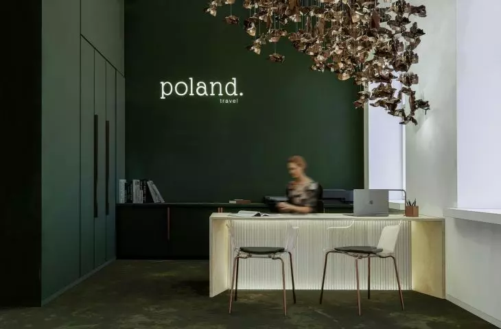
visualization of the office
© Hubert Białk
Poland's showcase
Current tourism promotion, while effective in conveying information, often suffers from a lack of clarity and visual appeal. As Białk notes, the visuals of such sites are often mediocre and fail to attract the attention of potential tourists. For this reason , the design of the PTO's office is intended to become a place that not only conveys information, but above all encourages visitors to Poland by creating a modern and attractive space. Central to the concept is the question, "Temptation or curiosity?" - What is the main driving force for tourists deciding to visit our country?
visualization of the office
© Hubert Białk
location and interior layout of the office
The PTO office, located at Karlavägen 47B in Stockholm, was designed with functionality and aesthetics in mind. The interior includes four workstations, a director's office, storage facilities, as well as social space. All of this has been subordinated to the main idea of promoting Poland by referring to the elements most associated with our country - natural wealth, especially Polish forests. Nature-inspired patterns and colors dominate the design, giving the space a unique, warm character.
cross sections
© Hubert Białk
"Polish forest" in the heart of Stockholm
When designing the interior of the office, Białk relied on the theme of the Polish forest. Poland, as a country with one of the largest areas of forest in Europe, boasts its diversity and beauty. This inspiration was transformed into the language of interior design - through the use of natural materials and earthy colors, the office transports visitors to the atmosphere of a summer day among the trees.
visualization of the pavilion
© Hubert Białk
The interior is filled with desks made of plywood, two of which are protected with black oil and serve male and female employees, while the third, in natural wood color, provides a place to receive guests and visitors, attracting the eye and standing out in the interior. The decorative lighting, the form of which is reminiscent of the crowns of trees and the sun's rays penetrating through the leaves, is made of irregular copper sheets, creating the effect of feeling like being among nature. The fleece-inspired flooring, made of micro-cement in colors of green, brown and yellow, abstractly reflects the natural contrasts of the forest, evoking the beauty of its imperfections.
visualization of the pavilion
© Hubert Białk
a coherent story about Poland
The Bialka project is a unique story about Poland, using the richness of nature and culture to create a modern and attractive showcase for the country abroad. Both the office and the pavilion are designed to encourage male and female tourists to discover different corners of Poland, not only through information, but above all through experience - a multi-sensory, emotional, memorable experience. Hubert Białk has created a space that not only fulfills a promotional function, but also shows the beauty of Polish nature and its various tourist qualities.
axonometry
© Hubert Białk


