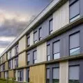
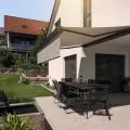
Although the 89° studio did not win the competition for the design of the Center for Cultural Initiatives in Komorow, it is worth stopping by the concept of this office for a longer period of time. The building intrigues not only with its characteristic body, but also with the solutions used. The building may bring to mind mole mounds or an anthill, thanks to its conical form and skylights in the roof.
The design is somewhat reminiscent of a church concept in Rwanda through the memorable, it would seem, nature-inspired shape of the block. The African temple may be associated with a large beehive, while the Komorov concept for the Center for Cultural Initiatives is associated with a mole mound or anthill. There is nothing surprising in this, after all, these animals are among the most capable representatives of animal architecture - right next to beavers and spiders. However, the architects had a different goal - the modules of the CIKwK building relate in scale and form to the houses in Komorovo.
The main goal of the architects was to create a building that would respond to the needs of the Komorovo community and fit into the surrounding garden. Thanks to the irregular form, plazas and courtyards of various sizes, and therefore purposes, are created around the building. Some can serve more formal events, others a little less so, such as the one that overlooks the café and opens its space to the garden.
The building's space had to be specially tailored to the needs of its future users
© 89°
On the agenda of the Center for Cultural Initiatives
The building's space had to be specially tailored to the needs of its future users. Thus, there was a 150-seat concert hall, a room for movement and dance classes with expanded facilities for a checkroom. In addition, workshop rooms, an intimate cinema room and administration offices.
All these main functional rooms have been placed on the first floor for the sake of the disabled. They are connected by a spacious lobby, which opens up to the Center's surrounding... garden. A visual identity was also designed with the disabled in mind, strongly contrasting with the background, which will make it easier for the visually impaired to navigate the complex.
The building is illuminated by skylights located in the gables of the roof, as well as large glazings that open up. The facade on the side of the tracks has no windows for acoustic reasons. The primary material used is maroon corrugated sheet metal on the facade, whose vivid color provides a painterly contrast to the surrounding greenery. The light-colored wood covering the interior of the CIKwK emphasizes the local character of the architecture.
Design with respect for greenery
Maroon corrugated sheet metal on the facade, whose vivid color provides a painterly contrast to the surrounding greenery
© 89°
The architects were keen to preserve the existing tree stand. The landscaping design provides for a free spread of wild vegetation between the trees. The area around the site has been partially landscaped - two circular zones have been created for a playground, a "green gym" and a recreational space. Throughout the park there will be a trail in the form of a wooden deck referring in its geometry to the projection of the CIKwK building.


