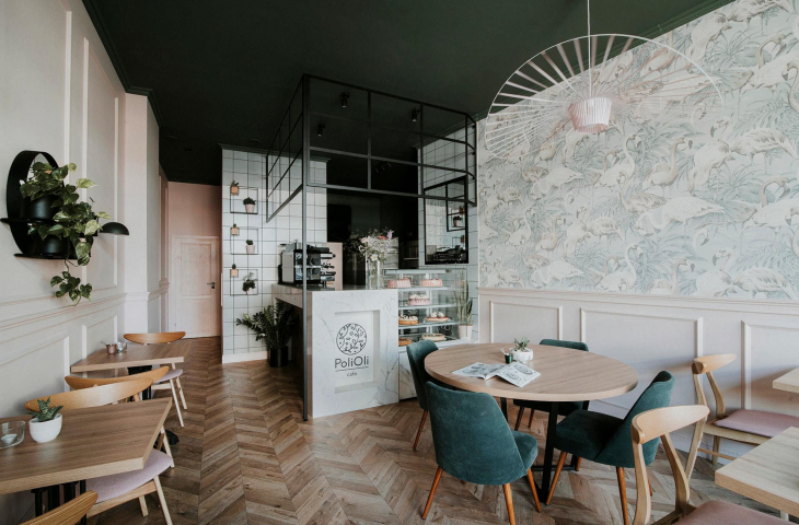
At PoliOla, you can eat pink mini meringues, frosted with thick icing and adorned with mountains of whipped cream, and fruity cheesecakes. All this sweetness is complemented by the interior - cleverly javirating between emphasizing the sweetness with powder colors and flamingo wallpaper, and toning it down with wooden flooring and black steel accessories.
Architects from {tag:pracownie} managed to arrange the interior of the Wroclaw cafe in such a way as to strike a balance. Fabulous-looking cakes and pastries tempt from behind a display case against a background of white square tiles surrounded by a marble counter. Dark elements - lamp shades, flowerbeds, as well as an openwork structure that optically closes the counter space - break the delicacy of the interior, giving it character.
Basia Hyjek: What was the main inspiration for the design?
Mezzanine: PoliOli is a patisserie where cakes and desserts are prepared on site. The interior was to be sweet and frosted, but with claw. The investor wanted the interior to be feminine and used her favorite colors, namely pink and bottle green.
We wanted the interior to be feminine and sensual
© On the Mezzanine
Basia: Where did you get the idea for such a selection of colors and materials?
On the Mezzanine: We wanted the interior to be feminine and sensual. That's why we chose pink, green, blue, as well as wood and white marble. There is a lot of stucco in the interior, so to balance this classic and feminine look we decided to use colorful 20 × 20 tiles in the kitchen area. This provides a kind of contrast. The interior also features arte wallpaper in flamingos and the iconic Vertigo lamp in pink.
Basia: Where did you get such an idea for the division of the space?
Mezzanine: The restaurant is just over 60 square meters, and we needed a sizable kitchen area - hence the decision to cut off a large space for the back room, the corner of which is the bar. We wanted it to be visible from the very entrance and be an "inviting" element.
There is a lot of stucco in the interior, so to balance this classic and feminine look we decided to use colorful 20 × 20 tiles in the kitchen area
© On the Mezzanine
Basia: What was the biggest challenge in creating this space?
On the Mezzanine: Relatively small square footage versus a large range of needs - a dining room for several tables and a full kitchen.


