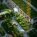
The Olsztyn High School of Art boasts a new exhibition pavilion. Architects from the Gadomscy Architectural Office have added a new building to the school's 1960s building, which, thanks to its large glazing, constitutes an art gallery that enters the urban space.
The Frederic MendesohnState High School of Fine Arts in Olsztyn offers practical classes in painting, graphic design and sculpture and ceramics. The works created during the lessons are mostly known only to the teaching staff, hence the PLP management in 2017 decided to build an exhibition pavilion. A design by the Gadomscy Architectural Office was selected through a competition.
The building was built on the corner of two streets
Photo: Jakub Obarek © Gadomscy Architectural Office
new building on the map of Olsztyn
The newly built, one-story pavilion is located in the very center of Olsztyn, at the corner of two streets Partyzantów and Lance. The height of the building was related by the authors to the level of the parapets of the high school and the surrounding historic frontage buildings. The pavilion complements the school's functional program, expanding the framework of its activities to include public exhibitions, presentations, art events, among others, with the possibility of introducing the public to the space of the planned indoor "art garden."
As the authors say about the design of the gallery and the difficulties involved:
An art gallery as an object of architecture is a difficult challenge. The dilemmas in such cases are always similar - does the architectural setting have the right to attract the attention of the viewer directed to the exhibits presented? Is there a concept of aesthetically "neutral" architecture? How to design a universal space, capable of displaying exhibitions with changing themes and different exhibition concepts?
interior of the pavilion
Photo: Mieczyslaw Wieliczko © Gadomscy Architectural Office
glazed pavilion
The resulting facility designed to exhibit student works also serves as a multifunctional educational, workshop and conference space. The amphitheater-like exterior atrium is a gallery of large-scale sculpture. Ribbon glazing connects the interior gallery space with the exterior street space. The use of a raster superimposed on the classical glass facade minimizes the optical boundary generated by the glass - the double structure of the facade focuses the viewer's attention on the external facade grid. Thanks to the glazed facades, the building opens towards both the school and the passerby, inviting them to interact with the art.
elaborated by Dobrawa Bies
illustrations courtesy of Gadomscy Architectural Office


