The pastel-colored apartment with mid-century modern style accents is located in a development at Port Praski, a prestigious area of Warsaw on the right bank of the Vistula River. The investors asked Katarzyna Szostakowska of Kate & Co. to design an apartment intended for long-term rental, where one can both relax and work.
The 54-square-meter apartment consists of a living room combined with a kitchen, a bedroom, a bathroom and a hallway. The layout proposed by the developer was slightly different. The designer decided to demolish the wall in the entrance area to create one space and bring daylight into the hallway. Thanks to this procedure, the architect also gained a view of the neighboring brick building and unlimited access to light. The guiding color of the interior is a soft, muted shade of pink, it's what binds and runs through all the rooms. Such color accents as a mustard-colored sofa or strong black frames of mirrors and paintings are also interesting accents.
The small space of the apartment is optically enlarged by a huge mirror hung in the hallway
photo: Pion Level © Kate&Co
Such are the interiors I try to design. All rooms are consistent with each other, both stylistically and in terms of color. And single, more expressive accents add character to the interior. A considerable design challenge was the wall running on a slant, places in the living room and bedroom. With such architecture, the designer has to do everything to align the proportions of both the wall itself and the entire interior, says Katarzyna Szostakowska.
The space is used to the maximum, with a built-in closet in the hallway and a workspace in the bedroom
Photo: Pion Level © Kate&Co
functional space
The space of the small hallway, in colors of white and light gray, was optically enlarged by hanging a large mirror framed with a strong frame. It reflects the daylight coming from the living room. On the opposite side there is a very capacious built-in closet, which serves as a closet and utility room. Thanks to its light grey fronts, it is not conspicuous, and thanks to its functional design there is also room for, among others, an ironing board and a vacuum cleaner.
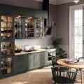
Kitchen built-in in shades of light gray and elements imitating granite
photo: Pion Level © Kate&Co
living area in soothing colors
Being in the hallway, we can cover the entire living area of the apartment with our eyes. Attention is drawn to the classic wooden floor and the furniture - an oval table, upholstered chairs and a radiola, referring to the mid-century modern style. The perspective of the living room is closed by a mustard sofa and marble coffee tables. The marble alludes to the finishing elements of the kitchenette, the stoneware placed on the strip of floor along the row of ash-colored cabinets and the quartz conglomerate used for the countertop. The same, deceptively marble-like stoneware also appears on the floor in the hallway and bathroom. A passage from the living room leads to the bathroom. It is long, but thanks to the consistency in the materials used it gives the impression of being spacious. On the walls the architect placed stoneware resembling fashionable terrazzo, and a large mirror suspended over the sink countertop multiplies the space.
The wall above the bed was painted to even out the proportions of the interior
Photo: Vertical Level © Kate&Co
relaxation and work
From the living room we move to the private area. The entire one wall of the bedroom is occupied by a closet, the last module of which was designed as an open bookcase. Right next to it - a sign of today's times - a place intended for a home office.
After painting a section of the wall behind the bed, the illusion is created that the room is rectangular. By doing so, I cheated the perspective and evened out the proportions of the wall, which runs at an angle," says designer Kate&Co.
In place of a desk lamp, the designer proposed a floor lamp, which with its arm embraces the desk and again, characteristic of this project, naturally separates another zone of the apartment - the bedroom. Instead of bedside lamps, highly decorative glass fixtures hang on two sides of the bed with a velour headrest.


