The duo of architects from Warsaw's 81.WAW.PL studio - Anna Paszkowska-Grudziąż and Rafał Grudziąż - have so far become known primarily as a team that creates tailor-made, modern single-family homes. However, they also have interior designs to their credit, including the space arrangement of a forest-surrounded house in Warsaw's Bielany district designed by Daniel Cieslik.
in a forest setting
Themodern and minimalist body of the existing house is surrounded by pine and birch trees. Daniel Cieslik, the author of the building, fulfilling the dream of the investor - Monika - designed the house so that nature penetrated into its interior. The greenery around the house also became a starting point in the design of the space, architects from the 81.WAW.PL studio, wanting to merge the interior with the block itself and its surroundings, relied on wood, graphite and the juxtaposition of black and white.
{The house in Bielany was designed by Daniel Cieślik, interior design was entrusted to 81.WAW.PL studio,title=home in Bielany was designed by Daniel Cieślik, interior design was entrusted to 81.WAW.PL studio}
house in Bielany was designed by Daniel Cieślik, interior design was entrusted to 81.WAW.PL studio
photo: Budzik Studio
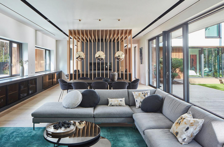
Usually, when designing a house, we already think about the interior, but here it had to be different, explains Anna Paszkowska-Grudziąż. - We wanted it to be consistent with the architecture and surroundings. The guiding motifs became graphite and black - because part of the facade is covered with slate - wood and the ever-present forest. By replicating certain elements, such as the vertical lines of tree trunks, we tried to give the space a rhythm. Hence, for example, the idea of a partition separating the kitchen from the living room. Similar boarding is repeated on the ceiling of the gym, where the painting in turn refers to the slant of the roof. We spent a long time looking for a way to transfer this motif to the interior, so that it would not be too strong, disturbing. There are a lot of linear elements that organize the interior - such as the black frame of the shower stall and around the mosaic in the bathroom - also because they reference the black window ironwork, the architect adds.


large glazings in the living room
photo: Budzik Studio
consistent solutions
The two-story house in Warsaw's Bielany district houses the downstairs living area - living room, kitchen with dining room, study and guest bathroom, as well as a bedroom with bathroom and dressing room. On the first floor, on the other hand, two rooms, separated by a bathroom and a guest room, a gym and a terrace from which residents watch and feed the birds were located.


Planking on the ceiling in the gym
Photo credit: Budzik Studio
The open living room, dining room and kitchen form a single unit - an elongated, functional sequence. What's more, part of the walls in this zone of the house is entirely glazed and allows access to the garden. The kitchen is visually separated from the other parts by the aforementioned openwork wall marking the border of the dark-colored zone - with a graphite sintered countertop and semi-matte lacquered fronts in the same shade. In a similar color are made a low built-in that runs the entire length of the living room and a minimalist fireplace.
Left: the kitchen is separated from the living room by a wooden partition; right: view of the living room and fireplace.
Photo: Budzik Studio
permeating nature into the interior
A similar effect of penetrating the outside into the interior can be seen in the master bedroom. Two glass walls - in front and to the side of the bed - give the romantic impression of sleeping in a garden. The velvet upholstered bed is flanked by two smoked glass doors - to the dressing room and the bathroom, where one can also see the inspiration of the house and the surrounding nature.
The 


The velvet upholstered bed in the bedroom is flanked by two pairs of smoked glass doors - to the dressing room and bathroom
photo: Budzik Studio
Another interesting element is the completely wood-clad narrow staircase, into which a handrail has been symbolically introduced - a glowing line that adds some dynamism to the massive wall.


wood encased narrow staircase
photo: Budzik Studio
Although the range of colors used in the interior design is narrow - the project is far from monotony. The variety of textures, framing views of the greenery surrounding the house, the introduction of color contrasts, designer accessories and a variety of materials makes the interior consistent and modern.


