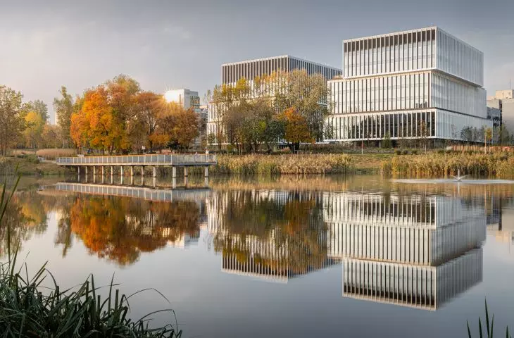
The construction of the Lakeside office building has been completed on the Sluzewiec Brook in Warsaw. Designed by Group 5, the block, with its geometric lines, is supposed to enter into a dialogue with the natural landscape, becoming a background for it. But could the office building that stood here before really not be adapted?
view from the park
Photo: Adam Grzesik © Group 5 Architects
Lakeside is an office and service building with an underground garage, which stood on a plot of land located on the edge of Mokotow adjacent to the Sluzewska Dolinka park, which is a recreational area next to the Sluzewicki Stream. In designing the green area, the emphasis was on creating a modern, friendly space, linking the new building with nearby green areas. This space is also intended to provide an attractive interior between parts of the building. The landscaping design involves a contrast between the level of the site and the body of the building. The building has a geometric form. The green area, on the other hand, is landscaped, with gentle forms, winding paths and walkways.
covered plaza
first floor plan
© Group 5 Architects
The office building itself consists of two separate parts built of staggered blocks 2.3 stories high. They are connected visually and functionally by a connector suspended at the height of the second and third floors. Underneath it, a public space has been arranged, constituting an extension of Henryk Małkowskiego Street, which opens a perspective to the Służewiec Pond.
placed in context
bird's eye view visualization
© Grupa 5 Architekci
Representative lobbies and service spaces have been located on the first floor. Subsequent floors are occupied by offices with two independent communication shafts. The top floors serve technical functions. The grouping of floors results from the fit with the neighboring buildings, sunlight and shading. One of the tasks of the façade shaped in this way is to level the massiveness of the building and relate it to the characteristic elements of the surrounding buildings.
reuse boundaries
University Business Center I and II
Photo: Zdzislaw Adam Niedzwiecki | © Wikimedia Commons CC BY 3.0 DEED
Prior to the construction of Lakeside, the site was home to the University Business Center office building. It was built in the 1970s and underwent a major renovation in the 1990s. Group 5 Architects has many projects in its portfolio of adaptations of existing structures, and as the designers argue, in this case, too, they began the design by considering whether there was a way to make use of the existing fabric or at least relate to the site's history.
Unfortunately, neither in the construction of that building, nor in the modernization, did they use enough sustainable materials to actually talk about the possibility of making effective use of the existing fabric. On the other hand, the location of the building prevented the construction of an underground garage, as a result of which the rest of the project's plot was a paved parking area supplemented by an inefficient underground garage separated from the building.
In addition to arguments concerning the substance of the building itself, its location and shape also proved problematic, effectively cutting off the connection of pedestrian routes from the UW site towards the Sluzewiec Creek.
view from the park
photo: Adam Grzesik © Grupa 5 Architekci
While the UW plans to modernize and redevelop the nearby campus in the future, we were focused on finding site connections and eliminating barriers. Preserving the existing development would have meant duplicating a development pattern fraught with huge drawbacks. The above was also carefully analyzed at the stage of obtaining the environmental decision already purely in terms of environmental conditions. They, too, showed greater long-term benefits in the case of replacing existing buildings with those proposed in our project.
shorter and shorter life of buildings
Since the lifespan of buildings is getting shorter and we are increasingly witnessing the demolition of buildings only twenty or thirty years old, does the same fate await office buildings currently being designed? Group 5 Architects argues that in its projects it tries to think about the future and shape the designs in a way that allows the program and function to change.
Each building function requires different thinking about space. This is imposed by legislation, technology and market standards. Office buildings usually have a centrally located core and a relatively wide tract. Residential development is implemented completely differently. It is therefore difficult to talk about complete flexibility of buildings. On the other hand, in our projects we try to make sure that, first of all, the layout of the structure is flexible enough to allow future changes in function - this is mainly about the height of the floors and the arrangement of the column system. Also, when thinking about the construction of external walls, we try to look for solutions that will allow future changes in divisions and, in extreme cases, replacement of the facade without significant interference with the remaining fabric of the building. Some building certifications place a premium on performing analyses of the possibility of changing the function.
facade detail
Photo: Adam Grzesik © Group 5 Architects
As the architects argue, not only the building itself and its interior, but also its relationship with the environment should be evaluated when considering reuse - its possibilities, limitations and costs.
Much more important than the structure of the building itself is whether it is properly sited, whether it allows human connections and life between buildings, whether it fits into a well-cut local plan. Function is already a secondary issue here. If the building properly interacts with its surroundings, there is no need to correct its form and it is much easier to make a decision on adaptation.
truth and falsity of visualization
office floor plan
© Group 5 Architects
After the publication of photos of the completed Lakeside office building, a lot of comments appeared online that the building looks better than in the visualizations. At the same time, this coincided with a discussion about the adaptation of a factory on Szwedzka Street, also designed by Group 5, where comments were exactly the opposite - disappointment prevailed. As the architects explain, visualization is only an approximation of reality, which is not yet there.
Like physical or 3D models, we use visualizations to depict our work and intentions. Also to verify the correctness of the adopted solutions. Then visualization is an element of the work, which can further change as a result of agreements, investor's guidelines, conservator's guidelines or our own thoughts. In our studio we try to make the visualizations correspond to the later realization, that is, to go outside the studio when we know that the project should not change much anymore. In the case of Lakeside, we have brilliant photos with perfect light and the end of autumn. Nature cannot be reproduced as beautifully on a computer as it will do on its own, imaging itself in the frame of a good photographer. The building, on the other hand, was realized as in the visualization - only and so much. In the case of the adaptation of the factory on Szwedzka Street, in the case of the other stages of the realization of this complex, our visualizations are also in line with the realization.
Disappointment related to the project on Szwedzka Street may be due to changes in the design during the development. This is because visualizations of an earlier concept, prepared by other designers, are circulating online. And it is with these images that the effect of the reconstruction is compared, which was carried out on the basis of another project, which, as its authors argue, much better reflects the historical truth about the object, as confirmed by the opinion of the conservator.
In embarking on the design of this part of the entire complex, we began by carefully examining the context and listening to the needs of the conservator and investors. Unfortunately, it is a pity that the storm in the media began before verifying the matter at the source.
a cross-section through the office building
© Group 5 Architects
