Work submitted for the competition
"Best Interior Diploma 2020/2022".
The adaptation of the interior of the church of the former convent of St. Monica in Lisbon is an undergraduate diploma project in response to the phrase "House of Words." The designed space focuses on promoting the culture of writing and books among the youngest in a creative way. They are the ideal target group, at this stage of development there is the greatest chance of getting them interested in literature.
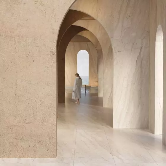
The concept of the project is based on the notions of sacrum and profanum. The idea of a "sanctuary" in the sanctuary was created by adding a new layer that replicates the interior form of the church, which with its structure and shape expresses respect for the existing tissue and provides a new architectural value. Moreover, the created space makes use of the values associated with books and illustration, involving children in its discovery and subjective verbal decoding.
The recesses of the former shrines were used as seats
© Klaudia Towarnicka
Color in the design was included as an accent. I was inspired by the work of esteemed Portuguese children's literature illustrator Madalena Matoso. Her illustrations are strong and characterized by free geometric patterns interspersed with organic forms and vibrant colors. The artist's work became an excuse for me to capture the interior not only in monochromatic areas, but also with accents of color geometry.
The functional-spatial layout was created through a modern take on the division into secular and sacred zones, which coexist with each other. The determining factor for this layout was the specificity of the activities in question, and the separation occurs along vertical lines. Creative works are mundane, while the reading ritual is spiritual.
The structure in the nave replicates the internal shape of the church, including the vault;
It represents a new architectural value introduced into the abandoned walls of the monastery
© Klaudia Towarnicka
sacrum
The idea for the new architectural value in the middle of the nave was to create another layer replicating the interior form of the church. The new fabric was built of thin steel tubes, consisting of risers and levels that form a truss. It also serves as a boundary to the space, the vastness of which may overwhelm the youngest users. The austere walls are a backdrop for the visually lightweight white structure with color geometry. The delineated divisions allow one to stay in touch with the original structure, which is still in sight, moreover, it allows daylight to flow into the interior. The recesses left by the former chapels have been used as seats for solitary encounters with reading.
The structure was built from thin steel tubes
© Klaudia Towarnicka
An important element is the library in the form of two bookcases flowing through the center of the nave to the chancel. The books, placed only on the lower few shelves, form a massif that is relieved by their absence in the upper levels. The chancel is connected to the nave and continues the main idea of the design. The layering in this part is denser and has regular divisions. At the end of it there is a large common c-shaped seat with a rounded shape, children can lean back comfortably while reading. This form allows them to integrate with their peers by reading together.
creative zone, paper making workshops
© Klaudia Towarnicka
profanum
The porch belongs to the creative zone and is a place focused on handmade paper. My goal was to create conditions so that children would have a real impact on paper making and learn basic paper making techniques. The process involves the preparation of shredded pulp, the appropriate amount of which is drawn into a sieve, then drained of excess water, pressed and returned to drying. This requires appropriate equipment and facilities, the operation of which is sure to arouse the curiosity of the little ones.
The columns in the room dictate the functional layout with their rhythmic arrangement. The work tables have been aligned axially, ensuring free movement. In order to lower the height of the room, a steel structure covers the entire ceiling and runs down the walls and is used to dry the resulting sheets of paper.
Rest area and a piece of furniture for storing art materials
© Klaudia Towarnicka
Thesecond level of the porch, the choir, is a continuation of the creative process. Referring to the monks' rewriting of books, I designed a space where children can interact with writing and illustration. Here they can give vent to their creativity in writing, painting or drawing. The hallmarks of the room are the large tables that allow integration with peers and the freedom to do activities. A piece of color accent furniture stretches along the walls, providing storage for art supplies and easy access to them. Behind the double-passage wall dividing the room is a seating area where parents or children can relax and enjoy the view including the nave and chancel of the former convent church.
Klaudia TOWARNICKA
Illustrations: © Author


