When we think "kindergarten," what often comes to mind is a room lined with carpeting imitating a city full of streets, buildings and cars, colorful furniture, colorful walls and colorful toys. Children seem to find themselves in this kaleidoscope of colors, but do they have a choice?
Design duo {tag:Studio} - Daria Bolewicka and Daria Skoczylas decided to change these "rainbow" tendencies. In their concept, they proposed a subdued space dominated by grays and pastels. The colors are balanced, not overwhelming - the interior design became a background for learning and playing, rather than one of its main characters, excessively absorbing the attention of users.
"bo/skie" interior
The "Smart Kids" kindergarten was created in cooperation with the Jezierski Architekci design office, which helped plan all the necessary rooms. The space of almost 170 square meters includes two playrooms, a toilet for children, kitchen facilities, social facilities and the director's office. A locker room has been set aside in the hall, as well as a meeting place for children and their parents. A major challenge was the concrete pillars - the designers wanted to preserve their structure and at the same time ensure full safety for users. Hence the idea to wrap them with thick natural cord - after all, the kindergarten is located by the sea!
"Smart Kids" kindergarten in Gdansk
photo by Hanna Połczyńska | studio chronicles
Before starting the design, the architects familiarized themselves with the educational offer of the institution. The space had to be planned so that there was room for classes with elements of yoga, judo, or art workshops (including architecture classes!). The kindergarten is supposed to be a child-friendly place, so the walls were decorated with graphics depicting animals, mountains and trees. Their author is artist Magdalena Czechowska.
with the youngest in mind
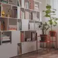
The furniture in the nursery must be fully adapted to the needs of its users. However, the designers wanted to preserve the minimalist character of the space, hence they chose simple forms in bright colors, referring to Scandinavian schools. One of the duo's goals was to provide children with varied forms of play - the rooms have no shortage of hiding places, cottages and nooks.
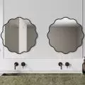
The bathroom was conceived so that using it would not cause anyone the slightest problem. The cabinets under the sinks have been placed at the right height, and the children also have easy access to the hangers and cubicles - all of which have been highlighted in a different color.


