Nominated for the EU Mies Award 2022 for the design of the monastery in Dobrzen Wielki, architects from the PORT studio in Wroclaw create subdued architecture, in which light, natural materials and the occupants play an important role. Against the backdrop of white walls, simple blocks and minimalist interiors, it is the users of the facilities who are in the foreground. The same is true of a recently completed kindergarten in Opole created using existing buildings and the original layout of the blocks.
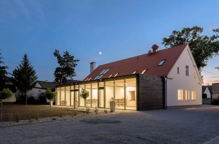
The project included the expansion of a former school building and changing its function to a kindergarten, as well as the conversion of an outbuilding into a children's workshop and day care center, while preserving the original historical layout of the building, its dimensions and details.
{The architects have preserved the original layout of the building, its dimensions and details,title=architects have preserved the original layout of the building, its dimensions and details}
architects preserved the original layout of the buildings, its dimensions and details
photo: Stanislaw Zajączkowski
Into the original outline of the exterior walls of the former school, the architects introduced a new functional layout with new interior walls, ceilings, floors and roof. Due to space requirements, it was necessary to expand the original block - the architects decided to introduce a new, contrasting glass part with the kindergarten building, through which the original facade can be seen. The different materials used in the two parts, according to the project's authors, emphasize their spatial and temporal distinctiveness.
The 


The new part contrasts with the traditional body of the kindergarten
photo: Stanislaw Zajączkowski
a window on the world
When designing, we wanted to create a space for users that is inspiring and allows for the most optimal development. We believe that it is a vessel whose "shape" can promote children's development, happiness, foster self-esteem. This vessel can be a window to the world and give a sense of security, provide emotions, be an experience for the senses, a matrix for the future understanding of the world, a source of identity," write architects from the PORT studio.
A small outbuilding located on the plot, which was originally intended as a workshop for children, also gained the function of a day care center during the design process. In the places of the existing openings and gates, the architects introduced glazing to illuminate the multifunctional space, restored the unpreserved vaults as concrete, and added a vestibule with space for a sink and toilet.
interior of the community center building
photo: Stanislaw Zajączkowski
Although from the outside the blocks have traditional forms - the existing buildings are small objects on a rectangular plan covered with a gabled roof, and the new part is a glazed cuboid - inside they are full of various spaces adapted to the needs of the youngest, variable heights andunusual places for play or rest - openings in the walls can be a point for interaction or seating, glazing between the rooms gives the opportunity to look into inaccessible nooks and crannies, and from the usable attic you can reach the first floor thanks to.... a slide!
The interiors are full of a variety of spaces, changing heights and unusual places to play
photo: Stanislaw Zajączkowski
a building that tells a story
The buildings in many places tell a story and create unusual images - on the preserved fragments of the walls they reveal their structure - sometimes it's a fragment of an old lintel, sometimes it's a bricked-up or repointed wall. Thanks to this, as the authors of the project emphasize, they affect various senses - the building shows its roughness, the smell of natural material, change, aging. The roughness of the materials can also be seen on the floors, walls and ceilings - the imprint in the concrete topping that wraps the building shows what kind of formwork was used, and on the ceilings and vaults one can see the grain of the imprinted boards.


attic with exposed brick
photo: Stanislaw Zajączkowski
In a world today that is often supernaturally overstimulated, overwhelming with a plethora of information and products, perhaps a building can help us learn to appreciate contact with nature, naturalness, simplicity, our own identity. Understand the way things are constructed and the nature of things. Create a good frame and atmosphere for building the first good relationships," the project's authors conclude.
Ola Kloc: In the project you decided to preserve the original layout of the buildings, the houses' dimensions and details. What does your design process look like when considering historic buildings or their remains?
PORT: We try to preserve what we consider to be of value. Here those values were many, we liked both the buildings and their layout, the space between them, the relationship to each other and the history. We would also like to show young users how the buildings live and change, and how the basic structural elements function.
interior details
Photo: Stanislaw Zajączkowski
Ola: You expanded the old school building, traditional in form, adding a modern body, glazing, what influenced this decision?
PORT: The expansion was a necessity due to the insufficient space of the existing building, but we wanted to still read the original building along with its historic facade. We can see the original facade through the glass wall. We also wanted to diversify the spaces in the interior, to create a more introverted space and something like a warm courtyard - a space where we have contact with nature.
first floor plan
Photo: Stanislaw Zajączkowski
Ola: You have already designed schools and kindergartens, what is the most important thing for you in realizations tailored to the needs of the youngest?
PORT: We always try to create an inspiring, functional and beautiful space. We believe that space can help in development, forming a sense of value, discovering one's individuality. What kind of architecture we surround children with influences their further understanding of aesthetics, so it is extremely important to take designing for the youngest very seriously.


fragment of the interior of the added block
photo: Stanislaw Zajączkowski
Ola: What was the most difficult part of this project, and what are you most satisfied with?
PORT: The idea actually came pretty quickly on the spot, we knew what we wanted to preserve and how to do it. However, the existing buildings have a lot of surprises in them, and we constantly had to react and adjust solutions during construction. We're glad that it worked out.
Ola: Thank you for the interview!
