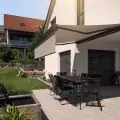
Thehouse in Koscielisko in the Podhale region is bathed in natural light streaming in through large glass windows. Who wouldn't want to cook in a kitchen open to the mountain landscape, and later bask by the fireplace in the living room?
The house in Podhale was designed by the Kucia Tyczynski architectural firm. The beautiful view stretching towards the mountains determined the way in which both the body of the building and the space in its interiors, full of light coming in through numerous large glazings, were shaped.
A lot of natrual light enters the kitchen
photo: Anna Michałek © Projekt Miejsce
reference to Zakopane villas
The interiors of the house were created by Projekt Miejsce. The space of the dining room and kitchen, linked to the living room as the center of family life and a place for social gatherings, was to be particularly bright - giving the impression of spaciousness and at the same time opening up to the mountain landscape. The glazing in this part of the house was inspired by the bright verandas of old Zakopane villas.
simple and minimalist bedroom space
photo: Anna Michałek © Projekt Miejsce
simplicity and functionality
The interior design is also an attempt to meet the imaginations of a pair of investors - owners of a furniture manufacturing company - for whom it was important to create a light, contemporary and functional space, of which the furniture would be an important asset. The main design goal was, of course, to create a coherent and holistic concept, which will combine simplicity of forms with functionality, but also give the impression of coziness.
Color accents add warmth
photo: Anna Michalek © Projekt Miejsce
mustard accents
The design focuses on using quality materials - hence the choice of stone countertops, veneers, stoneware and wood. The dominant colors are white, black and the color of natural wood. To warm up the interiors, upholstered furniture was introduced, including old refurbished armchairs and accents in mustard yellow.
elaborated by Dobrawa Bies
illustrations courtesy of Project Place


