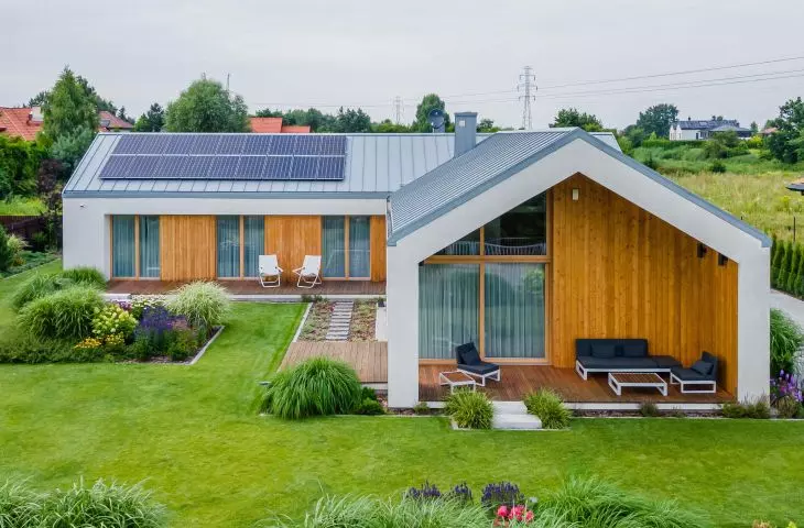
"Form follows function" - Referring to Louis Henry Sullivan 's maxim, designers from Z3Z architects studio, created a single-family house consisting of two blocks. The architects analyzed the needs of the investors - a family with a dog, and proposed a one-story building with a gable roof divided into separate parts - the living and the sleeping areas.
The house is divided into two blocks
Photo: Marcin Mularczyk © Z3Z Architekci
The layout of the house also allowed the architects to create two courtyards - one recreational one sheltered from two sides by the building and the other located in front of the entrance to the house. The white building blocks, differing only in length, take on the color of wood in place of the openings. The terraces are their continuation - they give the impression of being formed from a wall cut out and laid in front of the opening created after it.
One of the household members is a large dog
Photo: Marcin Mularczyk © Z3Z Architects
The front block with large glazed openings is the living area, with a tall living room with dining room and kitchen. The second block, hidden in the rear part of the plot, is the night part containing all the bedrooms of the householders.
living area with kitchen
Photo: Marcin Mularczyk © Z3Z Architects
interview with architect Mateusz Zajkowski
Dobrawa Bies: Today we are talking about a single-story house. You decided on a clear division into two blocks, which reflects the division of functions. Tell us, please, about the design work. What did you start with?
Matthew Zajkowski: The design work began with determining the appropriate location of the various functions on the plot - with regard to the location of the site in relation to the road and the sun. The garage was located deep into the plot so as to give space for daytime functions on the southwest side. The other functions and even the solids, i.e. day and night, were thus able to take up space on the south and west sides. It was natural for us to place the day block closer to the entrance and the entrance to the plot, and the night block more in depth, further west. Such a simple scheme was the development of the land and plot. We strive to make our designs as simple and understandable as possible, and therefore beautiful. So that this beauty is created by even obvious solutions. In order to translate these seemingly simple assumptions into solidity, a lot of details must be taken care of. There is a paradox here, because very simple solids, in order to look just that simple, must underneath, in the construction and technical solutions, contain a lot of complicated treatments.
zoning scheme
© Z3Z Architects
Dobrawa: The building is characterized by economy of form, its simple layout, gabled roof, and the wooden elements of the facade are the accent. Where did this decision come from?
Matthew: In a nutshell, in approaching the subject, we wanted a simple white block, after which "cut out", wooden elements are revealed. Wood was used in places where there is an opportunity for tangible contact with the building. Where we can touch the building, where we spend time next to the building. So that contact with the house takes place through a nobler, warm material.
The White House has several terraces
Photo: Marcin Mularczyk © Z3Z Architects
Dobrawa: For whom was the house designed? Did the investor have any special requirements?
Matthew: The house was designed for a family whose rather demanding member is a large dog. It was for him that the durable floor was designed. Other than that, the investor's requirements were not particularly strange, the cooperation was very good. It is worth noting the fact that, as one of our many projects, it was built without major changes from the first concept presented to the investor. It seems that we did our job well, because after collecting the necessary design guidelines, we presented a design that the investors fully liked. No other versions of the project were created, because there was no need for them, and the changes from the first initial concept were cosmetic.
minimalist interiors
Photo: Marcin Mularczyk © Z3Z Architekci
White House in the evening
photo: Marcin Mularczyk © Z3Z Architects
Dobrawa: The biggest design challenge and reason to be proud is?
Matthew: Certainly the biggest source of pride is doing your job well, that is, creating a concept that fully suited the investor. It is essential to do this by listening carefully to the investor's needs and being willing to address each of them, even if on the surface it seems very difficult or impossible. A reason to be satisfied with the results is also consistency in the creation of the solid and that calmness in the form. Seemingly simple, but requiring a lot of discipline in design.
Dobrawa: Thank you for the interview.


