There is no room for coincidences here. Clear plan, repeatable dimensions, carefully planned views, austerity of materials, harmony of verticals and levels. Jaime Gaztelu and Diego Llorente of the Spanish-Polish studio James & Mau talk about how the project of the House in Mława was created, the variety of the seemingly boring plan, perfectionism and the differences in the work of architects in Poland and Spain.
brick, concrete and nature
photo: Jakub Certowicz
timeless house
The James & Mau studio has taken the Polish architectural scene by storm this year! In March, the House in Mława, designed by a Spanish-Polish team, was presented at the exhibition of single-family houses of the Visegrad Group countries "V4 Family Houses 2021", and a few months later, in June, it won an award in thesingle-family residential building category in the SARP 2022 Award of the Year competition for, as we read in the jury's justification, modesty in the creation of solid geometry and consistency manifested at every stage of the project, from conception to implementation. The competition jury appreciated how brick and concrete interact, calling the House in Mława a timeless house. What is its secret? We asked its creators about it.
Ola Kloc: Both the plans, sections and elevations of the Mlaw House are a set of extremely precisely drawn lines, a harmonious arrangement of verticals and levels. What was your design process like?
Diego Llorente: It's a matter of time spent. Jaime is very orderly, he's the type of person who stresses seeing a projection of a house where the dimension on one side is 3 meters and on the other side is 2.99. He's very precise, and his way of designing is extremely accurate. And I think this order can be seen later in the drawings.
Jaime Gaztelu: When we started sketching, the first drawing was very simple. What emerged was a projection of a boring but functional house. And from that point we started to complicate it a bit to achieve different goals. The plot is very narrow, so in order to get better views and avoid the green corridors that would form between the house and the fence, we started to create more or less complicated variations. None of them worked, they were too convoluted. Finally we found a concept that had nothing to do with how it's drawn now. The idea in it was to create long corridors between the built-up volume and the fence, the boundary of the site, to connect the outer walls of the fence with the walls of the facade, and to yield external rooms. Later I took the dullest sketch I had and combined these walls in it. And suddenly the result was exciting, fun, complex, but with simple lines.
projection sketch
© James & Mau
A slight change in concept made the whole thing richer, but while maintaining and continuing its clean geometry. So we began to diversify a bit the concept of the walls that connect the perimeter of the plot to the building, in order to solve each of the spaces created. And so the pedestrian entrance is not the same space as the car entrance, two corners are created - one half-enclosed, the other open, similarly two gardens. Then there is the space of the exterior corridor, with which the garden forms a relationship. All these relations of interior and exterior, of being inside or outside, are built in a different way.
elevation sketch
© James & Mau
Ola: The intimate courtyards and cutouts in the walls make the volume create a sequence of frames. You have accurately predicted what you want us to see depending on where we look. There are no coincidences here, right?
Jaime: I had a lot of time [laughs]. I have a lot of sketches, for the courtyards and surrounding walls alone I created probably thirty drawings. I didn't like what was going on in one place, I didn't like something else, and what if the wall inside touched the wall outside? What if it didn't? What happens if the walls go into the garden? Won't the space become too much like Mies van der Rohe? No, I want the corners to be more closed. And so on... And so in the courtyards, for example, the corners are always closed, but the interior is much more fluid, more free, because it is ruled by the structure of the beams. The interior is a bit more restrained, more neoclassical, you can't see the roof. I wanted the space to be perceived as more permanent just by not having a roof. And all this takes time.
Intimate courtyards and cutouts in the walls make the volume create a sequence of frames
photo: Jakub Certowicz
Ola: Time well spent!
Jaime: It's easy to understand what rules work best in this language we invented. There are also small exceptions like towers....
The tower highlights the main entrance to the house
Photo: Jakub Certowicz
two towers
Ola: Exactly, towers, what function do they serve?
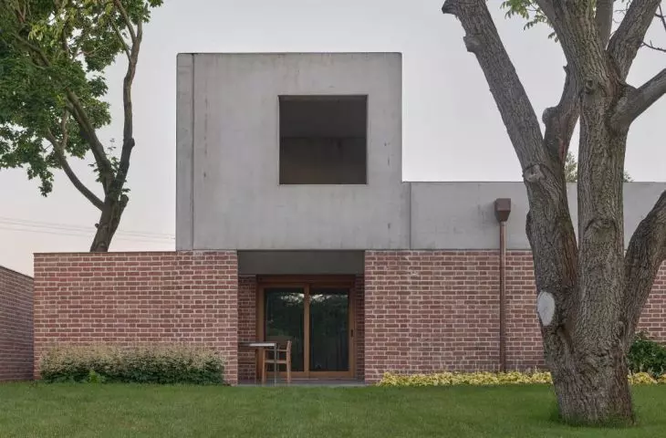
Jaime: They are an exception to the flat roofline. The shape of the house is a perfect rectangle of concrete, absolutely flat and three meters thirty centimeters high. However, there are two places where the relationship between the interior and the exterior is the greatest - these are the terrace and the entrance to the house. This is the transition between the open space of the city and the more intimate scale of the interior. But also this part with a higher elevation brings much more daylight into the space. If the roof had been flat throughout, the interior would have been dark, and so, thanks to the four openings in the towers, the sun comes in. And depending on the time of day we have light or shadow inside, this creates a greater richness of atmosphere.
The towers of the Mlawa House make it possible to recognize the building from street level
photo: Jakub Certowicz
The towers are the "icing on the cake", they allow you to recognize the house from the outside - the only thing you can see from street level are the towers, you don't understand what's going on, you only see the towers. Some people call the house a castle. So we made them to let you recognize the house from the outside, but they are also a transition to the scale of the city. Moreover, if they weren't there, the existing tree would visually "eat" the house. And now from inside the house you can admire the crown of the tree, if there were no holes in the tower, you would see the trunk itself. A beautiful frame is created. So we made it because of those relationships - with the scale of the city and with the tree on the lot.
Diego: There is a tree on the plot that grows leaning. It is located where it should be. If someone asks us: "where should the tree be?", the answer is: "here".
The architects took into account the existing tree on the plot in the design
photo: Jakub Certowicz
honesty of the material
Ola: The materials were left in their raw state: you used concrete and, on the terrace, bricks from demolition. What influenced this choice and selection of materials?
Jaime: It is ordinary brick as is, similarly precast concrete, nothing was touched.
Diego: I don't know if this only happens in Spain or all over the world, but it's really important for us to dignify the material, to not cover it up. We try to avoid that as much as possible, those layers, that plaster. Anyway, for example, in the office building we are currently finishing in Niepołomice, we left the porotherm bricks visible. It was a bit of a risky decision, but it looks great. In my opinion, a building should tell a story about something, you have to leave the installations more or less so that you can guess how they run, so that the ceiling slabs are clear.
Jaime: The client wanted us to use materials that are easy to use in the area. No steel, because locally they don't put a lot of steel up there, and no wood either, because, he says, it's not used much. So he wanted to use brick and concrete.
Carefully designed openings frame thoughtful views
Photo: Jakub Certowicz
Diego: Brick and concrete is a much more expensive choice than masonry with plaster, but there is no risk involved because it is a systemic solution. Still, the decision to put brick on the floor or to leave the ceilings visible or to make the entire section of polished concrete was a bit of a risk.
Jaime: Throughout the project, up to a height of two meters and twenty centimeters there is only brick, whether facade or porotherm type, load-bearing. Above that, both outside and inside is concrete. The difference is that inside it is in-situ concrete, and outside it is precast. If this were my house, there would be brick painted white instead of plaster on the inside.
Photo: Jakub Certowicz
Ola: As I understand it, the owners were not convinced by the idea of painting the brick?
Jaime: No, they didn't want to.
Diego: When you work with the material in its natural form, there are moments that you are afraid, because everything is very dirty, you have the feeling that you will not achieve the planned effect.
Earlier Jaime mentioned something that I think is one of the most important and unconventional issues. It is about the height of two meters and twenty centimeters, from the beginning everything in the project was at this level. The height of the fence is usually one meter seventy, practically at eye level. In Mława, however, a higher dimension was allowed, and this difference is very important.
Jaime: 2.20 is also the height of the windows.
Diego: Exactly. And it also makes sense that the beams are at that height.
Up to a height of 2.20 meters, the whole thing is made of unplastered bricks
Photo: Jakub Certowicz
Ola: You are designing another house in the same neighborhood. What makes them different? What did you learn from your first project in Mława?
Diego: I think they are very similar to each other.
Jaime: My father-in-law, when he saw the design of the house, said it was the same as the first one! In my opinion, they have nothing in common. The structural system is the same, but the outer shell will be all concrete, in this house you won't see brick at all. The house also does not meet the plot boundary, the floor plan is completely different and at the same time very similar.
Diego: Yes, the plot is bigger.
Jaime: The house, its interior, is cross-shaped, but the whole thing is a rectangle, it doesn't touch the outer boundary, it leaves three meters.
Diego: There are several concepts that are the same, an interior garden, an accent in the form of a tower, but the geometry is completely different. The plot also gives more possibilities.
Jaime: Every interior space has an exterior space to look at. Both houses had to be one-story, in such cases horizontal lines are always created. It seems to me that making sloping roofs there doesn't make sense, so we break those horizontal lines with something vertical.
Perfectionism and precision
Ola: What are you most proud of in the realization of the house in Mława, and what would you change?
Jaime: What are you most proud of? A little bit of everything, but most of all that the clients are happy there. The house pleases the clients, it pleases everyone who visits it, and it also pleases specialized magazines and the press, which doesn't deal with architecture, but likes the details. I think the project is very complete. What don't I like? There is one small detail, through no fault of ours, that arose during implementation, but every time I see it I get annoyed. It's silly, but it makes me sick when I look at it. It's about the part by the window that covers the side of the brick. It shouldn't be there, it should be at the back, then there wouldn't be this little skip. It creates an ugly shadow there. You can live with it, but it really annoys me. I also don't like the front door too much. But there is nothing that we really don't like. One of the things I like best are the pergolas. We added them at the end, at the last minute, if it weren't for them the house would be too much "behind the wall". One day, when the fence wasn't done yet, a neighbor on the small bench next door was clipping his toenails [laughs]. The customers were delighted with the sight - "this is the most wonderful thing in the world, you have to show it!". Initially we thought of a fence with brick louvers, but in the end I think what we did is more obvious - in front of each window there is a pergola of the same dimensions.
Pergolas of the same dimensions as the windows in front of them were placed in the fence
photo: Jakub Certowicz
Ola: Thanks to that, those picturesque images you designed even go beyond the plot....
Jaime: Yes, see, the windows measure 3.30 by 2.20, the pergola 3.30 by 2.20. You go to the kitchen - here the window is 2.20 by 2.20, and the pergola is 2.20 by 2.20.
view from the kitchen to the truss in the fence
photo: Jakub Certowicz
Ola: Precision!
Jaime: It looks like we suddenly became Swiss [laughs].
Ola: Spanish architecture is also very precise in details. You guys have been working in Poland for many years, do you see a lot of differences between the two countries?
Diego: One of the biggest differences is that here there is very little time to complete projects. The salaries are quite low.
Jaime: In Spain they are bad, here they are very bad.
Diego: The biggest problem in Poland, and this is the real cancer of architecture, is that supervision is free.
Jaime: In Spain, architects are paid 40% of the price for basic design, construction, 30% for detailed design, and 30% for construction management.
Diego: If you don't have construction supervision, you can't do everything right. And if you charge for supervision, people don't ask you to go. So you do it for free.... Projects that seem easy, the process of design work, to achieve something simple that works, requires many hours, trying endlessly, so that in the end the size of the kitchen fits perfectly into the bathroom next door, so that the installations do not form strange shapes.... These are hours that, on the one hand, for economic reasons, you don't have, but also, on the other hand, the client doesn't let you, doesn't give you that time.
Jaime: And in the design phase you have to synthesize, remove, remove, remove until the essence remains.
Ola: So on the one hand there is the time that you spend on the project, and on the other hand there is the investor who wants things quickly and cheaply.
Jaime: You have to explain things to the client all the time, until he gets bored with you [laughs].
view from the living room on the cutout in the fence
photo: Jakub Certowicz
Ola: There are studios that bill clients for hours of work, that way they avoid a lot of changes in the project.
Diego: In our case, we are our own executioners.
Jaime: We are our own enemies.
Diego: In all our current projects, clients have said "enough is enough, it's already good" long before we did.
Ola: So you are perfectionists.
Jaime: Yes, we may not be perfect, but we are perfectionists.
Ola: Thank you for the interview.


