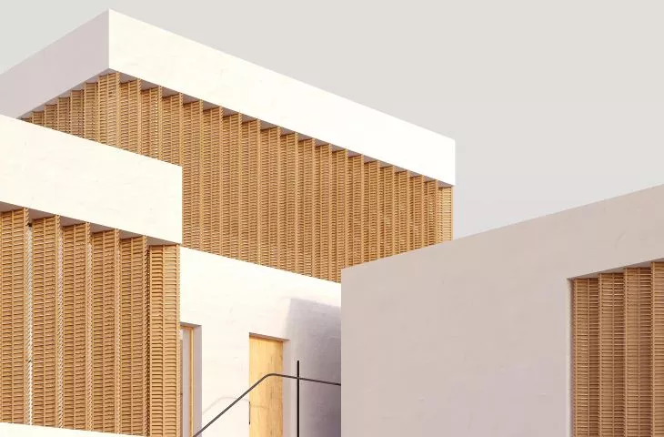
Simple in its expression, the hotel, inscribed in the hillside of San Miguel Alto, is a proposal by Anastasi Lupach. The young architect, while on an Erasmus exchange in Granada, inspired by traditional architecture, beautiful views and the Spanish climate, created a design for a building from which one can admire, among other things, the Alhambra.
The hotel project by Anastasi Lupach was created during an Erasmus exchange as part of a class at the Escuela Técnica Superior de Arquitectura de Granada. Granada is a city located in the very south of Spain, famous for its warm climate, its thousand-year history, the Alhambra and its hilly location.
The author placed the hotel project on the hillside of San Miguel Alto
© Anastasia Lupach
hotel in Granada
Inspired by the Spanish landscape, the author decided to place the hotel project on the slope of San Miguel Alto, overlooking the entire city and the Alhambra. The surroundings of the site are very interesting - on the hillside there is a small church of San Miguel Alto, an observation deck, and the territory itself is surrounded by the ancient Nazari wall, which protects part of the slope overlooking the city. On the hillside are the so-called casas cuevas (cave houses) - a type of house housed in hollowed-out caves, where the walls are covered with lime. Such a cave offers the best view of Granada.
I realized that the history of this place, its uniqueness and authenticity is the first and most important thing that can attract tourists to this place. That's why the architecture itself receded into the background, and I tried my best to preserve the atmosphere and aesthetics of the place. I wanted the design to be delicate and not spoil the view of the San Miguel Alto slope, which is visible from almost anywhere in Granada," says the author.
The main design inspiration was Spanish cave houses and the desire to fit the building into the terrain
© Anastasia Lupach
inspiration from tradition
The main design goal was to create a small hotel, placing it within the Nazari wall and fitting it into its relief. Since the height difference in the terrain is about 20 meters, the architect had to take into account many factors, such as lighting, communication and construction.
However, all the intricacies and problems of the hotel's location were rewarded by the incredible view that unfolds from it. It's a rare opportunity to design a project in such a beautiful location," adds Anastasia.
The design premise was to create a building with a delicate expression that captures the aesthetics of the place
© Anastasia Lupach
Thinking about the concept of the building, the author realized that she should design something delicate, but at the same time reflecting the aesthetics of the place. Her main sources of inspiration were three elements she observed in the project area. The first was typical cave houses, whose clear typology influenced the concept of organizing the living space. Another aspect was the space in front of the house where people gather. The combination of open and closed zoneshelps create an atmosphere characteristic of Andalusia. The third important element of the design is the combination of different types of activities and users. In this way, the architect wanted to create a place that reflects the local culture, where people gather, regardless of their cultural background.
cubes scattered on a hill
Anastasia Lupach, as the design base for the hotel, adopted the concept of a cave house, whose rooms are located around the main patio. Three cub es of different sizes form the base of the building. They were arranged around the patio in such a way that they fit well into the terrain and provide unobstructed views of the city.
After creating one such group of buildings, I placed the rest of the cubes using the same technology, creating an abstract drawing of cubes on the surface of the hill. This abstraction was the right decision, because the space between the cubes gives the project air and freedom; the houses are clustered around the patio, but do not belong to it," the author explains.
The cubes that make up the building were arranged around the patio
© Anastasia Lupach
Three of the four types of cubes have two levels inside. The first houses a small kitchen and toilet, while the second houses a bedroom, which opens up a view of Grenada through a panoramic window. The construction of the buildings was done by using traditional masonry. Brick, which is the main material, is covered inside and out with white plaster, traditional for the region. The interior is simple and minimalist through the use of wooden elements and terrazzo on the floor.
To protect guests from the hot Spanish sun, the architect used adjustable window blinds that can open and close depending on the time of day.


