materials and details
Eliza: What materials were used in the project? Were there any changes here from the conceptual stage as well?
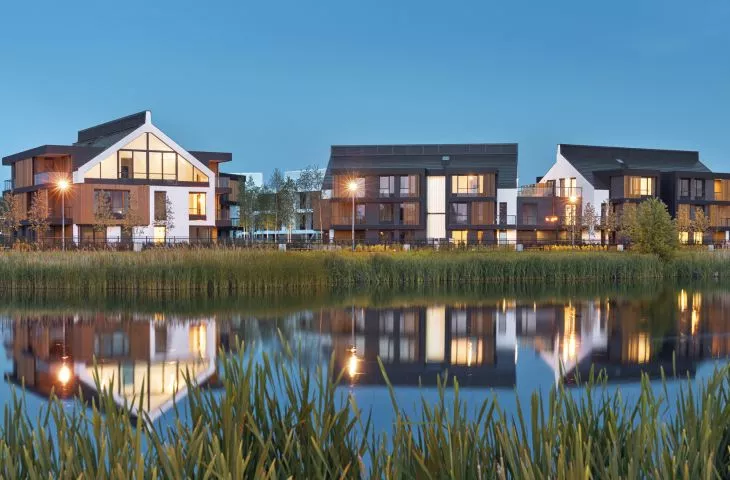
Marek: I am a proponent of the sincere use of materials, i.e. not using one material to imitate another. In the project we used natural materials, for example, raw-looking ceramic brick with very elongated proportions, the color of which is adapted to the color scheme of the building: tar black or light gray. The second widely used material is natural wood. We have used it as cladding for balcony niches, i.e. places on the façade with which residents have direct contact, as construction and finishing material for sliding shutters, as an obscuring element for pergolas, finishing material for floors of outdoor relaxation zones or bridges over water assumptions, in landscape furniture and others. Wood is also present in an educational playground for children. The third material is raw concrete, which we have consistently used in all landscape forms: retaining walls, troughs and reservoirs of water assumptions, elevations of the (underground) spa/fitness building and others. We have also used galvanized steel - it is found in nets for climbing plants on the facades of buildings, as structural material for trellises ("green walls") and pergolas, the structure and part of the floors of bridges over greenery and water assumptions. The gabled roofs of the buildings are covered with simple ceramic tiles, white or anthracite, as required by the local plan. I will admit that it was difficult to find good quality white clay roof tiles, this is a topic for a separate story.
Working on the project, we limited the architectural diversity of the buildings from the competition concept, disciplining the number and type of materials used, to the benefit of the completed project.
Eliza: In the project you solved the detail of the chimneys in an interesting way.
Marek: Thank you. The design of the chimney walls crowning the gabled roofs was a complex detail. The apartments were equipped with mechanical exhaust ventilation, which made it possible to freely bend all the ducts in the attic space above the top residential floor and align them linearly along the ridge. The duct outlets are enclosed with a continuous openwork enclosure. This made it possible to replace all chimneys and exhausts with one long chimney, which organizes the body of the building. As a result, we have a solved detail that we could adapt to our other projects with pitched roofs (laughs).
The folded shutters form a continuous openwork screen, with no clear sash divisions
Photo: Marek Łańcucki © MAARTE
Eliza: Sliding shutters are also an individual solution?
Marek: Yes - like virtually every detail in this project. It was a real design challenge, both for us and for the contractor. The shutters, by design, are meant to obscure the windows and balconies of the apartment in question from the sun and the outside view, while providing an unobstructed view of the outside. The ribs of the shutters' sashes are made of solid wood with a cross section of eight by four centimeters with an eight-centimeter gap between them, which made it possible to meet the basic assumptions. The shutters are of mixed wood and steel construction, and are hung on custom-designed guides. We wanted them to be easy to move by hand, while protecting against unwanted movement caused by gusts of strong wind, common in the Tri-City. The folded shutters form a continuous openwork screen, with no clear sash divisions.
Eliza: The Botanica estate is undoubtedly a premium residential development. In the functional layout, rooms with rare functions have appeared in the common spaces....
Marek: Yes, indeed, it is probably a bit of an unusual estate. In the landscape, we have a custom-designed (Landscape Studio) educational playground, there is an outdoor fitness area, a tennis court, a multipurpose court. There is also a spa/fitness building, which was an important functional requirement of the investor, as well as a DIY workshop room - fully equipped with tools and all the aids, a paradise for anyone who likes to tinker. Next to it is a separate room where you can wash and vacuum your car or motorcycle. There is also a uniquely original kite drying room for kitesurfing, which any lover of the sport will appreciate.
spacious gym
Photo: Marek Łańcucki © MAARTE
Eliza: The interiors of the spa/fitness building are also your design?
Marek: No, the interior design was created by Studio LOFT. This building shows well the interplay of elements designed by architects, interior designers and landscape architects. In preparing the concept for the building and interiors, with skylights and outdoor patios, we were responsible for the architecture, construction and installations. Then the interior architects got to work, interpreting the assumptions in their own way and designing these amazing interiors. In turn, the landscape architects shaped the outdoor patios, developing their layout and designing the greenery.
The spa/fitness building, by design underground, relates to the landscape concept with its prominent broken roof form. Although underground, it is wide open to the surroundings - thanks to two patios and two skylights. The patios open from the clubroom and the exercise and relaxation room, providing a glimpse of the outdoor greenery in the line of sight. The skylight in the club room transitions into a wide wall clad entirely in mirrors, visually enlarging the interior and reflecting the climbing vegetation. In turn, the second skylight, above the relaxation room, illuminates a glass cubicle with a tree, which is the heart of the establishment. Relaxing after a workout or sauna, we have the impression of being among the greenery.
Eliza: What did you pay attention to when designing the apartments? What structure of apartments dominates the premise?
Marek: We paid special attention to the possibly perfect functional layout of the apartment, so that, being a contemporary "cave", it would meet the investor's requirements and, above all, the expectations of the future resident. Also important was the resident's contact with the outside world, i.e. the view from this "cave": individual, allowing to feel the identity of the place, interesting, changing throughout the year, to give a sense of security. We achieved all these aspects through a jointly developed landscape concept.
The apartments range from small, two-room apartments to very large ones with terraces. All of them are provided with interesting views of the surroundings, and some of the apartments at the gable walls have very large glazing, allowing us to create interesting interiors. I'll admit that in such apartments the open, high space of the living room is really quite impressive.
"Green walls", obscuring the gardens of first floor apartments
Photo: Marek Łańcucki © MAARTE
Eliza: Greenery plays a special role in the premise, in line with the garden city idea you mentioned. Please tell us more about the landscape architecture of the estate.
Marek: The Botanica Jelitkowo estate is another of our projects, where we had the opportunity to widely create the space of the estate with the full understanding and support of the investor. When planning the internal urban layout of the estate, we designed landscape axes shaped like the broken line of a naturally meandering "river" - water assumption. The cubic volumes of the above-ground parts of the buildings were located in reference to the line of the "river banks": gentle, green with a flat surface covered with grass and small shrubs, and steep, shaped by "green walls" of trellises and hedges and "islands" of trees. "The river" leads residents to their homes and "flows" into the (retention) reservoir, which was intended as an ideological continuation of the establishment; here we proposed two piers and a floating barge club/café for residents.
Eliza: The greenery project was developed with Landscape Studio - how was the cooperation? Did you have an influence on the shaping of the various elements of the "green spaces" between the buildings, or did you rather leave the design freedom to the landscape architects?
Marek: The cooperation went very well, at least we think so (laughs). The landscape architecture studio was chosen independently by the investor. For some time we intensively discussed the concepts of the Landscape Studio in the context of our idea from the competition design, achieving general and detailed solutions close to our original idea. We are pleased with the excellent selection of plants, their impressive number and variety. The greenery perfectly complements the landscaping elements we designed: water assumptions, pergolas, trellises, walls, bridges, nets and support structures for climbing plants. Landscape architects have solved the outdoor relaxation zones very well, and the educational playground is perfect in my opinion. Greenery comes in the form of flat green roofs and grasses, dynamic forms of shrubs and trees, vertically growing vines. In the interior of the fitness area, the greenery blends with the surroundings and even shapes the internal landscaping. The abundance of flowering plants also contributes to creating an insect- and bird-friendly space.
An individually designed educational playground for children by a landscape architect
Photo: Marek Łańcucki © MAARTE
Eliza: What difficulties did you encounter during the design and subsequent implementation? Did you use non-standard technologies and solutions in the design to protect the building or, earlier, the excavation from the difficult soil and water conditions often encountered in the immediate vicinity of the sea?
Marek: The landscape location of the buildings influenced, among other things, the solutions for the projection and construction of the garages, forcing the foundation of the above-ground volume parts on thick transfer slabs. The slabs also add weight to the structure displaced by ground water. Difficult soil and water conditions and high groundwater levels required special protection of the excavations with a DSM-type palisade. In case of heavy rains, the entrances to the garages were secured with systemic removable bulkheads, the so-called shandors. Retention basins were also created.
Eliza: How do you assess the result? Is it satisfactory?
Marek: Yes, we are very satisfied. For this success I would like to thank all the co-creators of the project, especially the architects from my studio, landscape architects, interior architects, tradesmen, contractors and the investor. The first stage of the estate has been completed, the second stage is under construction, but we can already say that an exceptional project has been created. We engaged creatively to the best of our ability, designing not for the shelf, but for implementation. A very important role was played by the author's supervision, discussing all the relevant details or rehearsal of 1:1 scale models. I believe that the most important task of the architect is his active participation in the implementation process.
The first stage of the development, which was built in the summer of 2019, already lived to see its first award in the fall: it won in as many as two categories (out of nine) at this year's PLGBC Green Building Awards 2019: "Best Green Multifamily Residential Development" and "Best Sustainable Interior."
Eliza: Thank you for the interview.


