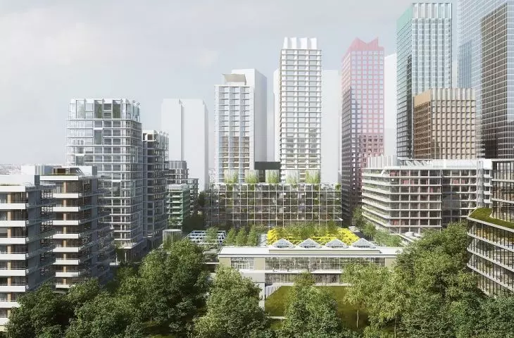
Towarowa 22 is a huge potential in the heart of the intensively expanding Wola district. The new office center of the capital has a chance not to repeat the mistakes of Mokotow's Mordor. Not the Copenhagen-based BIG, but the Warsaw office of JEMS will design a new district on the site of the former printing house. The investment has a chance to blend into the urban landscape or become an enclave of the rich.
The success of this project will be determined by the architectural design, the investor's approach, but also the city's policy. Warsaw authorities must secure the interests of their neighbors as soon as possible and start investing in the public spaces of this part of the city. Since 2004, officials have failed to develop a Local Development Plan for the area, so the field of action is limited. This makes it all the more important to have a responsible housing policy, to counter gentrification and exclusion. The city should also use tools such as Article 16 of the Public Roads Act, forcing developers to invest in infrastructure that will benefit users of the newly built quarter.
BIG's celebratory architecture
In 2019, the developer first presented a design for a new development on the site of the then still operating Jupiter Shopping Center. The preparation of the concept was commissioned to the BIG studio, led by Danish starchitect Bjarke Ingels. The designer, who seems to have put the best years of his business behind him and has recently been known mainly for his work with right-wing populists of the likes of Jair Bolsonaro, proposed a solution from his firm's permanent repertoire of forms. Above a building enclosed by a roof in the form of grassy knolls, the rectangular blocks of sky-high office quarters, supported only by slender pillars, were to almost levitate.
© Bjarke Ingels Group
The proposal received incomprehensible support from the local environment. This is because it seems that under the green cloak and celebrity PR, the real dimension of the development was then successfully hidden—that is, the construction of one of the capital's largest shopping centers, a closed complex set in the reality of twenty years ago. Fortunately, this concept will not live to see implementation, although some of the urban layout presented by BIG can also be found in the JEMS concept. These include the arrangement of quarters or the characteristic breakdown of residential development into smaller blocks building irregular quarters and a central green space.
House of the Polish Word
photo: Wistula © Wikimedia
changing optics
That green space is crucial to the image success of such large, complex projects has two main reasons. First of all, in recent years, the theme of nature in the city has become dominant in the discourse on friendly living space. Concepts that were acceptable a few years ago are becoming the object of crushing criticism today—something that has happened to, for example, Five Corners Square, and will soon probably also befall the Polish History Museum complex. Concrete in 2023 will no longer pass, and by surrounding the project with lots of greenery, it is easy to hide the real intentions or problematic aspects—something BIG already knew how to exploit.
© City Is Ours
The second reason is the location itself. Wola is a district of Warsaw with one of the longest access times to parks in the entire capital. This part of the city lacks arranged green areas, the largest of which is hard to consider as a recreational space, as it is the Powazki cemetery. Not surprisingly, the new green space may become an important aspect for the neighbors of the development, who will thus more easily accept its scale and impact on the neighborhood.
greened infrastructure
The park itself in the JEMS project, or rather the large square at the heart of the establishment, is, moreover, a formally interesting proposal, drawing on the history and substance of the site. The designers used elements of the halls of what was once Poland's largest printing house to create new outdoor spaces. The Polish Word House is to replace the Polish Word Park with elements of the former halls' construction.
visualization of the park
© JEMS / ECHO / AFI
We are also keen to take advantage of the historical heritage. We propose to use the structural elements of the most interesting factory h alls as a base for a modern, multi-level urban park, a green enclave that is missing in Wola. This is a unique architectural solution on a European scale, which shows a completely different perspective on the use of the historical character of the buildings", explains Maciej Rydz, partner at JEMS Architekci.
The designed green space is thus to be a complex, multi-level structure with elements of former buildings intertwined with plants. In the case of this type of establishment, the key is the selection of plants, the maintenance and growth of which will not require huge amounts of energy, care or irrigation. The second issue is the historicity of the establishment and how much of the original fabric will actually be preserved, and how much of the designed elements will be mere dummies and pastiches of historical solutions. This concern is not unfounded, as strolling through the nearby Norblin Factory or Powisle Power Plant, it's hard to resist the impression that these are brand new retro-style buildings, rather than historical matter.
© JEMS / ECHO / AFI
artificial cityscape
Thesense of artificiality of these gentrified places doesn't just come from the all-too-new and clean architecture, devoid of vintage qualities. It's also the functions and curated, investor-supervised range of service establishments found in developments like the Warsaw Breweries. Selected restaurants, a street of grocery stores of the most popular franchises, chain cafes and pharmacies, expensive boutiques and pastry shops. All with black-and-white signs with consistent dimensions, fields of protection and location. It's difficult to strike a balance between orderly urban space and the artificiality of a shopping mall in such conditions. What differentiates a public space from a mall is primarily the purpose of its existence and the approach to those who use it.
street visualization
© JEMS / ECHO / AFI
In department stores, design enforces consumer behavior, conquers sales, exposes merchandise and displays. In a public space, everyone should be equal, it should be open and accessible to a diverse group of users. It should provide for free the ability to meet basic physiological needs, but also the opportunity to express oneself or manifest views. Will it be possible to hold a protest in a private urban space in a quarter managed by a single developer? Will indigent people feel comfortable there?
A diverse group of the same people
And here we come to the question of what is a good city and how to design it? For first and foremost, it must be a structure that is diverse not only spatially, typologically and functionally, but also socially. And this is difficult to expect from the complex designed by JEMS.
visualization of the premise
© JEMS / ECHO / AFI
For me, a city is real when there are stores where you go down to get rolls in the morning, when ladies with their dogs come out and chat with their neighbors, and when local "lumpy" people sit under the tree. And this does not mean at all that it is dangerous. I'm talking about the typical structure of the city, where society was mixed. You lived with professors, you lived with an official and you lived with a guy who collected bottles and scrap metal, " Magdalena Jaskiewicz, an urban planner and long-time head of the Office of Spatial Planning in Krakow.
Buildings with apartments, offices, rental housing and services needed on a daily basis are to be built around the Polish Word Park. And although the housing offer is seemingly diverse, it is aimed at the affluent middle class and the rich. This is because we don't have mechanisms in Poland, such as those in place, for example, in France or the UK, which would force developers to transfer a portion of the apartments under construction to the municipal stock or for cheap rent. In this context, an appropriate policy of the city authorities is extremely important, which should counteract the gentrification of the neighborhood, the jump in rental prices of apartments and the move out of less affluent residents.
broader context
Towarowa 22, visualization
© JEMS / ECHO / AFI
What the city should also take care of is the broader context of the investment. The part of Wola through which Towarowa Street runs is a rapidly expanding office district with glass skyscrapers and more food halls. However, it lacks high-quality public space and infrastructure. The central point of the neighborhood, the Daszyński traffic circle, is a scaled-down interchange without any form. It is pure traffic engineering and road design based on assumptions and models from decades ago. In fact, the same can be said of the streets approaching the traffic circle. Multi-lane urban highways, narrow sidewalks and repeated collisions between pedestrians and cyclists caused by poor solutions in this area make it unpleasant to be here.
Daszyńskiego traffic circle
photo: Emptywords © Wikimedia
The new quarters filling the district, such as 22 Towarowa Street , but also the existing Warsaw Breweries, the 19th District or the planned development on the Polfa site designed by BBGK on behalf of NOHO, will never begin to form a coherent whole separated from each other by such barriers. It is necessary to tie the neighborhood together with new pedestrian crossings and bicycle crossings in the axes of smaller streets and shorten access routes between important points of the neighborhood.
Nowa Towarowa—visualization of the square near Daszyńskiego Roundabout
© Zarząd Zieleni w Warszawie
The need to create street spaces as public spaces rather than road infrastructure. The concept of Nowa Towarowa was such an attempt. It was a joint effort of the Wola Museum, the Warsaw Branch of SARP, the Stocznia Research and Social Innovation Studio and two developers. Through a series of workshops and public consultations, a program for transforming the surroundings of Towarowa Street was developed. Unfortunately, the implementation stage never happened, and the only traces of the initiative at the time are the greened sections along the streetcar tracks.
plan
© JEMS / ECHO / AFI
best practices and critical analysis
The recently completed Browary Warszawskie complex, also designed by JEMS Architekci, shows that the studio can be trusted in matters of urban composition and structure. The quartet has harmoniously filled a gap in the development, become a keystone of several torn parts of the district, a popular place for strolls and marked out new traffic routes. What the Brewery lacked was sensitivity to social aspects and a certain amount of spontaneity, which creates an authentic atmosphere of the place.
© Browary Warszawskie
In a managed space with a curated offer, there is no room for randomness and unpredictability. Nothing there depends on its users, but rather on the developer's marketing concepts. Do these types of projects have the potential to foster community building and care for a common place to live? They can have—but the conditions must be met, ensuring not only aesthetic and spatial diversity, but also social and economic diversity, which will create the conditions for a more inclusive urban space to function.


