We usually read about interiors already completed. We admire the effect of architects' work, comment, write down ideas and solutions that will work in our apartment as well. So we forget that arranging a space requires a great deal of commitment, work and problem-solving on the part of designers. The interior of the house located in the vicinity of Bródno Forest posed many challenges to the architects from the beginning.
When an architect encounters an obstacle or difficulty while working on a project, he usually has two options. Either try to level it or hide it, or turn it into an asset and a distinguishing feature of the realization. Designers from the Warsaw studio KAEL Architekci, designing the interiors of the house located near Bródnowski Forest, consciously chose the latter option. Thanks to this, the uncluttered ogee in the living area gained wooden laths, the replication of which in other rooms, defined the character of the realization. And this one is best reflected in the word "concrete". It is so thanks to the geometric shapes of the furniture, expressive colors, but also bold decisions of the owners.
The uncluttered oval in the living area gained wooden laths, the replication of which in other rooms, defined the character of the realization.
photo by Rafal Chojnacki
The investors, with a taste for minimalist, cubist buildings, were not convinced by this solution. Connecting the living room with the dining room, the wall shaped in an arc - as it is referred to - actually required a well-thought-out concept, so as not to affect the character of this interior. Pawel Kranz and Michal Litwin, founders of KAEL Architects, decided to approach it as a challenge, which resulted in the idea of building it up with a series of wooden fins, with the clearances between them giving lightness to the curve. This required close cooperation with a carpenter, a lot of time and a few inevitable adjustments. But the result proved worth all the effort - the ribbing outlined the stylistic course of the rest of the interiors of the 140-square-meter house. It is also set by geometric forms of furniture and decorations and a strong but elegant color scheme.
Its choice was also left to the architects, and having a clean slate, they filled it with a noble color palette. From the emerald green of the sofa and carpet in the living area, which corresponds with the vegetation of the garden separated by the opening glazing, through the light wood of the floors and trim, to the white base contrasting with parts of the wall and ceiling in graphite.
working comfort, living comfort
The owners also relied on architects for the design of the staircase, both the stairs and the handrail of which are made of white resin, creating a form that looks remarkable against the dark background of the walls. This striking solution is at the same time quite demanding in terms of maintenance, but the owners took a brave approach, agreeing to the designers' proposal.
I make no secret of the fact that this is an exceptionally comfortable situation for the architect, when, using his creative freedom, he can fully realize his design assumptions ," says architect Michal Litwin, and Paweł Kranz, the other co-founder of KAEL Architects, adds: "But for such cooperation to be successful, in addition to trust on the part of the investors, it is also necessary to have a responsible approach on the part of the architect and his sensitivity to the needs of the residents.
In this case, all these conditions were met, as the owners are satisfied today that they were not frightened by uncompromising solutions. Their awareness was perhaps due to the fact that the investor herself is a co-owner of an architectural studio, which KAEL Architects sees as quite a recommendation. The kitchen, which is a separate room, is, for a change, rather conservative in its minimalist design. The black kitchen cabinetry is juxtaposed here with white wall cabinets, and a light marble panel is used between them. Nevertheless, the limited means of expression, do not deviate from the aesthetics of the living area, where attention is also drawn to the white fireplace with a simple shape, perfectly facing the cubist form of the staircase.
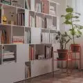
They are united by the motif of wooden slats, in the bedroom placed on the wall above the head of the bed, and in the study juxtaposed with bookshelves
Photo: Rafal Chojnacki
The dining room - a relatively small space separated from the first floor plan - takes a breather thanks to the use of a tall sideboard with mirrored fronts. Reflected in them is a table with chairs of interesting geometry and equally original lighting, where a semicircular flower pot hangs next to round white lamp globes. If we add to this that one of the walls of the dining room is formed by a spacious glazing with an exit to the terrace and a view of the birch trees growing in the garden, it turns out that the modest size of the room is no limitation. As in the case of the bathroom, for the needs of which a small space under the stairs was used, and optical enlargement was provided by glossy slabs of light marble combined with white walls.
stylish rooms
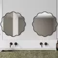
The color scheme of the other two bathrooms - we are now moving to the first floor - is closer to the warm tones of wood motifs, and one of them, lined from the floor to the ends of the walls with beige marble, impresses with its irregular pattern. On the first floor, in addition to the no less stylish children's room, there is also the owners' bedroom and a study for work, which - while fulfilling completely different functions - are at the same time very consistent with the interior architecture of the entire house. They are united by the motif of wooden slats, in the bedroom placed on the wall above the headboard of the bed, and in the study juxtaposed with bookshelves so that the work desk stands against them.
Lined from the floor to the ends of the walls with beige marble, it delights with its irregular drawing.
Photo: Rafal Chojnacki
It is complemented by furniture built in black and only slightly lighter gray walls of both rooms. The atmosphere of the bedroom is built up by the softness of the materials used for the upholstered bed, bedding and curtains, also in shades from the gray palette. In this and other rooms, every element seems to play its role perfectly, leaving no room for coincidence. The architects and founders of the KAEL studio explain that they took care of the "Ostródzka" project holistically: from the first sketches of the architectural concept to the final touches in the form of art selection. As a result, abstract monochromatic paintings and artistic black-and-white photographs are the perfect punchline for the interior architecture of this house with character.


