Architects from the MOOMOO studio were faced with a difficult task. The building they designed was to stand on a plot of land where flat-roofed houses could not be built. However, the investors set a condition - since there must be a sloping roof, do everything so that it does not resemble a barn!
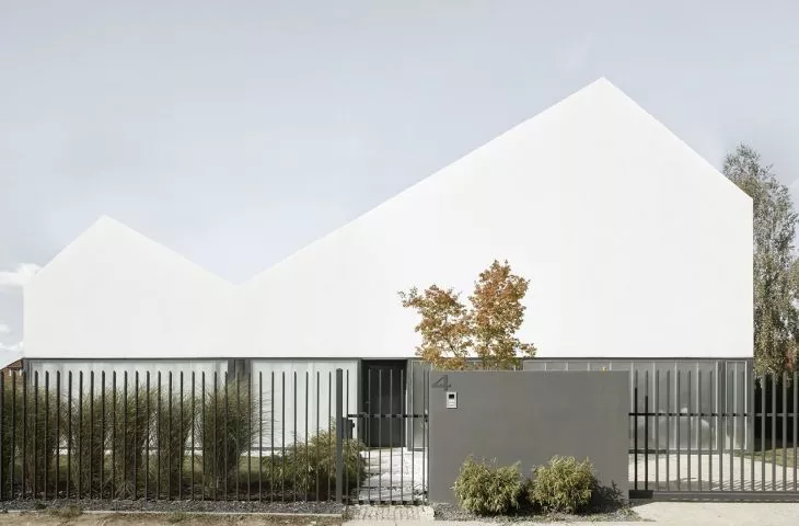
Thewhite house in Lomianki near Warsaw is a minimalist block with a multi-sloped roof and an interesting layout including an atrium. The architects, referring to the guidelines, designed a membrane-finished roof, which from the entrance to the building draws attention to the double slope of the white facade. The use of spacious glazing visually divides the building into two horizontal zones - a white plastered first floor and a transparent bottom.
The building is visually divided into two horizontal zones
© MOOMOO
Dobrawa Bies: What was the main inspiration for the project, what is the shape of the block derived from? What were the expectations of the investors?
Jakub Majewski: The building was being constructed on a plot of land where flat-roofed houses could not be realized, so reconciled with this thought, the investors set a clear goal - if there has to be a sloping house already, then do everything to make it not resemble a barn! One of the residents is a person concerned with modern technology and likes clean, minimal forms, so a very important element of this house is the roof covered with a membrane and finished with a white facade. Of course, you can't see the form without understanding the functional layout of the house - this was a big challenge, because when sitting down to the project, we already knew that it would be optimal to have a larger living room with a kitchen, and an additional room on the first floor, but the building factor imposed by the Local Development Plan was pushed to the maximum.
The difficulty was to make the roof of the same material as the facade
© MOOMOO
Dobrawa Bies: What was your priority in this project?
Jakub Majewski: It became a priority to look for solutions that would balance the deficiencies of the plot. We had to "conjure up" an additional room for which there was no permission from the office. So we created a patio, around which are walls of glass facade windows. The patio was placed between the living room and the study, and a system of sliding high windows allows residents to use the patio during warm days as an additional virtually domestic space. This solution was intended to help in one more situation - when work in the study did not require the greatest concentration, parents could have constant contact with their children and the terrace became a place for games and play. On the other hand, when work required more attention, it was enough to close the two glass wall systems, pull the blinds and cut off from the rest of the house.
paito surrounded by a glass facade
© MOOMOO
Dobrawa Bies: What posed the greatest design difficulties, and what are you most satisfied with?
Jakub Majewski: The biggest difficulty ten, eleven years ago, when we designed this house, was to find - back then - the technology that would allow us, in a pure form, to realize the white roof in the same material as the facade, and to change the attitude of window manufacturers to realize the glass-polycarbonate facade of the first floor, including the garage door. Now it's 2020 and we have completely different support from the company and manufacturers of custom solutions, but just a few years ago it was quite a bold design move.
Also read about the interior design by A88 and Tomasz Szponar, which complements the minimalist architecture of the house.


