In the recently decided Architecture of the Year competition of the Silesian Voivodeship, the award in the interior category went to the 8486 Architekci studio team for the space arrangement of a single-family house in Katowice. What distinguishes this Silesia's best interior?


green furniture box scala interior
photo: Bartosz Dworski
cube anew
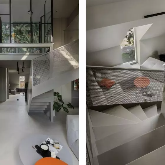
The starting point for the work was an existing single-family house - a cube from the 1970s - in need of extensive reconstruction. During the renovation, the first floor level was deepened, fragments of the walls were demolished and an additional space of nearly 40 square meters was added in the first floor section, where a ceiling skylight (of the same dimensions as the dining room table underneath it!) was installed to illuminate the interior. The first floor, which previously served technical functions, was rebuilt to accommodate the needs of the residents and create an open layout with a connected and slightly elevated living area - the living room and the kitchen and dining room in the extension. Three bedrooms, a study and a bathroom were located on the first floor.
ground and first floor plans before and after renovation
© 8486 Architects
an interior that breaks the mould
The remodeled building was filled by Anna Struska and Henryk Struski, a duo of architects from the Katowice-based studio 8486, with a thoughtful composition of shapes, colors, forms and materials, thus creating, according to the jury of the Architecture of the Year of the Silesian Province competition, the best interior in this part of the country.
The jury of the competition, chaired by Piotr Średniawa, awarded the prize for the artistic approach to the reconstruction of the house, breaking with color and composition of individual solutions the schemes used so far.


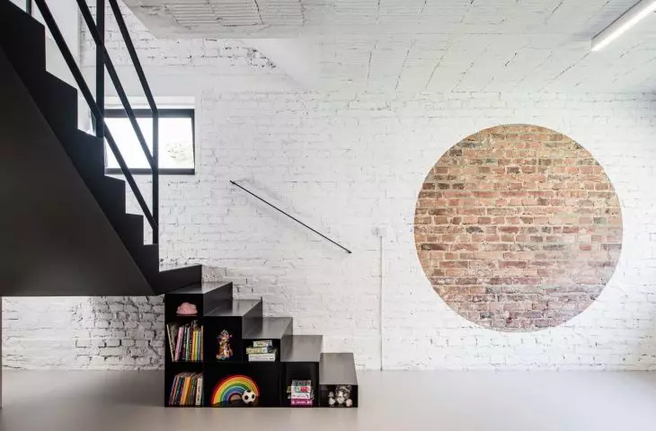
white, raw walls of the living room
Photo: Bartosz Dworski
In creating the character of the interior, [...] existing elements of the original house were used, the architects explain. - The slanted wall at the entrance door to the building was left. Brick was uncovered on the walls, and the surface of the ceiling was given a unique structure - the Akerman hollow block ceiling was left fully exposed after the plaster was removed. The intention was to clearly indicate which part of the house is the original, which is the new extension.
The 

 .
.
The dining room table has the same dimensions as the skylight placed above it
photo: Bartosz Dworski
composition of contrasts
The somewhat austere, minimalist and bright interior is inscribed with color accents emphasizing individual functions, such as a furniture box in an intense bottle green color integrating auxiliary rooms (a small bathroom, boiler room, pantry), closet, kitchen furniture, closet, living room bookcase and visually organizing the space. Other strong accents are black elements made of steel - part of the staircase and the living room bookcase, gold used on the kitchen island and bright pink on the steel hood.
The 


A kitchen dominated by green, gold and pink
photo: Bartosz Dworski
The two bathrooms deserve separate attention, according to the authors of the project. Designed in a different decor, however, they duplicate elements that can be seen in the rest of the house. Pink-colored wall tiles, wall cladding made of gold-colored furniture boards, the same diameter mirror wheel referring to the decorative brick accent, or bevels replicating the forms of triangular shapes. Above all, however, the composition of contrasts - non-standard combinations of colors and materials - appears again, the architects conclude.
bathrooms
photo: Bartosz Dworski
