Emotions have not yet subsided after the competition for the design of the pavilion - the Conservation and Storage Center - at the National Museum in Warsaw, which was decided on Monday. The P2PA studio's victory confirms its good run - in recent weeks alone, the young architects won first prize in the competition for the expansion of the Museum of Acts of Uprising in Góra Św. Anny and honorable mention in the competition for the design of the buildings of the Court of Appeals and the Mazowieckie Voivodship in Warsaw. Today, however, we will look at another competition proposal. Check out the design of a pavilion at the Warsaw headquarters building of the National Museum, created by a team from the Katowice-based BaH studio.
sketch
© BaH studio
In the competition, the recognition of the jury deliberating under the chairmanship of Prof. Ewa Kuryłowicz was won by the already mentioned P2PA studio (First Prize), Projekt Praga (Second Prize), WXCA (Third Prize) and the proposals of the IFA Group and Scmidlin Architekten offices, which received honorable mentions. The project of BaH studio (team consisting of: Mateusz Białek, Marcin Harnasz, Bartłomiej Tymosiak ,Piotr Buśko, in cooperation with Piotr Rutkowski), although it did not receive an award, presents a decidedly different approach to shaping the body of the pavilion connected to the museum by an underground tunnel.
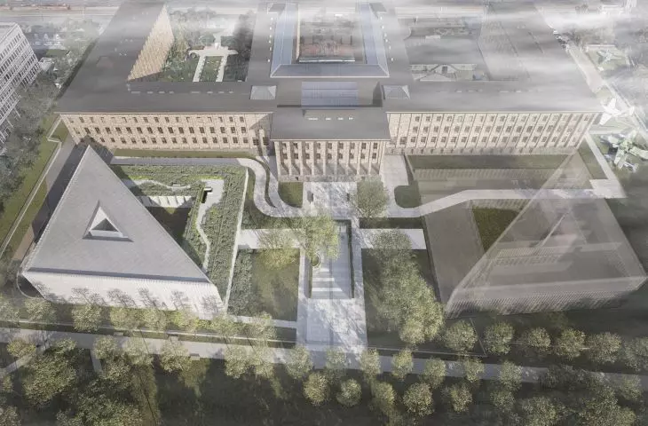
visualization, bird's eye view
vision: be3design © BaH studio
The lump of the pavilion is the negative of the western courtyard - instead of its emptiness it is a mass. Repeating the courtyard's dimensions as a mirror image in the form of a 53 × 53 meter building honors the existing spatial layout, BaH studio architects explain.
The four-story cuboid created in this way (three above-ground floors and one underground floor) underwent various transformations in subsequent stages, which - according to the designers' assumption - were supposed to make it fit even better into its surroundings.
block shaping scheme
© BaH studio
The most important thing was to take into account the axiality and symmetry of the museum building, as well as to create a suitable foreground for it, and to preserve unobstructed views of the southern façade with the main risalit. Therefore, the upper two floors of the pavilion were reduced to half of a cuboid, but cut off diagonally. The triangular volume created in this way creates the desired perpendicular frontages on the west and south sides - in the former case continuing the form of the internal street that is created between the MNW building and the Party House - while minimizing the volume leaves a wide view opening to the museum from the south, as well as to the Park Na Książęcem, the architects explain the design decisions. - The cubic volume of the pavilion undergoes further modifications - this includes cutting out a large patio to preserve the existing century-old tree, but also to better light the rooms. The layout of the inner courtyard paraphrases both the main museum building and the surrounding buildings, including the aforementioned Party House, they add.
visualization, on the right the stairs leading to the visitors' wing
vision: be3design © BaH studio
Wanting to preserve the existing stand of trees and protect the zone around the existing Oligocene well, the architects placed the visitors' wing underground and connected it to the new pavilion. Descent to this section is via a wide field staircase, which can also serve as an amphitheater for cultural events, running along the line of the museum's main axis - right through the center of the establishment.
Descending the stairs allows one to look at the southern façade of the museum and the risalit designed by Kazimierz Golawski, which have so far usually been invisible to visitors, from a completely new and unusual perspective. The arrangement of columns and glazing in the visitors' section enters into a dialogue with the rhythm of the columns of the museum's southern risalit - as if the recessed section were their mirror image. Standing at the top of the stairs, one will even have the impression that the museum's facade is reflected "in water" - as is the case at the front, where in fact the volume is reflected in a shallow pond. Here, however, one can delve into the "sheet of water" and discover this recessed space, the designers explain.
visualizations; the facade of the museum reflected in the pond and the entrance to the green roof
vision: be3design © BaH studio
In the visitors' section, the architects placed a retention basin - a shallow pond - and planned a green patio, where they also introduced a water element. Also green (and accessible to both museum staff and visitors) is the pavilion's roof terrace.
Proposed by the team from BaH studio, the pavilion is divided into two main parts - a lower one on a near-square plan and a higher one based on a triangular shape. This ground-floor "podium" of the building houses the main entrance to the building, a gatehouse, storage rooms and a queries room, while upstairs - on the level of the 1st and 2nd floors - conservation studios and custodians' rooms are located.
plans of the +2 level and the roof
© BaH studio
The southern and western elevations are formed by rows of vertical veins, the arrangement of which varies depending on the height of the floors - the higher they are, the denser their rhythm becomes, and the windows become correspondingly narrower.
The facades of the pavilion reflect a contemporary spirit, but at the same time enter into a dialogue with the edifice of Tolvinsky's design. The most exposed facades - the western one, visible from the terrace of the Party House, and the southern one, parallel to Stanislaw Lorentz Avenue - have been given vertical divisions and noble stone cladding of light sandstone. The material alludes to the museum building, but its lighter shade emphasizes the distinctiveness of the era, the architects say.
visualization
vision: be3design © BaH studio
In contrast, the northern and eastern elevations in the lower sections of the warehouse are devoid of windows and faced with sandstone, which is intended by the designers to create the effect of retaining walls. Above the compact part of the elevation - in the diagonally routed part of the block - a complete glazing is planned, reflecting the monumental main building of the museum.
visualization, view of the pavilion
vision: be3design © BaH studio
The designers have also included numerous ecological solutions in the design - the division of the pavilion's body into a green patio and an overhanging volume, as they emphasize, is to facilitate natural ventilation of the building (thanks to a shaded courtyard and courtyard-well), the introduction of the already mentioned retention tanks and a rainwater recovery system is to help rainwater recovery system, in turn, is expected to help irrigate gardens and flush toilets, while photovoltaic installations, building control via a BMS system and the use of energy-efficient lighting sources in optimizing energy consumption.
cross section
© BaH studio
For heating and cooling of the building, an innovative bottom-source solution for heat pumps (brine/water) is provided. This system provides the ability to heat the building using clean and renewable energy sources, the ability to store and accumulate heat/energy, and natural cooling in summer, the designers add.
