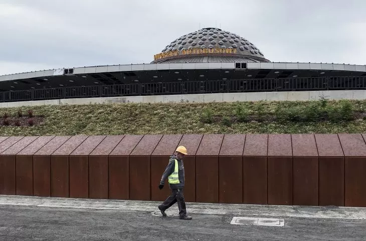
Kielce's PKS Station is the only such iconic and recognizable building in the Świętokrzyskie capital. Its recent reconstruction, however, is still closer to the widely criticized Rotunda dummy than a model modernization.
building metropolitanity
photo by Adrian Tync / Wikimedia Commons
The history of Kielce's railway station dates back to the 1970s. It was then, in 1975, that a decision was made to begin construction of a new transportation hub in the vicinity of the PKP railway station, the buildings of the Central Post Office and the Romantica cinema, erected in the previous decade. Thus, the construction was to be the next step in expanding the city center and giving it a metropolitan, metropolitan character. The project was the work of Edward Modrzejewski, responsible for many of the most valuable examples of architecture of the era in Kielce , working with Jerzy Radkiewicz and Mieczysław Kubala. The last of the three designers was also the author of the traffic system, ensuring smooth, collision-free movement of buses and pedestrians. The interiors, in turn, are the design of another designer well known in Kielce - Andrzej Grabiwoda.
construction with obstacles
photo Travelarz / Wikimedia Commons
Started in 1975, construction took a long time. Financial problems, economic crisis and material shortages stood in its way. Eventually, the station was able to be put into operation on the fortieth anniversary of the People's Republic of Poland - July 22, 1984. The 14-meter high station, enclosed by a dome, conceals three floors. Buses circulate around the perimeter of the premise, stopping at a lane covered by the outer ring of the canopy. Passengers enter the building through a lower level of tunnels, connecting at the ticket hall. A centrally located staircase leads to the waiting and service area from where one can reach the various stations.
unique work
Farewell to the train station
Institute of Design in Kielce
The functional layout is all the more important because, apart from the structural elements, it is really the only thing left of the old train station after the big reconstruction. And this is in spite of the building's inclusion in conservation protection.
"Erected between 1975 and 1984, the station building, among other things, is a unique and innovative example of communist architecture, considered one of the most valuable architectural realizations in Poland in the 1970s and 1980s, and a material document of the era.(...)"
swietokrzyski conservator of monuments
would-be shopping mall
Project of the would-be shopping mall
photo ARC
Of course, it could have ended even worse. In 2013, the site was transferred to the ownership of PKS 2, which intended to erect a large shopping mall at the site, with the historic dome absorbed into the new building. Three years after this transaction, the city decided to buy back the station for the sum of PLN 20 million. This would not have succeeded had it not been for the considerable opposition of the residents, who did not agree to the destruction of the architectural symbol of the city on the one hand, and another shopping mall in the downtown area on the other.
Soon after buying back the building, the city announced an architectural competition. According to the intentions of its organizers, the station was to retain its form, as well as its functional layout. Pedestrian communication or the arrangement of services were to be improved. The building was also to be adapted to the needs of people with limited mobility. The competition jury, chaired by Kazimierz Łatak and Zbigniew Maćków, considered the concept prepared by local architects - the Kamiński Bojarowicz Architekci studio - to be the best. Their project was referred for further development and eventually implementation. The cost of the reconstruction was nearly PLN 70 million. The rebuilt station was opened on August 27, 2020.
skeleton
Trailer of the documentary film
National Institute of Architecture and Urbanism, Institute of Design in Kielce
When describing their project,the authors of the reconstruction focus mainly on aspects of preserving the body and structure of the former building. And these indeed have not undergone (major) changes. The skeleton with its characteristic arched supports and the pillars of the outer canopy were preserved. The functional scheme has not undergone much modification either. And from a distance it may indeed seem that little has changed. However, it will be difficult to find material traces of the past by contacting the building directly anymore.
Photo by Kacper Kepinski
The most characteristic element of the building - the dome - has been modernized and made of better materials. It's hard to understand the decision to cover up the characteristic structure of the bus stand canopy with cladding that completely hides the rhythm of the columns. The crush is reinforced by the applied rhythm of faults in the ceiling finish, completely ignoring the divisions resulting from the building's unique design. The exterior arched supports, by the way, are one of the few truly original parts of the building.
erzac
photo by Kacper Kepinski, Travelarz / Wikimedia Commons
The exterior walls have completely changed. The curtain walls, which had a fairly standard facade design, but were in keeping with the spirit and era in which the station was built, have been replaced with bluish glass, over which a diagonal grid pattern made of steel cables with an aesthetic completely alien to the building has been superimposed. The accesses to the central passenger area were completely changed. Starting with the entrances and their canopies, which received a new architectural setting, through the (still too dark) tunnels. Rust-colored sheet metal is another fashionable addition at the 2016 competition stage, but it is nowhere near the architecture of the 1970s. The walls of the tunnels, once lined with natural stone, are now finished with decorative plaster and much more common materials. This is surprising, especially in the context of objections to the material and financial shortcomings of the original design in the 1980s. Perhaps the technical solutions used today are better. However, the effect faced by users of the station is worse.
Photo by Kacper Kepinsk
Reminders of the old craftsmanship
photo Travelarz / Wikimedia Commons
The only part of the original interior design that has been preserved is a fragment of a wall lined with broken porcelain, one pillar and a terrazzo bench in the ticket office space. Neither the restoration of the remaining surfaces, their restoration, nor the reapplication of the original solutions was decided. So in place of 20th-century porcelain, natural stone and terrazzo came even more rubbed plaster, visually associated with the decorative effects available in the paint section of home improvement stores. Wooden handrails and custom-designed benches were replaced by mass-produced system furniture and widely available finishing systems. It was possible to recreate the drawing of the ceiling in the characteristic honeycomb pattern. The lighting mounted in the top of the dome also refers to the original design, but it is not the original design.
Kielce Terminal
photo by Travelarz / Wikimedia Commons, Kacper Kępiński
The waiting room space has already changed completely. Once a bit too dark and enclosed, it is now filled with light and contemporary additions. On the plus side, the passenger information system is clear and integrated into the architecture of the building . It is legible, but also aesthetically pleasing, which is often a problem with this type of project. Slightly cluttered with various pieces of furniture (chairs, tables, standing lanterns, stage trusses, walls, armchairs, pouffes...), the space today more resembles the standard of an airport terminal than a regional bus station.
photo by Kacper Kepinski
stone pan
It's hard to resist disappointment when looking at the plaza in front of the building. He, too, was part of the grand project, and here, too, several mistakes were made. The first thing that strikes one's eye is the ratio of biologically active area to paved area. The former could definitely be more. Rachitic, rectangular-shaped tree crowns will not provide shade in this area for a long time to come. Stripes of granite paving radially surrounding the body of the station, in turn, is a solution as aesthetically consistent asimpractical from the point of view of a passenger with a suitcase. The fountain in the form of a red basin with jets and a concrete trough suspended above it with an aesthetically debatable sculpture also has no function beyond decoration - there are no benches or tables in its immediate vicinity.
Photo by Kacper Kepinski
It is worth noting that thanks to the renovation of the building, a sizable chunk of urban space has returned to the city - the station square. Its potential can be further exploited - so that it becomes a place that Kielce residents actively use. One of the formal efforts to give it an identity was an initiative proposed by Kielce councilors, who wanted to give it a name - Women's Rights Square. Unfortunately, the proposal was rejected.
Dominika Janicka
Acting artistic director of the Institute of Design in Kielce
artificial flowers and wow effect
photo by Kacper Kepinski
The fact that the building, unique in Poland, managed to save it from demolition or absorption by a shopping mall is an unquestionable success of the local community and city authorities. Kielce has not lost its icon. However, several years of discussion about the treatment of post-war modernism requires that we raise the bar and the demands placed on investors and designers facing the challenges of adapting buildings from the second half of the last century. After the loss of Supersam or Katowice's PKP railway station, the construction of a dummy rotunda in place of the original building, less and less real historic substance remains. Accused of poor quality materials and finishes, the modernism of the 1970s or 1980s is treated not in terms of a monument requiring a conservation approach, but a worn-out substance destined for replacement.
In the case of Kielce, the final result, calculated to generate attractive postcard shots, deprived the outstanding work of architecture of its original materiality, detail and charm. The preserved shape of the building has lost some of its proportions as a result of the modifications. Original, natural materials and techniques have been replaced with systemic, less durable and aesthetically pleasing finishes. Perhaps most symbolic in this context is the central island of greenery located on level -1 under the escalator. In photos in architectural magazines and design websites, it's an attractive natural-looking oasis bringing life to a somewhat sterile interior. In person, however, it's an island of green plastic. Artificial plants fenced off by a railing with care worthy of a botanical garden look good only in photographs. The question is whether they will age just as well, and whether such an erzac deserves a nomination for the Mies Van Der Rohe Award. And this doubt applies to the entire building.


