Construction of the Widok Towers office building in Warsaw is nearing completion. The building has been erected in place of the Universal office building, which is part of the historic Eastern Wall. The twice as large edifice will house, among other things, the offices of the City Hall.
the missing two towers
photo by Kacper Kepinski
Twice as tall as its predecessor and filling the space of the Widok Streetlot tightly, the office building was intended by its designers (Piotr Bujnowski and Martin Troethan) to imitate two towers. Hence the misleading name Widok Towers. Looking at the building from a pedestrian's perspective, it is difficult to find a split into two blocks. A treatment that was supposed to optically divide the building is the central part with a slightly differently designed facade, accommodating the central corridor in the building's circulation core. In the visualizations, this place almost dematerialized, creating a transparent clearance between the two massive blocks. In person, however, such an impression does not exist. Reflective glass, ceilings, successive layers of walls make it impossible to see through the building to the space even from a distance.
different from all sides
photo by Kacper Kepinski
The irregular outline of the office building's plan, which may be the result of a compromise between maximizing space and sunlight standards, makes the building look completely different from each side. From the perspective of Chmielna Street or Pasaż Wiecha, it is a bulky , squat lump. Looking from the opposite direction from Nowogrodzka Street, it becomes slender. The facade of the office building is quite three-dimensional by modern standards. This is due to the overlapping black panes of glass and slightly receding strips between the floors. The massing breaks horizontally on the north side of the building just over half its height. From Jerozolimskie Avenue, a loggia two stories high has been cut here (which gives a rather random visual effect), and the vertical slit of the main mass expands on one side.
concrete pan
photo by Kacper Kepinski
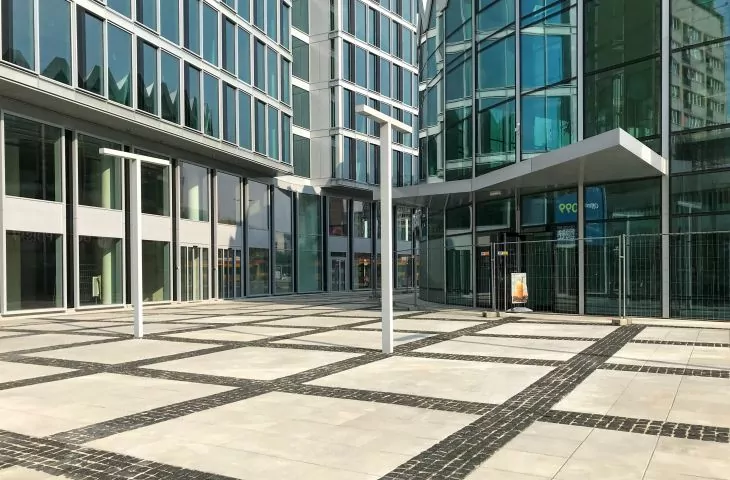
The base of the skyscraper was also designed differently. The ground plan has a different outline here, which on two sides allowed to overhang the upper floors and shape a retracted service frontage, while at the back the mass extends significantly towards the nearby buildings, leaving only a narrow passage. And it is the way in which the plazas around the building and its contact with the public space have been shaped that is one of the more problematic issues. For between Widok Towers and the Rotunda, an empty concrete plaza has been created, recreating the pavement pattern from before the demolition of the historic buildings that stood here not long ago. The failed reconstruction of the Rotunda and the building in place of the Universal have failed to create any new values for users of the public spaces around it. The square is devoid of trees and greenery (except for the green walls of the sunken section next to the Rotunda), and perhaps pots and urban furniture will appear here. At this point, it seems to be a textbook example of how not to design urban spaces in the face of a climate catastrophe.
hostile architecture
photo by Kacper Kepinski
At first glance, one gets the impression that the situation is much better in the back. Here they managed to set aside some green space and planted a few trees. After a closer look, however, there is disappointment. The steps leading to the lawn have been fenced off with a metal chain. Retaining walls that could serve as benches - instead of wooden seats have metal bars installed to prevent any use of them. Such treatments bring to mindhostile architecture solutions, i.e. treatments that impede the free use of public spaces.
Photo by Kacper Kepinski
advertisement hanger
The building of the "Universal" Foreign Trade Headquarters served as a display for large-format advertisements for almost the entire 1990s and 2000s. In the last years of its existence it did not look good, which did not win it any defenders in the face of demolition, which began in July 2016. S+B Gruppe developed the nearly twice as tall Widok Towers office building designed by Piotr Bujnowski and Martin Troethan on the site. Its dimensions, an irregular block with a characteristic break in the middle and expanding side wings significantly compromised the integrity of the urban composition of the East Wall. Universal was replaced by a building that matched the height of the Novotel hotel, creating a completely new, much more monumental and massive form of the Jerusalem Avenue gateway. On a closer look, too, the new design has created tensions and contrasts previously absent from the site - towering over the surrounding residential development and intimate View Street.
The East Wall's residential landmarks are about 75 meters, the nearby hotel, the former Forum, less than 100 meters. Our building could be about 90 m or a little more. Such would fit perfectly.
Piotr Bujnowski, co-designer of the Widok Towers project, for Dariusz Bartoszewicz, Universal to be demolished. Architects will use balloons to check the height of the new building, Gazeta Wyborcza, May 19, 2016.
An elegant backdrop for an icon
photo from the collection of Zbigniew Karpinski's family / National Institute of Architecture and Urbanism
Universal, as a fairly standard office building, served in the composition of the Eastern Wall primarily as a background for the neighboring Rotunda and closed the composition of the urban layout on the side of Jerozolimskie Avenue. In this case, the building's simple program positively influenced the appearance of the edifice designed by Jerzy Kowarski in accordance with Zbigniew Karpinski's guidelines. The office building completed in 1965 was characterized by restrained architecture, very simple curtain wall divisions and balanced proportions. The main office block was cantilevered over a visually distinct building plinth, housing commercial premises, including Orbis offices. Its scale referred to the dimensions of the Downtown Passage and gave the building a human scale, tying it to the surrounding public space. Subsequent modernizations in the following decades included the addition of an exterior staircase block with rounded corners on the east side and the replacement of the facade cladding panels, which gave the building its distinctive brown color, maintained until the demolition began in 2016.
photo from the collection of Zbigniew Karpinski's family / National Institute of Architecture and Urbanism
You can read about the history of the Eastern Wall and Universal in the online guide accompanying the 2021 realized exhibition "The Eastern Wall. The Architecture of Zbigniew Karpinski" of the National Institute of Architecture and Urban Planning.
city office
Photo: Tomasz Kubaczyk / National Institute of Architecture and Urban Planning
On Thursday, July 15, Commerz Real announced that ten floors of the office building will be leased to the Warsaw City Hall. The Office of Architecture and Urban Planning and officials reporting to the city treasurer will occupy floors -1 through 9, for a total of about 12,000 square meters. The Warsaw City Hall will pay about one hundred million zlotys for the 70-month lease (starting in spring 2022).


