1960s. New York's Madison Avenue is an iconic address on the serial map of every design lover. During the decade that frames the Mad Men series, much changes: characters, fashion or social issues. What remains unchanged are superbly designed interiors with mid-century modern style gems.
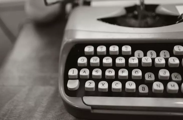
The atmosphere is built not only by the expressive characters and skillful verbal fencing, but also by what happens in the background: sounds and images. In the offices of the Sterling Cooper advertising agency, work is in full swing - phones are ringing, fingers are tapping against typewriters, and ice cubes are sonorously hitting the walls of glasses of high-alcohol drinks. Heroes with the obligatory cigarette in their hands prepare surprising campaigns and catchy advertising slogans. It seems a pleasure to work in such stylish and polished interiors. From the sofas to the lamps to the glasses and cigarette cases - thanks to the team of Dan Bishop, Amy Wells and Claudette Didul - there's plenty to hang your eye on.
frame from the series
© Filmandfurniture
The 23rd floor of a high-rise building on Madison Avenue
The set designers treat us to a double or even triple pleasure in looking at the interiors. The location, layout and size of the Sterling Cooper agency's offices change over the course of the series - giving new interior design scope. However, let's start at the beginning. In the first three seasons, to get to the Mad Men headquarters located in a New York City skyscraper - we have to take an elevator operated by a black elevator man. From a lobby lined with white and black stone with a touch of greenery, we transgress the thresholds of the advertising agency - we can feel thick carpeting under our feet, the walls are finished with wooden panels, and before our eyes we have a view of the open office space.
This is where serial employees work, not necessarily with a view of New York skyscrapers and access to daylight. The secretary who greets visitors sits behind a solid wooden but beautifully shaped desk - on a leather office chair designed by Charles and Ray Eames. In the background you can see a grown philodendron. In one season, a conference table with an oval top on a steel leg designed by Florence Knoll appears in the common space, surrounded by upholstered blue chairs by Eero Saarinen with a flowing back line and an opening above the seat.
The agency's more prominent figures work in their own spacious offices with views of the city and beautiful furnishings. Each office has been decorated in a different style, but none of them lacks wooden desks, leather armchairs with smooth lines, dressers on sleek legs, upholstered modern sofas and matching liquor bars. Here even the whiskey glasses are iconic - the Roly Poly model with a silver rim, in a spherical shape was designed in the 1960s by Dorothy Thorpe.
Roly Poly glasses, pro: Dorothy Thorpe
© Filmandfurniture
The office of one of the company's founders, Bertram Cooper, is governed by its own rules and has been decorated in Japanese style. In the office of creative director Don Draper, woven teak armchairs, model FD-146 by Danish designers (Hvidt and Mølgaard-Nielsen) stand at a wooden desk. Opposite, a meeting and teamwork area - an angular beige sofa finished with wooden sides, armchairs in the same style and a generous monstera.
Armchair FD-146, designed by Peter Hvidt and Orla Mølgaard-Nielsen
© MidcenturyrestorationUK
The interiors have no shortage of art, interesting designs and greenery. The open space is organized with semi-transparent partitions, and wooden elements are complemented with accents in soft shades of pink and blue. The office is modern, though kept in a traditional tone.
