Emotions after the recently decided competition for the design of the building of the CAMERIMAGE European Film Center in Toruń have not yet subsided. Today we present the winners of the third prize - the project of the Wroclaw studio P2PA, which the jury appreciated for its sensitive intervention in the city's skyline and balance - between culture and nature, rigor and freedom, utilitarian space and festival purpose.


view of the entrance zone to the facility from the eastern side
vision: Piotr Banak © P2PA
A team of architects from the P2PA studio in June this year won first prize in a competition organized by the Jan Długosz University of Humanities and Sciences in Częstochowa and the Częstochowa branch of SARP. According to their design, a new building, the Didactic Center for Medical and Health Sciences, will be built on the university campus. In the competition proposal they presented a compact block - a simple tower with a square base. The leitmotif of their next competition concept, this time for Toruń's ECFC, was also a simple cube, or rather ten elements freely "scattered" over the plot of land adjacent to the Cultural and Congress Center Jordanki designed by Fernando Menis.
open stage
The film center, as envisioned by the designers, is not only to become a globally significant cultural facility, but also to create a vibrant space for the residents of Toruń.
The concept aims to create an object that is a comprehensive and coherent response to each of the influencing factors. Their source is both the urban context of the Old Town with its surrounding ring of greenery, as well as the program assumptions aimed at creating a multifunctional and changeable building that is authentic, inspiring and unique. The building should be a stage for important international events, while at the same time being open and accessible to residents, the architects explain.
site development plan
© P2PA
unobvious frames
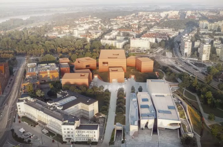
The designers, wanting to take advantage of the qualities of the existing greenery and avoid the effect of a massive mass, decided to create an ensemble built of independent cubes arranged in a composition that allows clear and flexible shaping of the space. The blocks were located between the entrance square to the building (from the side of Solidarności Avenue and Czerwona Droga Street) and the park greenery on the western side of the plot. In each of them (the cubes vary in size) a different function has been placed, including the Entrance Gate, Education Center, Cinema House or Market.
visualizations and cross-section B
© P2PA
The object, with its open structure, does not create barriers, ensuring the interaction of the square zone, green areas and intimate spaces flowing between the designed cubicles, explain architects from P2PA studio.
This seemingly chaotic arrangement of individual volumes allowed the creation of a representative square in front of the ECFC building and intimate spaces between the buildings. This square connects the ECFC area with the aforementioned CKK Jordanki, and its size allows for the organization of mass events, outdoor concerts or other events. An extension of the square is a meadow - a spreading, irregular green dome connecting the cubicles - a natural extension of the park adjacent to the facility allowing external communication.
Thanks to the location of direct exits at the level of the meadow in most of the cubicles, during events and festivals organized in the building it can serve as an outdoor place for recreation, relaxation, intimate lectures or film screenings, and at the same time can serve the residents. Round skylights are irregularly arranged in the surface of the dome, illuminating the interior in a natural way, emphasizing its individual character, the designers add.
visualizations and cross-section C
© P2PA
The interiors are also illuminated by other vista-framing openings - one or two stories high and set back in the façade by rectangular cutouts referring in proportions to the most popular movie picture formats thanks to which the building, as the architects explain, refers to the art of cinema in a non-obvious way.
simplicity and clarity
Each of the cubicles is designed for a different function - the central place was occupied by the block of the ECFC Gate with a representative entrance area to the complex, behind it was located the largest of the facilities - the Main Hall with a stage and audience in the first floor (1200 seats) and on the balcony (312 seats). The backstage area of the Main Stage is connected to the two-story Garderobe cubicle. A two-story Canteen cubicle connected to the Cafeteria building is also planned in the southwestern part of the site. In turn, in the northern part of the site, two cubicles were located to house the Cinema House and the Museum on floor -2. On the south side of the Main Hall, the Market was placed, and to the east of it - the Education Center and further the Studio.
plan of the +1 level
© P2PA
To create a visually coherent premise, the architects decided on distinctive material solutions.
The simplicity and clarity of the complex was enhanced by the choice of honest and authentic materials. The proposed buildings are made in concrete construction from brick-colored rammed concrete. Making walls with this technology requires pouring layers of concrete in strips not exceeding 50 cm, and then mechanically ramming them. The use of this solution makes it possible to obtain a facade with a unique structure, each part of which is unpredictable, and the resulting drawing of layers brings to mind the work of a craftsman. This solution alludes in an unobvious way to the nature of the art of filmmaking and indirectly relates to the surroundings of the UNESCO-listed building. The proposed reddish color of the buildings of varying tones and brightness refers to the traditional local brick architecture and its diversity. The structure of the green dome has been designed as monolithic reinforced concrete, and its material will also be seen as a finishing touch on the interior side. The facility's floors, due to its size, were designed as poured floors. Copper sheeting, following the dominant color scheme of the building, was used as an accent element for the elevator area or the entrance to the Main Hall, the designers explained.


project mockup
© P2PA
The architects also used environmentally friendly and energy-saving solutions in the project, including greenery, appropriately placed openings to ensure natural lighting of the interiors, solutions allowing the use of rainwater, the use of durable materials of high quality or the implementation of a BMS system, which allows, among other things, the control of thermal energy consumption.


![Relacja online z premiery nowego materiału EQUITONE [lunara] już 21 września o godz. 11.00](https://cdn.architekturaibiznes.pl/upload/cms_aktualnosci/8706/images/kadr19/fit/560x560/relacja-online-z-premiery-nowego-materialu-equitone-lunara-juz-wrzesnia-o-godz-151381.jpg)


