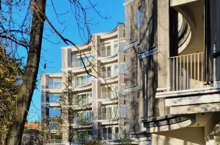
Fancy composition of loggias with silver curtains, original layout of blocks, unique location next to a historic park, large square meters and huge prices. That's how Perfumiarnia, a luxury residential enclave in Poznan by JEMS Architekci, looks like in a nutshell . The intention and quality are awe-inspiring, but there are also reasons for dilemmas.
This is the first multi-family development in Poznań by JEMS Architekci. The well-known and respected Warsaw studio is not making its debut here, however, as it has other significant projects to its credit. These include the Pixel office complex (from 2012), a contemporary wing of the historic Raczynski Library (competition: 2003, realization: 2013) and an office building (2023) in the Nowy Rynek complex, whose urban planning concept is also the work of JEMS (investor competition in 2016).
exceptions alone
A unique residential enclave called Perfumiarnia (investor: Garvest) was added to this set in late spring this year. What is its uniqueness based on? First of all, the location is unique: on the border of the historic Wilson Park in the Lazarus district, among old tenement houses on Sniadeckich Street. In addition, on the site of a former perfume factory (before the war - private, during the communist era - within the structures of Pollina Lechia), from which the commercial name of the investment was coined.
Perfumiarnia, Poznań, Śniadeckich Street, design: JEMS Architekci - schematic visualization of the investment.
Buildings from A to F - completed. Objects marked with dots - under construction or in preparation.
On the left - Wilson Park, in the lower right corner - Glogowska Street.
source: perfumiarnia.wparkuwilsona.pl
Secondly, the form is unique: the complex is made up of buildings with "rocking" arched large loggias opening to the park. Finally, third: unique in the city are the high standard and corresponding price of the apartments. This, by the way, continues the character of the place. On the other side of the park, on Matejki Street, stood the most luxurious townhouses in the city more than a century ago . The architects explained the general idea of the whole thing this way a few years ago:
The vertical articulation of the facades on the side of the existing buildings goes into terraces that are expressive in plan, obscured by curtains of metal mesh, providing a backdrop to the trees of Wilson Park
Perfumiarnia, Poznań, Śniadeckich Street, designed by JEMS Architekci - view of segments E and F from the northwest
photo: Jakub Glaz
the front rules
Are these unique features enough to describe Perfumiarnia as an unequivocally successful realization? Not really. It's an interesting and original project , carefully finished, but it also provides a few dilemmas. The first concerns a bit too much density. On a relatively small plot, the architects packed six five-story segments grouped in three pairs (on a common garage hall) in an irregular way. Each of them was designed on a different, "cut" original plan. It's a picturesque idea, but attractive mainly from the park. From the side of Sniadeckich Street it is much less interesting, which evokes associations with the grand front and more modest courtyards typical of old tenement houses.
elevation of segment B from Sniadeckich Street, on the right: a fragment of the former Huggers brewery
photo: Jakub Głaz
Thecontrast between the highly original park-like elevations and the other wallsseems too much. The former, thanks to the thoughtful composition of the loggias, form a kind of undulating curtain. The loggias themselves, in turn, are rich in sliding blinds or curtains of very fine, translucent steel mesh. The variable arrangement of these covers introduces a much-needed variety and corresponds well with the free composition of the park's tree branches. The less exposed elevations, on the other hand, are simply plain plaster walls punctuated by tall portfères.
View of Block F from the park from Glogowska Street
photo: Jakub Głaz
more meters!
Finally, the apartments. On the one hand, their decent square meters (from 47 to about 150 square meters), height (3 meters, 3.5 meters on the top floor), floor-to-ceiling windows and floor plans almost undivided by load-bearing walls should be appreciated. On the other hand, the layout of the buildings means that even sizable units don't have windows across (smaller apartments - only on one side), and the layout of the windows and irregular shape of the apartments make it difficult to divide the space more flexibly (the floor plans can be studied on the investment's website). Some of the units in Perfumiarnia therefore have a chance to fulfill themselves mainly as representative, even showcase apartments. Playing the role of multi-room "normal" apartments will come with difficulty for some units.
A view of the loggia in the central part of the complex from the side of Wilson Park
photo: Jakub Głaz
The doubts enumerated here are not significant drawbacks, but nevertheless contrast with the exclusive nature of the investment, as communicated by the investor. The price per square meter in Perfumiarnia hovered (and still hovers) around 20 thousand zlotys, so one could hope for a bit more breathing room and refinement of the less externally visible parts of the buildings as well. The slight overcrowding is probably the result of changes coordinated to the architects by the developer. In the spring, during a guided tour arranged by the Poznań branch of SARP, the project's authors Marcin Sadowski and Jan Damięcki spoke about the task set before them of increasing the space in the buildings by 2,500 square meters. The result was the grouping of six free-standing segments into three pairs (which, according to the designers, worked out well for the concept).
View of the elevations from Sniadeckich Street, clearance between segments B and C overlooking segment A
photo: Jakub Glaz
The idea changed more often, after all. In fact, construction work began only more than two years ago, although the investor's first announcements notified 2017. The architects themselves spoke of the studio's "most lackluster project," indicating that the creation of Perfumiarnia may have been accompanied by considerable turbulence.
a road to nowhere
Perhaps the compensation for the investor's overly strong "monetization" of a very attractive location is the exceptionally careful design and finishing of the common areas: staircases, lobbies, integration areas. Wooden cladding, terrazzo, meticulously designed stair railings give the interiors a timeless and solid character.
Green square at block F on the border with the area of old tenements
photo: Jakub Głaz
The composition of the public walkway leading along the houses among the greenery from Sniadeckich Street up to the park is also interesting. What's worse is that this alley ends at... the gateless fence with which the Perfumery was fenced off. It seems clear that the tract's layout echoes the original intentions seen in visualizations from three years ago. The fence between the new development and the park was not on them. Now one has to walk all the way around to the park, which, by the way, contradicts the rather outlandish slogan advertising the Perfumery. The slogan speaks of "houses with a large garden," where the word "garden" simply means a public park.
Estate path leading to the fence; behind the fence: Wilson Park
photo: Jakub Głaz
Fortunately, far better than marketing gimmicks came out the investment itself, which - despite reservations - should be regarded as successful and raising the average level of Poznan's housing stock. On the plus side, the investor and architects should also be credited for the discretion with which the complex fit into the park surroundings (to which, by the way, it owes its unique character). Shrouded by the foliage of mature trees, it is essentially invisible, and in winter the light-colored facades with sliding curtains provide a neutral background for the stately boughs.
Perfumiarnia, Poznań, Śniadeckich Street, proj. JEMS Architekci - general view from the west
photo: Jakub Glaz
it's not the end
This, by the way, is not the end of activities at the park. Garvest is renovating and rebuilding the so-called Betonhaus, a pavilion erected in 1911 for the East German Exhibition, standing next to the Perfumery, as well as the former Hugger brewery behind it (the two buildings will be connected). The work, designed by Poznan-based CDF Architects, is underway and is expected to be completed next year.
Betonhaus next to the Perfumery, southern part - renovation and adaptation works are underway
photo: Jakub Głaz
The complex will include a restaurant, offices, space for conferences and exhibitions, and a spa. We will write about this project and the residential development started by Garvest between Perfumiarnia and Sniadeckich and Glogowska streets (the second stage of the development, see the visualization at the beginning of the text) soon. We are also waiting for the completion of work on another Poznan residential project by JEMS Architekci. These are also high-end buildings and also surrounded by greenery - being built in the very center, on the slope of St. Adalbert's Hill.


